Engraver's Script Instruction

arcangel6

Elite Cafe Member
Joined
May 11, 2011
Messages
141
Location
Brookfield, WI
Hi,

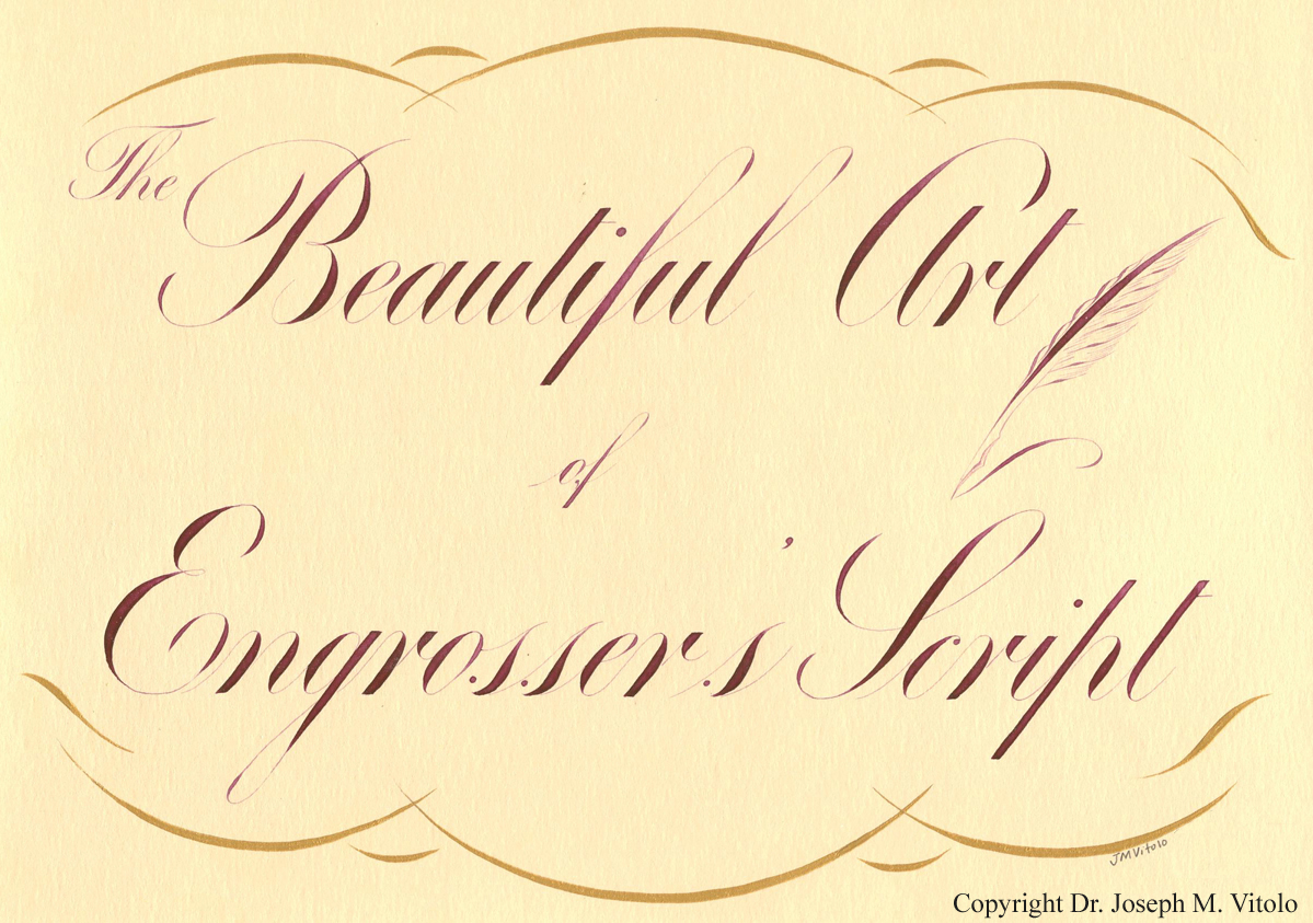
I hope Sam will forgive me for reposting this instructional link. I am a penman/calligrapher with a specialty in a form of shaded script (see my image posted below) that is known by many names including Roundhand, Engraver's script and Engrosser's script. This particular form of shaded script is sometimes described as 'engraving on paper'. Most modern calligraphers would could all of these variants named above as 'Copperplate'.

I have been teaching instructional workshops on this subject for many years. In addition, I have made ALL of my instructional materials (articles and videos) available online without cost on the website of The International Association of Master Penmen, Engrosser's and Teachers of Handwriting at:

http://www.iampeth.com

I am very aware that the approach to forming letters is different for pen versus burin; however, the resultant letter forms should be the same visually. A penman once told me that every shaded stroke of the pen has two lines. As you already know, the pen nib forms these lines in one stroke whereas the burin requires separate strokes. I took his advice to heart and spent MANY hours drawing my letters one line at a time similarly to the way the Engraver for form the letter.

As I've said above, I make ALL of my instructional materials available without cost since my day job pays my bills. At some point I will publish a Book/DVD instructional manual for my style of script. If any Engravers on this site are interested I’ve decided to make my complete Copperplate Workshop Handout available to members of this site. There is no cost and no catch. You may download and print the complete 87 page Workshop Handout at:

http://www.zanerian.com/VitoloBookHandoutComplete3.pdf

I just ask that you do not distribute this file since it will serve as the basis of my future instructional book should I ever get around to publishing it. The instruction manual is composed of several of the articles I’ve published over the years. Please keep in mind that these are individual articles pasted together; therefore, the narrative does not read as a cohesive book. Even though it is intended for pointed pen instruction it is my hope that Engravers will find the concepts contained with in helpful. I will be posting additional concepts in script under this post.

Regards,

Joe Vitolo
 

arcangel6

Elite Cafe Member
Joined
May 11, 2011
Messages
141
Location
Brookfield, WI
Of Ovals and Compound Curves

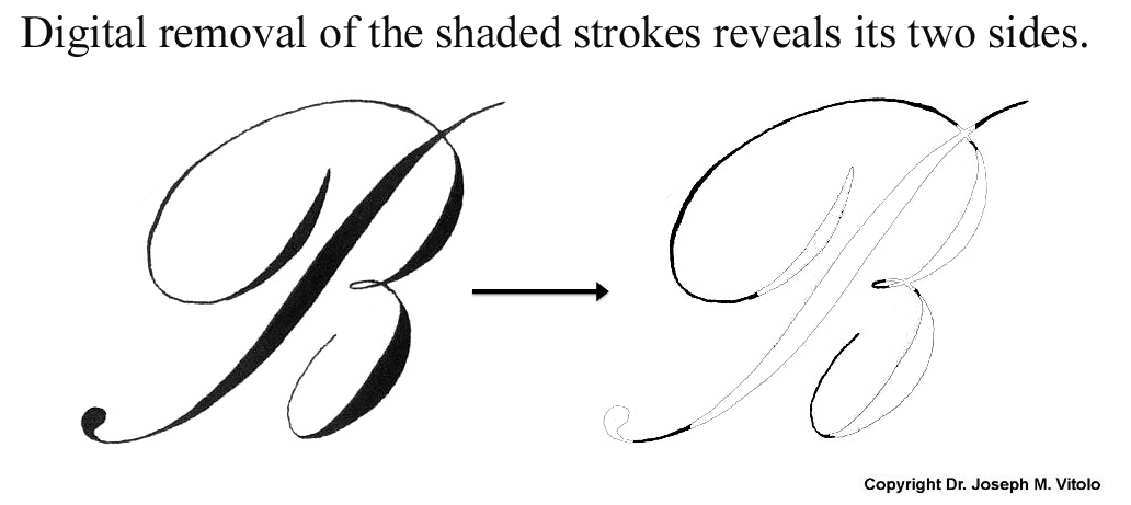
The fundamental form common to all Engraver's script letters is the oval. This 'oval' form further influences another very important fundamental shape, the compound curve. Here is a study I did using the capital 'B'

Regards,

Joe


JJ Roberts

:::Pledge Member:::
::::Pledge Member::::
Joined
Nov 10, 2006
Messages
3,515
Location
Manassas, VA
Joe, Thank you for sharing you knowledge of penmanship and do you think it will ever be taught in schools again? :thumbsup: J.J.
 

sam

Chief Administrator & Benevolent Dictator
Staff member
Joined
Nov 6, 2006
Messages
10,522
Location
Covington, Louisiana
Joe, we are grateful for your generous help with lettering study. The imaginary ovals really help with drawing of this letter. I wonder if some of our members would care to engrave this and maybe we can get a discussion going on cutting script, as I think cutting the letters with a burin as opposed to a pen causes subtle changes to the shapes of of the shade strokes. For instance, hand engravers are taught that the beauty line (the first stroke in your illustration) has a slight swell to the bottom portion. I believe this is a result of the beauty cut being made in two cuts. With hand-push gravers :graver: we traditionally cut in a counter-clockwise direction if we're right handed, so the beauty stroke is done in two cuts, starting with the bottom and finishing the lighter portion of the stroke at the top. This tends to make a slightly less symmetrical shade cut that has a larger swell toward the bottom. With pneumatic handpieces :handpiece: we don't have to follow the rigid counter-clockwise rule of the hand-push engraver, although for consistency we quite often adhere to that for many of the script lettering cuts.
bergling_B.jpg

Here's the letter B from JM Bergling's book Art Monograms and Lettering from Google Books. As you can see, his version has the slight swell at the bottom of the beauty cut. I'm curious to know your thoughts on this as a penman.

Thanks for this discussion! / ~Sam
 

Kevin Scott

Elite Cafe Member
Joined
May 17, 2009
Messages
241
Location
Philadelphia, Pa, USA
In Meek's book, Art of Engraving page 92 he shows the script alphabet also showing how ovals are used to produce quality script. Seems I have seen the concept in another engraving book also but not sure.
I need to study Dr. Joseph's lessons because my engraved script lacks a certain elegance that I see in quality engraved and written script. In addition to improving my cutting skills.
Kevin Scott
 

arcangel6

Elite Cafe Member
Joined
May 11, 2011
Messages
141
Location
Brookfield, WI
Hi Sam,

That is a beautiful 'B'. Engraver's Script (Roundhand) does not have a fundamental letter style. Contrast this to Roman capitals and you can point directly to Trajan's Column as the fundamental to which all such letters are compared. I have seen compound curves used where the main heft of the shade below the midpoint of the stroke as seen in the exemplar you posted. In fact, it is commonly seen on Spencerian/Ornamental scripts (see image below). The 'B' you posted is not as slanted as many handwritten forms which typically range from 52-55 degrees of slant. If anyone is struggling with forms like 'B, P and R' please see the following article (also found in my workbook page 58):

http://www.iampeth.com/lessons/engrossers_script/VitoloOvals%20and%20Compound%20Curves.pdf

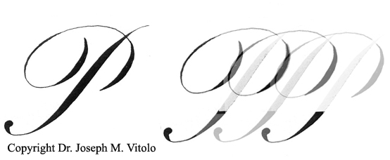
Also, another important concept in the underlying symmetry of these letters (B, P and R) can be seen in this image I like to call the 'Rolling P':


Regards,

Joe

Joe, we are grateful for your generous help with lettering study. The imaginary ovals really help with drawing of this letter. I wonder if some of our members would care to engrave this and maybe we can get a discussion going on cutting script, as I think cutting the letters with a burin as opposed to a pen causes subtle changes to the shapes of of the shade strokes. For instance, hand engravers are taught that the beauty line (the first stroke in your illustration) has a slight swell to the bottom portion. I believe this is a result of the beauty cut being made in two cuts. With hand-push gravers :graver: we traditionally cut in a counter-clockwise direction if we're right handed, so the beauty stroke is done in two cuts, starting with the bottom and finishing the lighter portion of the stroke at the top. This tends to make a slightly less symmetrical shade cut that has a larger swell toward the bottom. With pneumatic handpieces :handpiece: we don't have to follow the rigid counter-clockwise rule of the hand-push engraver, although for consistency we quite often adhere to that for many of the script lettering cuts.
View attachment 15732

Here's the letter B from JM Bergling's book Art Monograms and Lettering from Google Books. As you can see, his version has the slight swell at the bottom of the beauty cut. I'm curious to know your thoughts on this as a penman.

Thanks for this discussion! / ~Sam
 

arcangel6

Elite Cafe Member
Joined
May 11, 2011
Messages
141
Location
Brookfield, WI
Spencerian and Ornamental Script

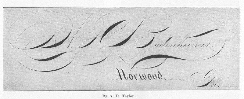
I am not sure if any Engravers use these beautiful forms. The first specimen of Ornamental script was penned by past master Henry P. Behrensmeyer (1868-1948). The second specimen is regarded by many to be one of the finest examples of Ornamental script and was penned by Albert D. Taylor (1863-1898).

Henry P. Behrensmeyer (1868-1948)


Albert D. Taylor (1863-1898)


Regards,

Joe Vitolo
 

arcangel6

Elite Cafe Member
Joined
May 11, 2011
Messages
141
Location
Brookfield, WI
Letter Proportions

Hi,

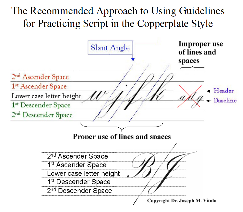
It is important in script when trying to tweak/perfect your letter forms to consider the geometric proportions of your letters. For anyone interested, you can download my lettering guidelines for practice. You can find the link here:

http://www.iampeth.com/lessons/guidesheets/VitoloScriptGuidelinesFromVideoClips.pdf

On the first page you will find the diagram below that provides insight into the proper use of these guidelines. The purpose is not to lock you into one letter proportion or slant angle but rather it provides you with fixed reference points to construct your letters consistently. Once your forms are consistent you can always vary your script to your artistic needs.

Joe Vitolo


arcangel6

Elite Cafe Member
Joined
May 11, 2011
Messages
141
Location
Brookfield, WI
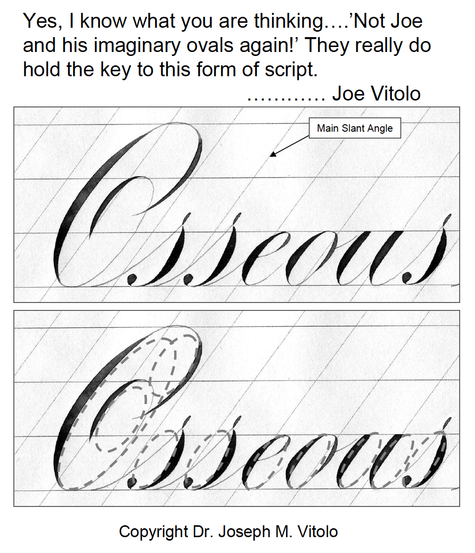
More on the role of ovals in Script

Here is an image that further illustrates the role of ovals in script and how I use them to evaluate my letter forms. The comment atop the image was not written for this group.

Regards,

Joe Vitolo


sam

Chief Administrator & Benevolent Dictator
Staff member
Joined
Nov 6, 2006
Messages
10,522
Location
Covington, Louisiana
This thread is a treasure trove for script study. Thank you Joe!

I've had imaginary friends so imaginary ovals are not a problem ;)
 
Joined
Aug 26, 2010
Messages
69
Location
Frogner, Norway
This thread has rekindled my love for Calligraphy! After a full weekend of calligraphy I already see a huge improvement in my script engraving!

Joe, thank you so much! When I grow up I wanna be just like you! :cool:
 

KCSteve

~ Elite 1000 Member ~
Joined
Jun 19, 2007
Messages
2,882
Location
Kansas City, MO
The book showing how you use ovals to construct your script letters is "The Jewelry Engravers Manual" ($8.95 from GRS). My copy is down on my bench so I can't give the page number.

I agree with the others. This thread - and Dr. Vitolo - are a tremendous resource for anyone wanting to improve their script engraving.
 

mbroder

Elite Cafe Member
Joined
Feb 1, 2007
Messages
203
Location
Brentwood,(Bay Area) CA
This lettering is beautiful...which leads me to ask what some might consider blasphemy... Can someone create a computer font of this???:thumbsup: While I certainly appreciate what goes into doing this all by hand, the business side of me needs to layout my lettering quickly and start cutting metal! I certainly would pay for a font like this:biggrin:.
 

arcangel6

Elite Cafe Member
Joined
May 11, 2011
Messages
141
Location
Brookfield, WI
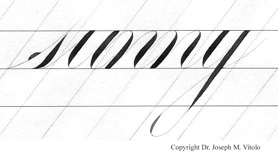
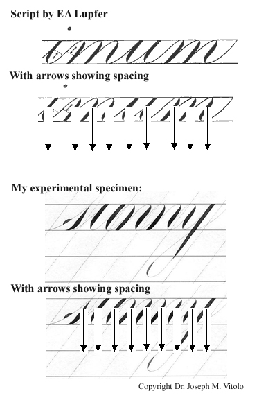
I sent the following to Sam in a previous email. The image pictured below is a study I did where I asked if letters in Engraver's script could be too symmetrical. I penned the word 'sunny' (see the images below) using non-standard connectors that allowed precise shade spacing.

Joe Vitolo


arcangel6

Elite Cafe Member
Joined
May 11, 2011
Messages
141
Location
Brookfield, WI
Rules in Script Embellishment

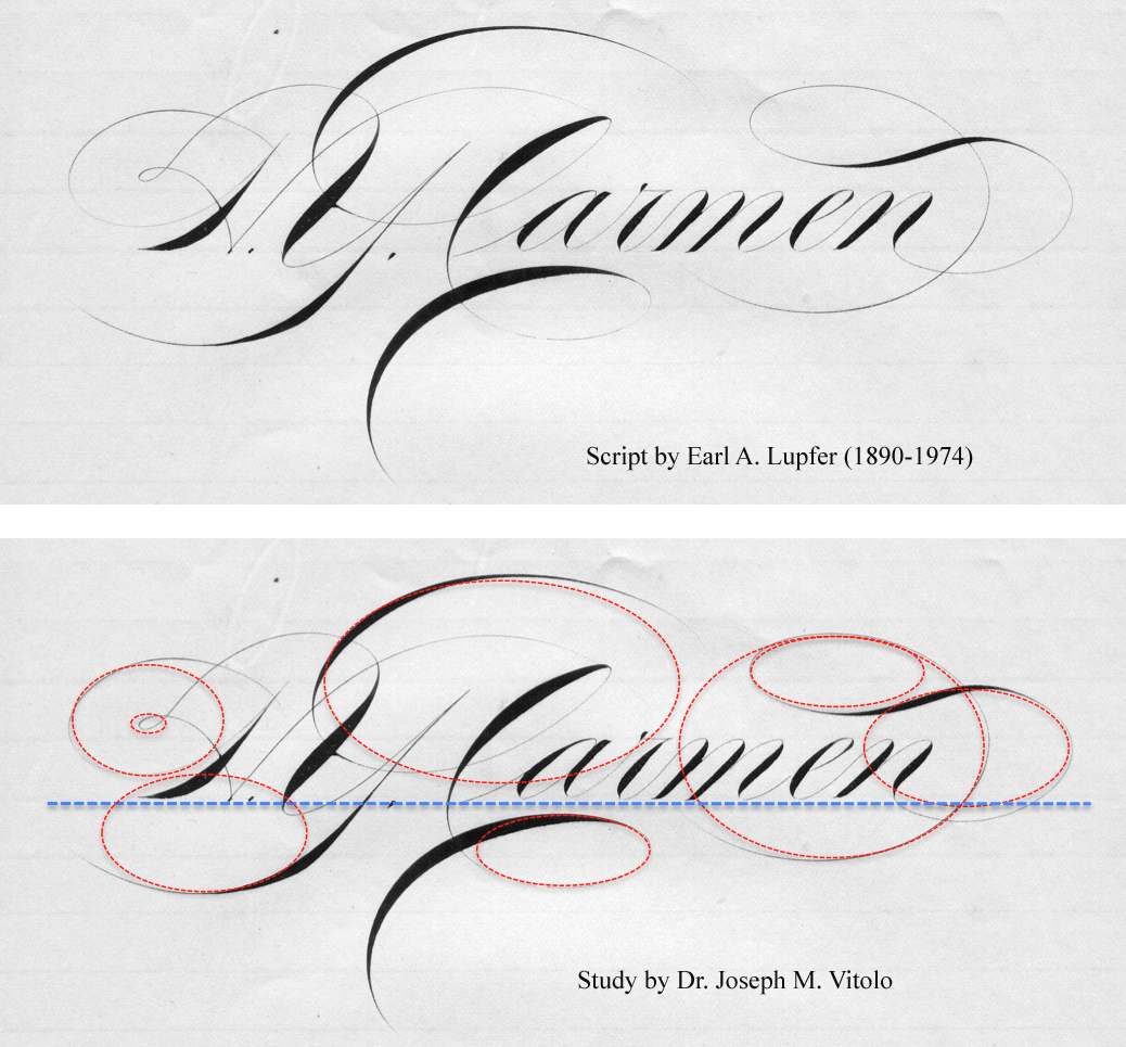
Here is a remarkable example of dramatic shaded and ornately embellished Engraver's script lower case lattes combined with Ornamental capitals penned by past master of the pointed pen Earl A. Lupfer (1890-1974). As a general rule when using embellishments to adorn and enhance their script past masters used the rule of keeping their forms based on ovals (shown in red) made horizontal to the baseline (shown in blue). For more on Lupfer please visit:

http://www.zanerian.com/LupferOrnamentalScr.html

Regards,

Joe Vitolo


Latest posts

Sponsors

Top