Acanthus practice

Tom Curran

Elite Cafe Member
Joined
Feb 18, 2007
Messages
451
Location
upstate New York
Well, after lurking for a month or so, I've decided to get in gear and start putting some stuff out for critique. I already know there are many things that aren't quite right, but I sure would like to hear what you folks have to say.


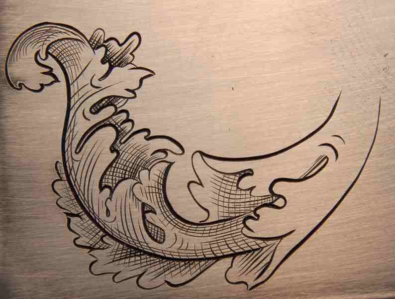
My main thing is gun work, and with that goes the decorative elements. I am mainly a hammer and chisel engraver, but have recently bought the GraverMach system. This piece is engraved entirely with the GraverMach. My main areas of interest lie in the decoration of artifacts from the Fifteenth Cent up to the Eighteenth Century. Even though the draftsmanship and workmanship on some original pieces is crude, I do not wish to emulate that.

Thanks, Tom
 
Last edited:

Marcus Hunt

~ Elite 1000 Member ~
Joined
Nov 9, 2006
Messages
1,799
Location
The Oxfordshire Cotswolds, England
Hi Tom, a good attempt but it could be improved a little in my view.

Firstly, your cutting is fine and you obviously have good graver control so this critique can be easily put into pratice by you. The shapes you have in the leaves could be improved a little but that really is a matter of personal taste. Where it falls down is in the shading.

Shading models and brings the shapes of the leaves to life. There are subtle tones and shades that can be achieved with fine shading but here we have mono tones. Try thinking of light to dark when you shade so that when you are getting to where a leaf (or part of) is underneath another the shadow should be almost black. This entails correct spacing of the shading lines and they should go from thin to thick so at the tips they are evenly spaced and at the finish they should almost, or even, touch. Think of the shape of the leaf and the lines should follow this shape. When cross hatching is used, be wary of over doing it. Again it is used to a modelling effect and should run from widely spaced gradually getting closer and closer as the shading darkens. My advice is don't use cross hatching unless strictly neccessary and then make sure your hatching lines are as thin as they can possibly be and certainly a lot thinner than the main shading lines.

When you have leaves running along the outside of the scroll and you're shading them as you are, the scroll itself should have a light spine otherwise you'll end up with a black blob and there will be no definition in the scroll. This part can be thought of as a highlight and if you are going to run a fine shading line along it do not cross hatch along it. Remember, hatching has to achieve something, it's not just there for the sake of it.....the 'fishing net effect' isn't what you're really after.
 

Tom Curran

Elite Cafe Member
Joined
Feb 18, 2007
Messages
451
Location
upstate New York
Marcus, thanks for your input. That's just what I'm looking for. I will try some more practice runs to try to get the concept of what you're talking about. Maybe what I should do is re-cut that design, with your suggestions in mind. Then post it again.

thanks, Tom
 

FANCYGUN

~ Elite 1000 Member ~
Joined
Nov 10, 2006
Messages
1,840
Location
West Grove, PA
Tom
How the heck did you get the image to appear in the text body nice and large rather than as a thumbnail? As Marcus said..let your shading converge down to a vortex. This will give more flow and greater depth to your form. The fish net effect is a little more like the old primative patch boxes on rifles. Use it as secondary lines not main lines on your shading.
 

KSnyder

Elite Cafe Member
Joined
Nov 13, 2006
Messages
613
Location
Toledo, Ohio
Tom , if you check out 18th cent. arms they have a certain look to them. they are not all that formal for a style of engraving. Lots of border work with some "scrolls" and "c" roccoco style.
Trying to accurately imitate the old style is tough.
The contempary makers sometimes go over the limit in the search for perfection.
Keep in mind the old masters had poor lighting / magnification if any and only hand tools.
my customers mostly want original looking pieces.Part of their charm imho.
this isn't meant to be critique but an observation.
Some jaegers have acanthus leaf motif , especially the early ones.
happy cutting,
Kent
 

Tom Curran

Elite Cafe Member
Joined
Feb 18, 2007
Messages
451
Location
upstate New York
Thanks for the input, gents. My main interest is to have my work appear in the style of the 18th smith. I am doing several things at once here, one of them is to study the style of leaf. The other is to try to understand the actual cutting techniques and the effects of shading.
 

Tom Curran

Elite Cafe Member
Joined
Feb 18, 2007
Messages
451
Location
upstate New York
I am using Photobucket.com for my URL picture storage. I think that's why my pics are coming out so large. Cody posted the answer below.
 
Last edited:

Cody

Elite Cafe Member
Joined
Nov 10, 2006
Messages
136
Tom, with this site, you don't need photobucket. You can load the pic directly from your PC. That's how they come up as a thumb nail. Go to "manage attachments", then "browse", pic your picture from your own files and download. Something like that anyway. Pretty neat system.

Cody
 

Tom Curran

Elite Cafe Member
Joined
Feb 18, 2007
Messages
451
Location
upstate New York
Ah! Thanks, Cody.

I will give that a shot when I post another pic.

This forum then, will have to store all the images on its server.
 

Dmitry Martinov

Elite Cafe Member
Joined
Dec 20, 2006
Messages
168
Location
Latvia, Riga
Markfox: do you understand what are you offering? All printable versions in those times was made like this. The engravers was working incredible incredible hard. Can you make the same , before give that advise like help? Person is making this engraving, not thinking does he can or not to make it.
 

Sponsors

Top