Question: Am I still on the rails with this design for a bolster folder knife

Arnaud Van Tilburgh

~ Elite 1000 Member ~
Joined
Oct 3, 2008
Messages
4,221
Location
Belgium
I have been buzzy making some new wedding ring models as I also have to make a living.
And as it is also summer in Belgium, my wife and I like to spend our week-end in our small Folder Westfalia Camper.
We have been to the UK, and last week-end we spend some days in France.
And as the Camper is to small to install my workbench, I only take some pencil and papers to spend the quite ours in nature, making some engraving designs.

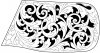
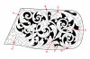
This design is for a Herbertz knife I have fore some years and was lost in the garden. My father who is 81 and lives with us, found it and cleaned it.
And as he is the greatest fan of my work, I want to engrave this knife for him, so he has something he can use and cherish.

So I came out with this design for the bolster, there is a small area on the other side of the knife where I can engrave his name, so it is not needed on the bolster.
It is a quite complicated design, as I'm still learning about design. This one has some overlays.

Sure there will be some areas that could be designed better in the future, but this is the best I could do so far on this knife.
I did not want to have a strait border line, that is why I have chosen for this solution.

But I would like to know if I'm still on the rails whit design and if I made some big mistakes?

So I already appreciate your time looking at this design and giving me some feedback.

arnaud


kcrutche

Elite Cafe Member
Joined
Dec 27, 2007
Messages
296
knife Design

Arnaud

who am I to criticize your design, if you like it go for it.

However, I personally I would use fewer leaves.

I threw this together in about fifteen minutes using CorelDraw since I already the leaves drawn and saved from another project.

This complete design is just one scroll and three leaf drawings, duplicated, resized, pushed around until they fit.

I tried to use your scroll spine and added my leaves.

One of these days I will learn how to do thumbnail photos

It took me longer to get the photos posted correctly than it did to make the design.

Ken

 
Last edited:

KCSteve

~ Elite 1000 Member ~
Joined
Jun 19, 2007
Messages
2,882
Location
Kansas City, MO
Only one thing caught my eye as it moved along the design.

Starting at the upper left corner you have your starting point, dropping down you have a tendril coming from behind a leaf and making what looks like an unconnected loop. If you look closer you can see it's coming off of the leaf below it, but as currently drawn it looks... off. You could delete that tendril and just adjust the leaves a bit and be good to go, in my very humble and inexperienced opinion.

Ken

I like your design too - more along the 'spagehtti scroll' style. Thinning things down allows (requires, really) that crossing tendril I don't like in the original to not only be there, but to be more pronounced.
 

John B.

Lifetime Pledge Member
::::Pledge Member::::
Joined
Nov 9, 2006
Messages
3,955
Location
Los Angeles area, California.
Hi Ken,
Take a look at the first leaf after the upper left starting point.
It is facing the wrong way.
Also, the huge leaf at the bottom of the design needs some help and breaking up.
It is way oversize and unbalanced with the other elements and leaves IMO.
You said you did this in a hurry and that points out the value of setting designs aside for awhile to look at them with fresh eyes when you're no longer so invested in them.
Sorry to be such a grouch. I enjoyed your past tutorial on computer leaves.
Best.
 

monk

Moderator
Staff member
::::Pledge Member::::
Joined
Feb 11, 2007
Messages
10,868
Location
washington, pa
i think you may need more of a border on the bolster of that particular knife, or you may get into some trouble with that particular design. the bolster edges appear rather well rounded on the knife.
 

kcrutche

Elite Cafe Member
Joined
Dec 27, 2007
Messages
296
Arnauds Design

Arnaud

It certainly was not my intention to hijack your thread.

Like Steve I did not make the connection with the one tendril, however I finely saw where it was coming from.

If you would back the leaf back just a little so you could see more of the tendril it would be obvious from where it originated.

Steve

I think Johns description was more on the mark.

John

I just had a few minutes while the air conditioner cooled down my shop before continuing with my own project.

I just started playing with the design to see if I could make a pleasing backbone that would still fit the area of the knife (then I add a leaf and got carried away).

As soon as I posted the design I saw the big leaf was out of place and said to myself I would correct it latter on tonight.

However I think I will leave well enough alone and back out of Arnaud's Thread.

Ken
 

Arnaud Van Tilburgh

~ Elite 1000 Member ~
Joined
Oct 3, 2008
Messages
4,221
Location
Belgium
Only one thing caught my eye as it moved along the design.

Starting at the upper left corner you have your starting point, dropping down you have a tendril coming from behind a leaf and making what looks like an unconnected loop. If you look closer you can see it's coming off of the leaf below it, but as currently drawn it looks... off. You could delete that tendril and just adjust the leaves a bit and be good to go, in my very humble and inexperienced opinion.

I see what you mean Steve, In my opinion that is easy to fix when I refine the design using Illustrator.

Thanks for the support.

@ Ken, I know about computer design, but I like tot draw first with pen and pencil, especialy when I'm out doors in nature. I than also don't need computer around.
I think your design is not really good balanced, especialy the leaf mass.

I will post my refined vector design soon.

arnaud
 

Arnaud Van Tilburgh

~ Elite 1000 Member ~
Joined
Oct 3, 2008
Messages
4,221
Location
Belgium
i think you may need more of a border on the bolster of that particular knife, or you may get into some trouble with that particular design. the bolster edges appear rather well rounded on the knife.

Monk, I know what you mean, but I want to do this without a border, but I will look first using a vector design if it will look fine, otherwise I still can add a border.

arnaud
 

FANCYGUN

~ Elite 1000 Member ~
Joined
Nov 10, 2006
Messages
1,840
Location
West Grove, PA
Personally guys I would not have started the design in the upper left corner but the lower right corner. If you look at the angles of the bolsters in both of these corners you will notice the lower left has a sharper angle to it which makes it tougher to fill and design for. I would have flipped the design and gone with the natural slanting flow from the lower left. Just my two cents worth.
 

FANCYGUN

~ Elite 1000 Member ~
Joined
Nov 10, 2006
Messages
1,840
Location
West Grove, PA
still drinking coffee and waking up here Start the design from the lower left not the lower right as i previously crusty eyed stated above...now back to the strong coffee
 

Arnaud Van Tilburgh

~ Elite 1000 Member ~
Joined
Oct 3, 2008
Messages
4,221
Location
Belgium
Fancygun, I think perhaps you have a point starting at the lower left.
If I'm right, there is not only one best way to make a design, so I will finish my design and see how far I come. I know thre could be some problems with background and shading, but I think I can solve that. I will see.

Monk, yes I know about the border, but I have to find out if it is a must. I think there is another properly way to have a border without drawing it
It is just my way now to explore possibilities, it could be wrong with this one, but it is another adventure to see if I can work it out this way.
And if I'm right, tone, positive and negative space (blacks and whites) can always be in balance.
So now I'm working on the shading, here is a refined version and I fixed some Steve pointed on, indeed there where some tendrils that where to thin.

arnaud
 

Attachments

  • ontwerp01.jpg
    ontwerp01.jpg
    132.2 KB · Views: 125
Last edited:

Marcus Hunt

~ Elite 1000 Member ~
Joined
Nov 9, 2006
Messages
1,799
Location
The Oxfordshire Cotswolds, England
Arnaud, not a bad attempt and I can definitely see your progress however there are a few bits of this design which need to be worked on. I've put some letters and arrows on your design to hopefully give you some pointers as to the weaknesses.

Starting at A the main scroll is the larger one of the two. There should be a clear spine running all the way from the starter tail through the larger scroll and the smaller scroll should grow from this spine. You are dividing the two scrolls which isn't right and will end up looking out of balance. This is easily corrected though; just remove the part of the smaller scroll's spine at A.

Moving to B This leaf is a little small and doesn't quite balance the fluted flower at this point.

At C, again don't split the leaf from the spine! You make the scroll very weak at this point.

The leaf at D is starting to advance too far forwards giving an awkward, elongated shape which isn't aesthetically pleasing.

The filler leaf at E is again split from the scroll. It would look better if it actually grows from the scroll. When cutting this type of scroll make objects like this look as if they are a part of the scroll growing in an alternating direction. Don't, if you can help it, make them separate units.

That being said, the two elements at E & F clash! When two leaves come at each other from opposing directions it never looks quite right. Much better is to fill this space with a small scroll growing from the main, much larger, one.

Point G looks far too weak to support a scroll growing there. If you remove the fluting at this area it will look much stronger.

The cluster of leaves at H just doesn't look right. Design is one of the hardest elements of engraving and it's often odd spaces like this that can either make or break a good design. What you have here has nothing in common with the rest of your design and if you cut it will unbalance the scrollwork. A small scroll with perhaps just one tendril and/leaf would be much better.

A couple of additional points. Be careful of the shapes of your scrolls, the largest scroll is full of flats and dog legs which aren't very nice.

And finally, be very aware of the space you're filling. You drawing is quite large and the actual bolster, much smaller. This means a drawing might be able to support a myriad of interweaving scrolls but when you actually cut it it can become a confused meleé of shading and much smaller scrolls than originally imagined. Depending on the actual size of the bolster make sure it can readily support all these interweaving scrolls and still be pleasing to the naked eye which is, after all, probably the way it will most often be viewed.

Well done though. Overall my critique is looking at quite small things. The overall design (with a little working on) is very pleasant.
 

Attachments

  • Arnaud-ontwerp01.jpg
    Arnaud-ontwerp01.jpg
    122.7 KB · Views: 104
Last edited:

Arnaud Van Tilburgh

~ Elite 1000 Member ~
Joined
Oct 3, 2008
Messages
4,221
Location
Belgium
Marcus, thank you very much taking the time pointing very clearly on the weaknesses in my design.
The A, Cand E I already found as I was trying to do the shading on paper. Indeed "don't split the leaf from the spine!"
About the size of the bolster to hold a more complicated design with overlapping, Sure you are right. But if well cut and shaded, couldn't it work than?

I also found another mistake in my design at the bottom left the two leaf parts has to be separated with background.

I have to study your other advises, but I think they are not hard to correct.
About the leafs a H, I will try something else, but as I already shaded it properly, I will show it when the whole design is shaded.

And I must say I'm surprised you did not mention the border, in my opinion I have respected a border without drawing it, and as all is new for me, I wanted to try this without a border.
Thanks again, I have learned a lot from your comments. :thumbs up:

arnaud
 

Arnaud Van Tilburgh

~ Elite 1000 Member ~
Joined
Oct 3, 2008
Messages
4,221
Location
Belgium
Marcus, doing the shading like this without engraving, some of us don't like it.
But, it made me redraw the mainlines as while trying to shade with my shading simulator, I find out that some lines weren't parallel enough with the flow.
So that is why, even it takes some time, I learn a lot using my refining and shading simulator.

You simply cant reduce the size of the picture to real size, because no computer can do it properly, as there are pixels that need to be eliminated on the screen.

My design is not real size, and no one can reduce it properly to real size.

So what you see is a bit like when you are looking true the microscope, sure it is a design, not an engraving.

I also know that for the size of the bolster, perhaps it is to much detail, for sure it would be overdone when adding more complexity or lines.
So less is perhaps more.
But I think, and that is why I have made a lot of study on the shading, when it is precisely cut and shaded, this design could have less confusion when seen with the naked eye.

Part H I will draw it different from this like you explained. It does not fit with the rest of the design. But as it was already shaded, I wanted to show how far I could bring it. And in my opinion it is not the best way to fill this area, but it could.

This design I think is a step forward in my design skills and even after one week I still like the design. So I think it is worth being engraved, after fixing the H part

arnaud


Arnaud Van Tilburgh

~ Elite 1000 Member ~
Joined
Oct 3, 2008
Messages
4,221
Location
Belgium
Here is the other version on the H part.
I will try to make an complete other design also for this knife, because although I'm sure I can engrave this design properly on the bolster, perhaps the design is to complicated to see with the naked eye.

arnaud


KCSteve

~ Elite 1000 Member ~
Joined
Jun 19, 2007
Messages
2,882
Location
Kansas City, MO
Arnaud

Rolande Baptise has a neat trick he does to see how a design really works.

Print out a copy of it life size and stick it down on the piece.

So simple you'd never think of it, yet impressively effective.
 

Marcus Hunt

~ Elite 1000 Member ~
Joined
Nov 9, 2006
Messages
1,799
Location
The Oxfordshire Cotswolds, England
Hi Arnaud, that looks fabulous now at the size you have it on this page (and slightly larger). However, something went wrong with my router last night and I ended up checking out the Café on my Blackberry. You're design came out, as near as possible, life size and the complexity of the design was, unfortunately, a bit lost which was a real shame. I think Steve's suggestion is excellent and well worth a try as you'll get a good feel for what it will be like at actual size.

Overall though, your design is excellent and you have a real feel for taking a critique and working with it to produce super results. Well done!
 

kcrutche

Elite Cafe Member
Joined
Dec 27, 2007
Messages
296
Knife Design

Arnaud

I really like this last design, especially after changing part H, a great improvement.

Ken
 

Arnaud Van Tilburgh

~ Elite 1000 Member ~
Joined
Oct 3, 2008
Messages
4,221
Location
Belgium
Steve, I know about this trick, I transfer the design with bakery parchment to see how it will look once engraved. But thanks for your support anyway.

I know the design is quite small for the details it shows, I tried to make another design but this one just looks the best.
So I don't disagree that my design once engraved real size (15mm X 28mm) is perhaps the limit.
But I had to find out how it would look. I have given extra attention not cutting the lines to wide, Also about the shading I could not engrave to many lines as otherwise the design would look black.
Anyway, I finished one side as I had to find out what size is the limit. Probably all you master have done that before me.

Here is the first side I finished, and I like it. One is still able to see the complexity of the design with the naked eye.

Hope you like it too, arnaud


Latest posts

Sponsors

Top