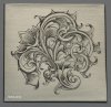
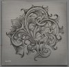
Here are my first drawing results after the lessons from Sam. I the first one I was just trying to get as much layers in a drawing as I could. The second drawing I’ve made to engrave. I would appreciate your comments to the sketches.
Your top drawing is way too crowded and everything just disappears in a mass of jungle leaves. It needs some pruning with heavy shears.
The bottom drawing is much better and is a lot easier on the eye.........one tip I would suggest is colouring your backgrounds in with pencil. This will show a up a lot of areas that are not so good. It takes a bit of extra time but is worth the effort.
I think that the two are both very well done. The first will provide an overall texture to a work. Little background removal but boy is that a lot to shade. Well not really I guess. look at all the lines on bulino work. The second seems to be a focal point type work. Possibly a concho or pendent. Could remove backgrounf inside and leave outside for contrast with a border perhaps.
I think both are very workable styles and both could be pursue to good effect. Fred
The only suggestions I can make is perhaps break that large leaf at the upper left on the first drawing into two leaves. I really like the upper drawing design; perhaps just a shade less on the shading.
Je gaat als een speer Hora, mooi werk !!!
Nice work, I can´t give you any advice on this, perhaps the only thing to mention is you obvious forgot to shade one leaf a bit left from the middle.
I'd say it's a fine design and you did a great job of shading. But you missed a leaf with your shade lines! You're really heading the right direction. We want to see more.
I am just home from a visit to see how my injured eye is holding up, and my pupils are a bit dilated, so my critique may be invalid, however, I would like to see a bolder outline of the outer boundary lines of your elements, as it stands the shading is approximately the same weight as your main element outlines. My recommendation would be to go over the outlines and, as Sam does, have a bit more of the beauty cut effect where you lean inwards and give the outer cuts some interest in their changing widths. This will immediately give a sense of depth?
Thanks very much for your comments. Much appriciated. Exept for te darkening of the background I incorporated most of the hints into the revised work. As I am now drawing ne scrolls again I have all ye comments from this thread in mind, . . . I hope. :beatup:
The area at the bottom is very messy and disjointed. Your origin is the small scroll/leaf structure at the bottom. Then you have the scrolls growing out at an angle with the band around them. It dosn't work.
The bottom scroll/leaf structure should act as a kind of vase for holding the rest of the scrolls etc. In other words they grow out of the bottom scroll/leaves.
I've attached a couple of rough ideas for you to hopefully explain it better.