
K Frei
Elite Cafe Member
Here is some of the "initial"/"Monogram" work I've been working on. thank you all for your posts earlier in the week, I will be getting some of the book suggested soon, and the tips were very helpful. I thought you might want to see what they (the tips) produced. The (L) is still a work in progress as my cust. wants me to integrate scroll into it. let me know what you think. i hope you can read them this time. thank you all K Frei
Attachments
-
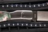 IMG_3202.JPG115.3 KB · Views: 130
 -
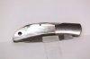 IMG_3194.JPG68.6 KB · Views: 123


