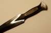
Well, like title says... What is the first thing you see watching this engraving?
A little hint - it's off center... and not a little, but quite a lot.
So here comes my logical question. Is there some way I could remedy this awful mistake? The fact that I already stippled the background makes fixing way harder, I guess. How could I make it look decent and later say that it was supposed to be that way, actually?
Oh man, is this a learning experience or what?")
Viljo
A little hint - it's off center... and not a little, but quite a lot.
So here comes my logical question. Is there some way I could remedy this awful mistake? The fact that I already stippled the background makes fixing way harder, I guess. How could I make it look decent and later say that it was supposed to be that way, actually?
Oh man, is this a learning experience or what?
Viljo
Attachments
-
 _MG_8977.JPG89.6 KB · Views: 310