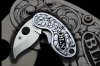
Just finished this little spyderco, Kind of an english/western brightcut hybrid. I still struggle with removal of background on small letters. thanks in advance for pointers.
I think that your work is very appealing, very clean and tasteful.
I am not sure that there is a point of giving your style a label, it might be somewhat American but I do not think there is anything English in it. One thing, the two scrolls are not just touching, if you do not really have the space to put two scrolls but need/want to put two of them I think it is better is they interlace, it is more elegant, I also question the fact that there are two "mother scrolls" and that both of them are turning in the same direction.
I kinda like the use of the space. Sure the "rules" are being broken but it seems to work here. As for this style of scroll, I tend to use it a lot lately but you do more with it and with more flair than I ever have Griff. Nice looking little knife. Well done.
My only critique would be the interruption of the flow on this one, it's kinda like two bulls butting heads and the three leaves at the bottom of the monogram don't really match in scale or contrast with the rest. I'd like to see more negative space on these three as well as matching definition to match the opposing leaves.
The last knife you recently posted was very well balanced, flowed well and was just a kickass little critter !
Wes, I really like what you have done here! It's kind of like there's 3 different things going on, and maybe a couple rules were stepped on, but so what? You made it work well. I think it's a refreshing look. Well done!