Engraved Zippo practice

oniemarc

Elite Cafe Member
Joined
Mar 29, 2021
Messages
367
Location
The Netherlands
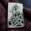
Finished the first side of a brass Zippo I bought to fiddle around with. First mistake I made was buying a regular one instead of an armour cased Zippo. Somewhat missed up the bottom, as there is a significant flat spot there. Slowly starting to get to grips with shading, allthough there are some bits and pieces I feel I messed up.

Marc 20211116_175513.jpg
 

AllenClapp

Elite Cafe Member
Joined
Aug 7, 2019
Messages
399
Location
Raleigh, NC
Not a big deal, but, if you do it again, think about making the bud larger and reshaping the first inside leaf to fill up a little more of that adjacent left lower background area. To my eye, the bud looks too small relative to the first inside leaf, which consequently looks too large. Enlarging the bud would take care of the bottom flat spot.

You might think about adding a small outside leaf coming off of the top of an enlarged bud and extending the outside downward leaf off the main scroll that is directly above it enough to close up the left border and create an enclosed relief area. Either that or forego relieving and stippling that area. The left edge of that lower left background area looks sort of contrived (particularly because the left border line extends past the leaf above), until I see the same treatment on the right.

My first thought was that it might be better to leave off the lower left and right stippled areas, like you did at the top. Looking at it again, the right side seems to work, but the left side seems a little off because of the left outside cut line extending above the leaf and looking like it got lost. If that left border line had stopped at the leaf like the one on the right, it would not be as big a visual issue for me as it currently is; the extra dark area at the bottom gives the design a feel of having a base, instead of floating.

The overall design is pleasing to me. The look and feel of the foldover leaves is welcoming to the eye. For the most part, the shading really enhances the 3-D look of the design. If this is your first try at this, or one of your first, you should enjoy having produced a design that is reasonably balanced and executed without any major flaws.

Consider setting up a WORD document to hold photos of this and subsequent ones. After a few, look at the progression and get ready to feel really happy for your progress. I look forward to seeing your next iterations.
 

AllenClapp

Elite Cafe Member
Joined
Aug 7, 2019
Messages
399
Location
Raleigh, NC
You mentioned that you wished you had gotten the armored Zippo with the thicker metal. What was your issue with this one? Did the metal flex too much to get clean cuts? Did you take out the guts and insert a wooden or other type of filler to dampen vibration?
 

oniemarc

Elite Cafe Member
Joined
Mar 29, 2021
Messages
367
Location
The Netherlands
Not a big deal, but, if you do it again, think about making the bud larger and reshaping the first inside leaf to fill up a little more of that adjacent left lower background area. To my eye, the bud looks too small relative to the first inside leaf, which consequently looks too large. Enlarging the bud would take care of the bottom flat spot.

You might think about adding a small outside leaf coming off of the top of an enlarged bud and extending the outside downward leaf off the main scroll that is directly above it enough to close up the left border and create an enclosed relief area. Either that or forego relieving and stippling that area. The left edge of that lower left background area looks sort of contrived (particularly because the left border line extends past the leaf above), until I see the same treatment on the right.

My first thought was that it might be better to leave off the lower left and right stippled areas, like you did at the top. Looking at it again, the right side seems to work, but the left side seems a little off because of the left outside cut line extending above the leaf and looking like it got lost. If that left border line had stopped at the leaf like the one on the right, it would not be as big a visual issue for me as it currently is; the extra dark area at the bottom gives the design a feel of having a base, instead of floating.

The overall design is pleasing to me. The look and feel of the foldover leaves is welcoming to the eye. For the most part, the shading really enhances the 3-D look of the design. If this is your first try at this, or one of your first, you should enjoy having produced a design that is reasonably balanced and executed without any major flaws.

Consider setting up a WORD document to hold photos of this and subsequent ones. After a few, look at the progression and get ready to feel really happy for your progress. I look forward to seeing your next iterations.
Thanks for the time you took to have a good look at this one. It is much appreciated for sure.
I totally agree with you on the bud being to small and that the lower left corner is somewhat empty because of how the first leaf tries to fill up that area. I should have seen that when designing, but sadly missed it. Will be watching out for mistakes like that from now on.

The borderline wich extends on the left is also present on the right, allthough much smaller. I got scared of cutting that split in the zippo, as it was one of the first cuts I did, so I started it slightly shy of that split. Lets call it an experiment. Not sure if I fully like that choice or not.

This was cutting scrolls part 14....hahaha. If this would have been a first attempt at cutting something like this, I would have been jumping up and down of joy. I am only able to cut half an hour here...half an hour there. Sometimes days or even weeks without a single cut. I have been trying to keep my sundays as free as possible to be able to engrave for at least a couple of hours.

I keep my practice on the workbench, with dates on them, so I can keep track of what I am doing. And which mistakes to avoid. I will be making quite a few more though I'm sure.
 

oniemarc

Elite Cafe Member
Joined
Mar 29, 2021
Messages
367
Location
The Netherlands
You mentioned that you wished you had gotten the armored Zippo with the thicker metal. What was your issue with this one? Did the metal flex too much to get clean cuts? Did you take out the guts and insert a wooden or other type of filler to dampen vibration?
The material is super thin indeed. Till now I have been making my practice plates in 3mm thick brass or steel plates.
I held the zippo in thermoloc in my vice. When I was finished I found out I forgot to take out the original insert and replace it with my wooden one. The top is empty so had a bit of flex and vibration, but wasn't too bad.

My biggest fear was going straight through the wall with my graver. That is not a nice feeling when cutting. It worked out though and learned I am not cutting as deep as I thought I was.
 

Latest posts

Sponsors

FEGA
Top