Critique Request Spyderco knife design help

Doctorslava

Member
Joined
Nov 5, 2018
Messages
72
Location
Atlanta, GA
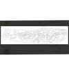
I am stuck with this small Spyderco knife design for quite a while. I feel I am trying to reach something that way over my abilities. This is a design I I went to so far. While the right side looks better to my eyes, the left side I am not happy with.
Please tell me how I can improve it. Thanks. Slava Spyderco1.jpg
 

John B.

Lifetime Pledge Member
::::Pledge Member::::
Joined
Nov 9, 2006
Messages
3,950
Location
Los Angeles area, California.
Good that you are taking a second look at an interesting drawing.
As I see it, and for what it is worth, the right side is full and fills the available space.
The left side is much lighter and doesn't balance with the rest of the design.
The right side fills the available space with a reasonable balance of border and negative space.
The left side has very large negative space and borders. Too much background.
I suggest that you black in the borders and negative space.
Then the problem and imbalance will jump out at you.
Redesign the left end to balance.
 

oniemarc

Elite Cafe Member
Joined
Mar 29, 2021
Messages
356
Location
The Netherlands
For what it's worth coming from a newbie, I might have something to have a look at also. The biggest scroll in the middle part of the knife seems to have a problem. Or at least it looks a bit off. I think I know what's happening , but it feels off.
If you trace that larger scroll back, it seems to end in...nothing. I think it rolls further behing the leafstructure, but it doesn't look like that. Mainly because there is a leaf coming from the backbone that doesn't end anywhere, making it look like that would be the backbone. As is, it looks like the backbone "jumps" to the left for that scroll.

Did that make any sense at all? If not, I'll be more than happy to add a picture to explain it more clearly.

Marc
 

ByrnBucks

:::Pledge Member:::
::::Pledge Member::::
Joined
Dec 25, 2020
Messages
184
Location
Chattanooga, TN
Hello Slavs, I’m a beginner and have zero design ability so please forgive my critique and scribbling on your design. The red seems to disappear into nothing. The blue and green appear from nowhere. The yellow splits behind that other leaf but both seem to not quite line up. And the purple doesn’t quite seem to attach. Overall I totally dig the feel of your design that’s just what just jumps out to me. I hope you have a wonderful day. BB 15A248DC-82D3-4152-B0E7-4595C65329D5.jpeg
 

Doctorslava

Member
Joined
Nov 5, 2018
Messages
72
Location
Atlanta, GA
For what it's worth coming from a newbie, I might have something to have a look at also. The biggest scroll in the middle part of the knife seems to have a problem. Or at least it looks a bit off. I think I know what's happening , but it feels off.
If you trace that larger scroll back, it seems to end in...nothing. I think it rolls further behing the leafstructure, but it doesn't look like that. Mainly because there is a leaf coming from the backbone that doesn't end anywhere, making it look like that would be the backbone. As is, it looks like the backbone "jumps" to the left for that scroll.

Did that make any sense at all? If not, I'll be more than happy to add a picture to explain it more clearly.

Marc
Marc, I would like to see a picture if you can. Thanks for your time an explanations. I tried to make all backbones connected and flow from a source.
 

Doctorslava

Member
Joined
Nov 5, 2018
Messages
72
Location
Atlanta, GA
If you are working in procreate, create a layer just for the back bone and focus on that by flipping it both ways to check for errors. Don’t worry I spent 60 hours (recorded time) because of my indecisiveness on a previous drawing.
Matthew, thank you. I am using a Corel Draw and it is my first attempt after probably 20 yeas of brake. But I will use your advice.
 

Doctorslava

Member
Joined
Nov 5, 2018
Messages
72
Location
Atlanta, GA
Good that you are taking a second look at an interesting drawing.
As I see it, and for what it is worth, the right side is full and fills the available space.
The left side is much lighter and doesn't balance with the rest of the design.
The right side fills the available space with a reasonable balance of border and negative space.
The left side has very large negative space and borders. Too much background.
I suggest that you black in the borders and negative space.
Then the problem and imbalance will jump out at you.
Redesign the left end to balance.
John, Thanks for the message. I will fill a negative space black and check it. I had a day without looking on the design and after your comments I look on it and I notice many places to improve that I have not seen before. It is useful to take a brake sometimes.
 

Doctorslava

Member
Joined
Nov 5, 2018
Messages
72
Location
Atlanta, GA
Hello Slavs, I’m a beginner and have zero design ability so please forgive my critique and scribbling on your design. The red seems to disappear into nothing. The blue and green appear from nowhere. The yellow splits behind that other leaf but both seem to not quite line up. And the purple doesn’t quite seem to attach. Overall I totally dig the feel of your design that’s just what just jumps out to me. I hope you have a wonderful day. BB View attachment 49069
Hi, BB. I will change this. Thank you for the observation.
 

oniemarc

Elite Cafe Member
Joined
Mar 29, 2021
Messages
356
Location
The Netherlands
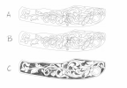
There you go.
This is just to illustrate what I was talking about.
A would be how I think you designed it and you feel the design flows. I could be very wrong though.

B would be what I was on about. The 2 arrows show how perception is messing with me. The 2 structures of the arrows flow in the same direction and using the same path. To me, they look like they should connect, simply because the end of the scroll, when traced back, looks to be ending.

C would a possible solution to the problem at hand. Not saying it is the solution or even close to a finished rendering, but it's a direction...
Blacked out the background so it shows a little better.

Hope it helps,

Marc


Untitled 106.png
 

Doctorslava

Member
Joined
Nov 5, 2018
Messages
72
Location
Atlanta, GA
Marc,

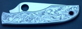
Thank you for your time and remarks. I try now to improve the design and take into account all your suggestions. Right now I am working on populating the left side of the knife and filling the negative space. It really helps! Here where I am now. Slava Spyderco1.jpg
 

AllenClapp

Elite Cafe Member
Joined
Aug 7, 2019
Messages
377
Location
Raleigh, NC
If you bend the last tendril on the left around to make a full turn or cross back over the stem, and then increase the size of the last upper leaf on the left so that it fills the extra space and touches the last tendril as it comes around, you will create a couple more background areas to balance out the scene.
 

John B.

Lifetime Pledge Member
::::Pledge Member::::
Joined
Nov 9, 2006
Messages
3,950
Location
Los Angeles area, California.
Allen, good job. that will help bring the border and negative space into better balance.
And break up some large, out of balance black areas.
Will help the overall design and there are some good features and elements in it.
 

Doctorslava

Member
Joined
Nov 5, 2018
Messages
72
Location
Atlanta, GA
Thank you everybody for yours expertise. This design is by far the most complex I worked on. It requires much more energy than an engraving itself. And all of that for a knife I bought at a gun show for $19. But learning how to make it properly is priceless!
This is what I have done at the end. Your suggestions were so valuable. Thanks Again. Slava Spyderco1.jpg
 

John B.

Lifetime Pledge Member
::::Pledge Member::::
Joined
Nov 9, 2006
Messages
3,950
Location
Los Angeles area, California.
Very much better. But the final scroll still has a too large negative space.
Try breaking the one leaf element into two elements.
One can partially overlap the underlaying tendril.
 
Last edited:

KGB 3

Member
Joined
Mar 20, 2017
Messages
7
Thank you everybody for yours expertise. This design is by far the most complex I worked on. It requires much more energy than an engraving itself. And all of that for a knife I bought at a gun show for $19. But learning how to make it properly is priceless!
This is what I have done at the end. Your suggestions were so valuable. Thanks Again. Slava View attachment 49077
 
Top