You are using an out of date browser. It may not display this or other websites correctly.
You should upgrade or use an alternative browser.
You should upgrade or use an alternative browser.
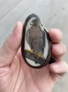
Peregrine falcon scrimshaw
- Thread starter Mike576
- Start date
the bird looks great. i would have used a smaller limb and concentrated more on the talons. jmho
Thanks for the feedback! I agree. Im not super happy with how the branch turned out. Definitely overshadowed the talons.the bird looks great. i would have used a smaller limb and concentrated more on the talons. jmho
Flatsguide
Elite Cafe Member
The eye of your nicely scrimed falcon looks too large. For some reason to me it looks like it is separate from the head.
Richard
Richard
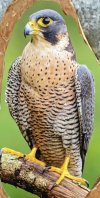
It may be a bit large, this was my reference photo. Still fairly new to scrimshaw. Lots of practice to go. I find getting proportions right to be the most challenging part.The eye of your nicely scrimed falcon looks too large. For some reason to me it looks like it is separate from the head.
Richard
Attachments
Monica
Member
Very beautiful details and coloring.
Thank you!Very beautiful details and coloring.


