You are using an out of date browser. It may not display this or other websites correctly.
You should upgrade or use an alternative browser.
You should upgrade or use an alternative browser.
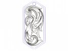
Critique Request A fresh idea
- Thread starter JBtheApprentice
- Start date
Daannyycc
Member
It doesn't appear to be overly shaded.
IF you can keep the lines properly aligned - it will come out really nice.
When you are concerned about how things will look, I suggest getting some metal to practice on and make it to confirm what you think. It also gives you the practice in getting that piece done (or a piece of a larger scroll).
If you like the idea of a "practice metal" I suggest going to a metal supply yard and see if they have any large "scrapes" you can buy then cut up to practice on (not thin stuff).
AllenClapp
Elite Cafe Member
You may want to consider a leaf foldover to reduce the long shading lines on the prominent vertical section on the left of the design. Likewise, a foldover or two on the similar section to the right side of the middle of the design.
KyleMontoya
Member
I’m pretty new to engraving but I think it looks good. Like Danny said, put it on some practice metal. Once you get in on metal you might notice something to change.
JBtheApprentice
Member
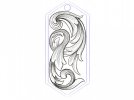
I’ve messed around with the design a bit more based on your feedback. I think it’s a pretty good improvement compared to the previous version. I still have to see if it works will work when scaled down to size. I’ll make some cuts in some scrap before I make the call. Thanks again for the tips! I’ll keep y’all posted


AllenClapp
Elite Cafe Member
This design gives much better contrast and balance. This is a great design to use for exploring how best to create depth with contrast in shading. If you are like me, you may find that trying different shading on some areas before spending the time to cut the whole piece may both reduce total time and make a better piece.
When you cut your trial plate, you might want to first transfer just the very top and very bottom to a plate and try different amounts of shading to increase contrast there. The middle areas already have pretty good contrast and depth.
On the bottom area, the last curl upward looks a bit uniform in shading. If you keep the dark shading on the under side of that curl, try interrupting the shading on the outside of it so that you keep some darkness for the shadow from the last leaf and some definition of the tip of the last curl, but better differentiate the back side of the last curl. Also, take a look where the bottom outside leaf and the main stem converge: they are both shaded at the same darkness. You may wish to try making your shade lines gradually widen more on the main stem so that they touch and make the area very dark as it goes behind the next leaf down. This would help it to be better differentiated from the outside leaf if the outside leaf shade lines are spaced further apart. You could also omit the top shading line (next to the stem) on the bottom outside leaf to create thickness of the edge of the leaf and separate the leaf and stem with that white space.
In the upper area, where you have an outside leaf above a two-lobe leaf that covers the backbone. You might try omitting the third shade line on the upper lobe to better define the leaf fold and create contrast--or break the shading lines on that section or the outside leaf to create more contrast there.
Playing a little to see what you like best before you cut the whole design may make the first cut of the whole design really shine..


