Help, please: add scroll to the practice plate?

Mario Sarto

Elite Cafe Member
Joined
Jul 30, 2008
Messages
611
Location
Bad Salzuflen
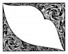
After my try doing the sculpting i thought i could add some scroll around it for practice.
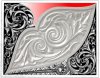
I did a pencil sketch for it, but i am not sure any longer if it really fits together...
...further more the red marked area is a problem for me. I don't know to fill because it is very small. I found nothing that would make a sense - the grotesque on the bottom is only a makeshift.

What do you think - better left it blank or should i give it another try?
Mario
 

Attachments

  • practice-5_5.jpg
    practice-5_5.jpg
    93.7 KB · Views: 253

Ron Smith

~ Elite 1000 Member ~
Joined
Apr 6, 2007
Messages
1,455
Hey mario,

I like the design you have for the thin area, but make sure the background area is not too bold.

You said it was a practice plate. I like the extra engraving myself, but you could cut this design out and make a pendant out of it. Then it would be a product. Somebody dear deserves to get this.

Ron S

What do you think?
 

Mario Sarto

Elite Cafe Member
Joined
Jul 30, 2008
Messages
611
Location
Bad Salzuflen
I like the extra engraving myself, but you could cut this design out and make a pendant out of it.

Good idea with the pendant - thank you!

But until now there is no cut done - it is still blank. The picture is only a photomontage from my pencil sketch and the plate.
Do you think, there is a expedient way to add scroll on the marked area and there, where the grotesque is?
 

Andrew Biggs

Moderator
Joined
Nov 10, 2006
Messages
5,034
Location
Christchurch, New Zealand
Hi Mario

Here's my thoughts.

I think the first thing that you can take from this project is to plan everything before you start. Trying to design in stages is almost impossible and can lead to the problem you now have. If you design everything from the start then the problem areas can be dealt with and solved on paper first.

However, this is just a practice plate and that's why we engrave them.......... to learn these things :)

If you place that criss cross pattern in the red area that will balance the whole design and give it a bit of a symmetrical look. The only thing I'm unsure about is the large triangular peice coming out of the grotesque.

I do have to say..............I like your scroll drawing and the grotesque. Very rich and European looking :)

Cheers
Andrew
 

Mario Sarto

Elite Cafe Member
Joined
Jul 30, 2008
Messages
611
Location
Bad Salzuflen
That is is! In my sanguine presumption i thought it could be done later - ha ha. Good point Andrew! I thought, nearly every area can be filled with leaves and scrolls. Now i know it better. It is not in line with the sculptured area. I leave it blank!
... Very rich and European looking :)
Can't be - always looked at American and wonderful Oceanic scrolls, never seen European ones.
Thank you, Andrew!
 

monk

Moderator
Staff member
::::Pledge Member::::
Joined
Feb 11, 2007
Messages
10,874
Location
washington, pa
mario: i would add the bottom theme to the top. otherwise the design is not balanced for my eye. and-- if i drew this, i would not have made the indent in the center , white part. i think the indent makes continuing the design outward, to be very difficult to do given the size of the other design elements.
 

Marcus Hunt

~ Elite 1000 Member ~
Joined
Nov 9, 2006
Messages
1,799
Location
The Oxfordshire Cotswolds, England
Mario, the first thing that hit my eye, also, was that triangular piece. Things like that do nothing to enhance a design as they have nothing in common with anything else; best left alone in my opinion. Also the final tapering scroll at he bottom left of the plate; be very careful of over extending this type of object as you can end up with a hook instead of a scroll. Better to shorten it and make a better scroll and make the leaf emerging from it just slightly longer. A nice overall design though, well done.
 

Arnaud Van Tilburgh

~ Elite 1000 Member ~
Joined
Oct 3, 2008
Messages
4,221
Location
Belgium
Looks good to me Mario, you made some nice changes.
I was wondering on what medium and witch pencil you use to draw.

arnaud
 

Ron Smith

~ Elite 1000 Member ~
Joined
Apr 6, 2007
Messages
1,455
That is beautiful Mario,

I see a square buckle with these overlaid in the corners and a nice monogram in the middle raised and overlaid in a contrasting metal and a blued background.

Good advertising and/or conversation piece for you (a buckle) and it would certainly make you a classy guy with this on your belt..........

Ron
 

doug

Member
Joined
Apr 11, 2009
Messages
88
Location
Hillsboro,Ohio
Mario Im just a beginner and dont know much about design so this may not be of any help,but when I looked at it my first thought was why dont you reapeat that criss cross in the red area.Maybe I should leave this to the pros but just thought I would give my two cents.
Doug Lovedahl
 

Mario Sarto

Elite Cafe Member
Joined
Jul 30, 2008
Messages
611
Location
Bad Salzuflen
I was wondering on what medium and witch pencil you use to draw.
The medium is a normal sheet of paper (the stuff you feed your printer with) and the pencil was made by "A. W. Faber Castell". There are grades from (i think) H6 (very hard) to H, then HB (medium) to B8 (very black and soft). The one i used was the "HB 9000", the medium.
The background i have blackened with a fine (0.5 mm) permanent marker, an "Edding 1800".
... and it would certainly make you a classy guy with this on your belt..........
Well those are bright prospects :) I have build a few in silver and gold (not engraved ones) but i never build one in steel - lets have a try on it. By the way, this mild steel stuff is great to engrave. I have to go out and find some new pieces at the scrap yard.
I am very glad you like my scratch and i am really happy about your priceless help which lie in front of me.

Doug, on this great place it is always a good idea to post your mind. It doesn't matter if you are a beginner like me or a master engraver. I believe we all learn a lot from each other.
The gizmo with the grotesque was an act of - lets call it frustration - a "placeholder". I did it, because i wasn't able to find a way, to fill the small areas with something that makes sense to the hole work. While i get the answers i think on it twice. Andrew hit it - it isn't a good idea to do a work in stages. Better plan all before. This and more i learned on this thread.

Thank you all, Mario.
 

Arnaud Van Tilburgh

~ Elite 1000 Member ~
Joined
Oct 3, 2008
Messages
4,221
Location
Belgium
I must say you draw very nicely Mario.
I use a bit harder pencil as otherwise my paper becomes smeary.
So for my refined design ready to transfer I prefer the vector draws.
I like the pencil very much and it is fast, but for a clean design with straight curved lines it also takes more time for me, That is why I prefer the digital pencil for that.

arnaud
 

Leonardo

Elite Cafe Member
Joined
Jan 9, 2008
Messages
640
Location
Cordoba - Argentina
Hi Mario,
I like your design very much, specialy the treatement of the leaves with so many variations that catch the interest in every detail. Beautiful done!
Best regards, Leonardo
 

Latest posts

Sponsors

Top