You are using an out of date browser. It may not display this or other websites correctly.
You should upgrade or use an alternative browser.
You should upgrade or use an alternative browser.
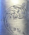
Critique Request Calla Lily inspired scroll design
- Thread starter Kyle
- Start date
looks very nice to me. btw: welcome to the forum
Thank you! I appreciate it.looks very nice to me. btw: welcome to the forum
Thanks Papart!nice stuff right here
Any constructive criticism is welcome.
Sorry Kyle, here is an unasked for critique;
Well designed but........
If you don't mind my saying it, your design would be MUCH improved if the shading was drawn lighter than most of the main outline cuts.
Well designed but........
If you don't mind my saying it, your design would be MUCH improved if the shading was drawn lighter than most of the main outline cuts.
Thanks for the tip! I will definitely implement that on my next sketch.Sorry Kyle, here is an unasked for critique;
Well designed but........
If you don't mind my saying it, your design would be MUCH improved if the shading was drawn lighter than most of the main outline cuts.
Thank you for being open to a suggestion, and giving it a try Kyle.!Thanks for the tip! I will definitely implement that on my next sketch.
Thanks Kyle. What do you think ??
I think you made a big improvement.
Keep working on the shading a little more.
I think you made a big improvement.
Keep working on the shading a little more.
The shading is definitely an area I need to improve in. I’m trying to focus more on than in my next design. I will post it when I finish it. Went ahead and cut this design on a practice plate. I’m pretty happy with some areas. Others still need improvement.Thanks Kyle. What do you think ??
I think you made a big improvement.
Keep working on the shading a little more.


