Critique Request design for a bolster knive

Arnaud Van Tilburgh

~ Elite 1000 Member ~
Joined
Oct 3, 2008
Messages
4,221
Location
Belgium
I didn't want to high jack Steve 233's tread about his design for a bolster knife.

But as I'm convinced that engraving starts with a good design, and in particular Andrew showed me the way, my patience has gone, waiting for Steve to draw his version.

So I would like to have some comments on my design for a knife I do not own. just like drawing scrolls and hungry for progress.

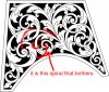
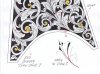
the first is my backbone design, the next a sketch how it could look engraved.

arnaud


Kevin P.

~ Elite 1000 Member ~
Joined
Feb 28, 2008
Messages
1,256
Location
Nambe, NM
A lot of detail; to my eye it looks terrific.
The detail is lighter which makes it distinctive.
Kevin P.
 

KCSteve

~ Elite 1000 Member ~
Joined
Jun 19, 2007
Messages
2,882
Location
Kansas City, MO
I had one area I was unsure of on the first picture but you must have felt the same because you cleaned up the origin on the second one.

I'm not advanced enough to see anything wrong with the design. Hopefully someone with a bolster of that shape will cut a copy.
 

Ron Smith

~ Elite 1000 Member ~
Joined
Apr 6, 2007
Messages
1,455
Arnaud,

This is a very good design, but as Andrew says............but, you have overlapped one scroll in the design. It is good to repeat a situation at least three times, as trianglation is a powerfool tool to increase the power of the design. I see one other opportunity to overlap a spiral, and this would improve the design a little. It would not fulfill the triangulation concept, but it would better balance the design. I will let you anylize and struggle with this one to see if you can come up with the answer or solution, and by solution, I mean that it is only an improvement, not a flaw necessarily. It is good to reach outside of what you already know in the mind and explore, for you will learn many things doing this. And it is one reason why I haven't told you or showed you myself. You are doing great and catching on fast.

Triangulation is used in art in composition all over the place when you begin to look for it. Jeff used it in his post of that one we just evaluated, except that it should have been a center piece instead of being off to one side if you see what I mean. It would then be an intentional focal point, rather than an accidental one. I describe this in my book and this is a good example of it. Look at the power of it compared to the rest of the surrounding elements. Go back and check it out, and see if you don't agree. You can enhanced it's importance by the way you shade it within the design, or you can deminish it's importance by keeping the shading uniform, which is what Jeff did, causing it to blend.

Would love to hear your comments on this concept, as it is an important one to understand and use.

Learning to work on different levels, overlapping and superimposed ideas on top of other ideas is a great way to get tremendous depth, but it is an advanced knowledge apart from basic engraving knowledge. It begins to get very complicated and difficult to lay out.

Anyway, nice drawing Arnaud. I just submitted this for your learning enjoyment, HaHa

Ron S
 

Arnaud Van Tilburgh

~ Elite 1000 Member ~
Joined
Oct 3, 2008
Messages
4,221
Location
Belgium
Ron, thank you for the rich explanation, analysing my design.
The reason I only had one overlapping in this design, is because I think it is important that when design of scrolls is new, you better not draw too complicated designs you don’t understand.
By analysing the space on this bolster knife, it looked a bit logical to me that I used this one overlapping although I didn’t study it in you book.

Otherwise I would have known about the trinity.
So I will study on that and then redraw this design adding at least one extra overlapping.
I’m quite sure I see where I can ad one quite easily, adding two would be more difficult.

Using the more advanced way of drawing scrolls and leaves come earlier than I had planed it, but it is inevitably.

Thanks again, I will show you my solution with this design soon.

arnaud
 

Kevin P.

~ Elite 1000 Member ~
Joined
Feb 28, 2008
Messages
1,256
Location
Nambe, NM
Arnaud, it looks good to us amateurs; but it's great that Ron's eye picks out those things that will improve the design.
As usual, I always learn from these critiques. I had to add more memory to my computer to store all this info.
Kevin P.
 

Arnaud Van Tilburgh

~ Elite 1000 Member ~
Joined
Oct 3, 2008
Messages
4,221
Location
Belgium
Ron, I have been searching in your book about the overlapping.
I found the chapter "Stem Stacking" on page 134.
It is probably that where you are pointing on.
You say: "as trianglation is a powerfool tool to increase the power of the design" I remember that one when evaluating photos and designs when my brother went to the academy.
I don't say it isn't in your book, but it is not very explicit, at least for me as I only understand 75% of what is written. (has to do with my poor vocabulary on Englisch)

But if someone has find the page in Ron"s book I overlook,please tell me what page?

But it is not that important, as I now know thanks to Ron pointing on triangulation, how to implement it in my designs as it is a general rule to use in art.

Back to the pencil :big grin:

arnaud
 

Arnaud Van Tilburgh

~ Elite 1000 Member ~
Joined
Oct 3, 2008
Messages
4,221
Location
Belgium
Another attempt

Well, to me this attempt looks quite advanced. To make it look better I will have to shade it with the pencil.
As I thought I could add one extra overlapping, I came out with some more.

In the meanwhile I have another book " The art of engraving" by James B. Meek. I received as a present from my daughter an son in law.

So sure I will now have all the answers to any question on drawing but sure I like your comments, especialy Ron's advice as he pointed on the possibility to have two overlappings .

arnaud


Andrew Biggs

Moderator
Joined
Nov 10, 2006
Messages
5,034
Location
Christchurch, New Zealand
Hi Arnaud

A very nice design indeed. You have come a long way with pencil and paper Arnaud. You should be very pleased with your progress and your brother would be proud of you :)

You have some very attractive things happening there. I like the design element on the bottom right hand corner where it's all growing/originating from.

To my eye it looks very attractive and starting to get quite sophisticated. And it's a lot of fun just drawing sometimes.

BUT :)

I'll let Ron carry on with this one as he has obviously got something in mind and too many people advising you just gets confusing. I'll be very keen to see what Ron has to say as well......after all, we're all fellow students together.

Cheers
Andrew
 

Arnaud Van Tilburgh

~ Elite 1000 Member ~
Joined
Oct 3, 2008
Messages
4,221
Location
Belgium
Thank you Andrew, indeed it amazes me as well that I already have come this far in such a short time.
I'm also curious about Ron's BUT.......:)

I refined the design a bit in Illustrator, so I can try some shading


arnaud


Ron Smith

~ Elite 1000 Member ~
Joined
Apr 6, 2007
Messages
1,455
I like it Arnaud,

And the origination point is very creative.

There are a couple clusters that create masses, but they will be camoflaged with good shading techinques. This design is going to come alive.

I am disturbed just slightly about the lower left corner of the design. I keep wanting an overlap here, but can't see a way to do it as it is right now. You would have to make some big structural changes to do it. You might could change some leaf placement and mass and make it work.

That one lone smaller spiral bothers me. Perhaps you could pass through that spiral to the left of it, or pass through "overlap" both of the spirals, but you would have to try it to see. It is a tricky situation. It is quite good as it is.

I'm anxious to see it shaded. This will make quite a difference in the visual too.

Go Arnaud!! Nice drawing!!

Ron S
 
Last edited:

Arnaud Van Tilburgh

~ Elite 1000 Member ~
Joined
Oct 3, 2008
Messages
4,221
Location
Belgium
Ron, thanks for your comment.

I know what the lower left corner is. There is that small spiral.
I understand an overlapping there would be nice but as you say, it is not obvious to draw one there. And if you don’t see a way without changing the whole design, sure I can’t.

You tell me; “That one lone smaller spiral bothers me. Perhaps you could pass through that spiral to the left of it, or pass through "overlap" both of the spiralsâ€

I suppose it is still about that same spiral bottom left, pass trough that spiral to the left of it or pass trough “overlap†both the spirals sounds like “Chinese†to me. It is my poor vocabulary of English of course.

So could you explain it a bit better?

I’m already shading this one with the pencil to see it come alive, I will post is soon.

I’m glad you too like the design. I also want to point that when I study design like this, you will see that the last changes on the right, look better than the part on the left although the left part was okay in my first attempt.

I mean I see my own improvements in just one design and if I would change the left side, probably after that I would have to change the right side as than the left side would look better.

arnaud
 

Ron Smith

~ Elite 1000 Member ~
Joined
Apr 6, 2007
Messages
1,455
I wouldn't change anything on the right side. That arrangement is very appealing. Only pay attention to the area that is causing the problem. There is probably a way, but you might have to re-construct the spirals on the left a bit.

I want to see the finished drawing with shading first. Maybe that will give us some idea what to do.

I meant that the lone spiral could overlap the two spirals to the left, but you might have to change some leaf placement and alter the spirals to make it work. Does that explain it better?

This might be something that you could do later. Copy this design and shade it as you have it, and you can alter it for a possibly better one later.

This is really developing into an excellent, exciting design.

Ron S
 

Arnaud Van Tilburgh

~ Elite 1000 Member ~
Joined
Oct 3, 2008
Messages
4,221
Location
Belgium
Thanks Ron, I think I understand it better. And I see a way out with changing some leaf at the bottom left, so I could draw an overlapping of leaf with the stem of the lone small spiral.

But I must give it some time to mature. So first now I will focus on the shading part of this one.
I made a vector design of this one so I can print it like my last attachment to study on the shading part. As I think that is my weakest skill at the moment.

to be continued, :big grin: arnaud
 

Ron Smith

~ Elite 1000 Member ~
Joined
Apr 6, 2007
Messages
1,455
Oh, I see, and I think you are talking about the little spiral (lower left) across from the little one on the other side (lower right). No, this isn't the one. The spiral between the two sides is the one I am talking about. It is in the lower center, but the arrangement of it because of no overlap here, and the larger spirals to the left is the area bothering me.

I like what you have in the narrow areas.

Ron S
 

Arnaud Van Tilburgh

~ Elite 1000 Member ~
Joined
Oct 3, 2008
Messages
4,221
Location
Belgium
Ron, okay I'm with you now. Indeed I thought about the small one at the bottom left.

The reason I draw it like that is because at that time I was placing round spirals the way they touch borders and each other. So was my first design on this one, but I made one overlapping that now has result in more overlapping on the right as I thought you pointed on the right side to have at least tree overlapping.

Sure I like my design this far but I agree the tree bigger spirals on the left, as they looked nice in my first draw, they now are a bit out of balance with the left side.

So I think I now understand you as you would like to see more overlapping with the tree spirals on the left.
And indeed I will than have to make some bigger structural changes.

I will do that as I'm sure by studying on that, it will take my design skills to a next level. :big grin:

But as it is just drawing practice and I probably never will engrave it on a knife, perhaps on a practice plate, I also like the design as it is now. So I will finish this one first with the shading.

After that I think I have to restart with the backbone design to solve the problem with the extra overlapping on the left.

Many thanks for your support

arnaud
 

Attachments

  • bolster01 RON correction.jpg
    bolster01 RON correction.jpg
    179.7 KB · Views: 75

Ron Smith

~ Elite 1000 Member ~
Joined
Apr 6, 2007
Messages
1,455
Correct! and you are approaching it just as I would have. You might have to move a few things around to get the spacing right, but you are on your way.

Rock on, Arnaud!!

Ron S
 

Arnaud Van Tilburgh

~ Elite 1000 Member ~
Joined
Oct 3, 2008
Messages
4,221
Location
Belgium
The shading part

Well, you might think I’m a lunatic, however this is how I’ve been practicing on my shading skills.

Of course once I know how to put the shading lines, I don’t need it anymore to draw them first.
I also could practice on the shading with a graver, but then I could not use a gum or “CTRL-Zâ€.

So after two days trying different shading lines, I now think I have understood something about shading.
I used my wacom pen and Illustrator to draw these really thin lines that could not been draw pith a pencil.
Sure I can use a pencil to put some toning on the design, but than I still wouldn’t know which
direction to put the shading lines.

Using the magnification tool in Illustrator made it quite easy to ad these shading lines, correct them, zooming out, to see the impact of equal spacing these lines.
I tried to taper the shading lines, the only thing that is different in this draw is that I can’t find a way to draw lines that go from thin to wider. As I think there is no such tool in Illustrator.

So I’m convinced that my time I spend this way to study some shading was worth doing this. Sure engraving them is another one. But as for design, if one can’t draw it you can’t engrave it, and I think that also counts for the shading part.


I have print it on glossy photo paper and it looks nice to me.
To show it on your computer screen is perhaps more difficult that is why I show tree formats.

I would like to know if I’m on the right way with this,

arnaud


Mario Sarto

Elite Cafe Member
Joined
Jul 30, 2008
Messages
611
Location
Bad Salzuflen
Hello Arnaud - wow what a lot of work and beautiful design. I like that. I found two points and if you don't mind i like to show in the picture.
 

Attachments

  • arnaud.jpg
    arnaud.jpg
    84.3 KB · Views: 67

Arnaud Van Tilburgh

~ Elite 1000 Member ~
Joined
Oct 3, 2008
Messages
4,221
Location
Belgium
Mario, thanks for you input, indeed about the flow.
Also for the size of the start and end point,
I think there is some space to make the start point a bit bigger, as for the end, I have to redraw some of the scrolls on the left as Ron pointed at a extra overlapping there.

But as I struggled with shading, for example I had to know where to start shading the end of a scroll or tendril, the inner side, the outer side, so this is why I tried it this way.
Also for leaving some blanks lines to have the veins in the leaves and stem, I had to find out.

And although it looks a lot of work, I have become fast now in drawing these lines and still learning from it.
I'm now also shading my design for my pocket knife this way, as I still have to do the shading on it and I need a good plan for that.

arnaud
 
Top