Critique Request design for a bolster knive

Arnaud Van Tilburgh

~ Elite 1000 Member ~
Joined
Oct 3, 2008
Messages
4,221
Location
Belgium
Correction

Mario, many thanks again.

Here is the correction I have made, as you see the plan can be changed quickly. :big grin:

arnaud


Last edited:

Mario Sarto

Elite Cafe Member
Joined
Jul 30, 2008
Messages
611
Location
Bad Salzuflen
I tried to taper the shading lines, the only thing that is different in this draw is that I can’t find a way to draw lines that go from thin to wider.
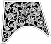
There is a way - at least in Corel - you can emulate those lines. I think it works also in other programs. Look out for "cross fading" (i don't know the correct word in English) if there is a need for you to work with.
The simple flower was done in this technique.
 

Attachments

  • flower.jpg
    flower.jpg
    56.5 KB · Views: 79

Ron Smith

~ Elite 1000 Member ~
Joined
Apr 6, 2007
Messages
1,455
Arnaud,

That is a great design and very good shading. Engraving it will improve it quite a bit as you can vary the thickness of the lines and therefore get better tonal changes. The extra overlap that you might add later will also improve the overall visual impact.

If you can cut that as well as you drew it, it will be beautiful.

Bravo!!

Ron S
 

Arnaud Van Tilburgh

~ Elite 1000 Member ~
Joined
Oct 3, 2008
Messages
4,221
Location
Belgium
Ron, I'm glad you like it, I will ad the extra overlapping soon.

Mario, thanks for pointing on that sharp tapered line tool, I found it in Illustrator, it is a brush one can find in the "artistic ink" library.

Here the result using the tapered lines. To me it looks quite like a printed engraving.

arnaud
 

Attachments

  • taperedbolster.jpg
    taperedbolster.jpg
    138.4 KB · Views: 96

ddushane

~ Elite 1000 Member ~
Joined
Jan 7, 2007
Messages
1,016
Location
Andrews, TX
Very Very Nice design Arnaud! You've done an outstanding job with all of the spacing. When you get that one spiral going your way it will be awesome. Thanks for the progression on this drawing. It's been fun to watch it grow and to read all the different comments.
 

Andrew Biggs

Moderator
Joined
Nov 10, 2006
Messages
5,034
Location
Christchurch, New Zealand
Hi Arnaud.

But.................................:)

I'm going to go against the flow on this one

I don't think that the computer shading lines are doing you any favours at all. I keep coming back to the pencil and paper. I think that you are still missing an opportunity to learn about shading.

I would sincerely advise you again to get rid of your computer for any of this drawing that you are doing. It may be providing a scientific approach to the shading and showing you some line direction.....but that is all..... shading is not a science, it is an organic/artistic thing that you will get a better handle on with a pencil so you can build these areas up and get a clearer picture in your minds eye of what the finished article should look like...........................and more importantly cut it to see the effects of where the lines are placed and where the shadows need to be on the actual engraving.

As you work with the pencil you will start seeing areas that you have over shaded and areas that need darkening up to add contrast to the work. The computer lines are not showing you any of this...................especially when you work on a large drawing.

Shading is a collection of lines (or whatever) to give light and shadow to your work. This gives form to the design and ads the visual third dimension.

When you look at your drawing in the smallest size, which is the closest to real life, it has no shadowing or depth and it looks like it is just one shade of grey. This is amplified each time it gets larger.

With a pencil you can make these areas darker and lighter so the design gets some dimension to it..................this is what shading is about and what you need to understand. Shading is more than uniform or tapered lines all going in a certain direction. They need to vary a bit in width and the spacing of them is important. Close together gives you dark areas and further apart gives you lighter areas. Thin to thick also build intensity from light to dark. Cross hatching builds the intensity/shadows even further and can also give form to the leaves (different curves) etc.

From what I can see you need to leave a lot more "white" areas in the shading. For instance the centre of the leaves so that it resembles a centre vein. Also the shading on the scroll spines is too much and these areas would look better left alone and in the white. By leaving white areas this gives contrast to the work..................you can do that on a computer of course but it will take forever and for no real purpose. Always remember that the drawings are a guide only............... and it is the finished engraving that counts. If you have your pencil drawing next to you showing the intense areas you can then start doing the shading lines accordingly.....................the computer drawing that you have done will be of little value to you other than to show you the direction of the lines which follow the contours of the leaves and scrolls.

I would highly recommend that you cut the design on a plate.......................this will show you exactly what I'm talking about as drawing and cutting go hand in hand and compliment each other.


Cheers
Andrew
 

FANCYGUN

~ Elite 1000 Member ~
Joined
Nov 10, 2006
Messages
1,843
Location
West Grove, PA
So nobody sees the straight diagonal line on the layout dividing the design in half ..............hhhmmmmmmmmm
 

Arnaud Van Tilburgh

~ Elite 1000 Member ~
Joined
Oct 3, 2008
Messages
4,221
Location
Belgium
Andrew, I totally agree that a pencil is much better for the tonal wide to see the design come a alive.

But..... With the pencil it almost impossible to draw these thin tapered lines I did. I blow the design as big as it fits on a A4 paper and use a optivisor to draw the shading lines with a pencil. When using a hard pencil the white on the paper remains longer, but will not be that dark. Using a softer pencil results in a design where the white has become grey cause of my hand that smears the lead of the pencil all over the design.

If I just want do the shading, sort like a sketch, it works for me.

And I agree that best is to cut the shading lines to practice on that. It is that what I'm doing at the moment after my study whit these computer vectors. And they really helped me understanding where to put the shading lines.
By doing the shading lines the way I did, I could easily switch between real size and a magnification of x 2000. This way I could easily see the different effects of the added shading lines and where to place them.

What I don't understand however is why shading lines don't have to be equal and parallel, because as far as I can see, Sam usually does his shading that way, also watching the videos of Lindsay are showing me very consistent shading lines.

I can agree with you that my shading perhaps has too many shading lines if seen real size, as than there is not enough white.

Of course the design is not the goal, but I'm still convinced that it has helped me a lot while studying shading lines as I see the design as vectors on my screen and use the magnification to see the result of the added lines. Showing even 3 sizes jpg's is not the same.

As I ask for critique on the shading, I hoped the have some feedback about showing more veins of the leaves, having more white in the scrolls etc. and yes you gave me some information on that.

I will cut this design and will try to do the shading properly, after I added an extra overlapping.
For the moment I'm shading my "pocket knife" and knowing how I was gone do that one, therefore I needed this crazy computer line work as I think I can now do some properly shading.

thanks for your support, arnaud
 
Last edited:

KCSteve

~ Elite 1000 Member ~
Joined
Jun 19, 2007
Messages
2,882
Location
Kansas City, MO
Hmmm....

Following this thread and thinking about it, it suddenly occurs to me that, perhaps, what you're saying Andrew is that we really shouldn't be trying to draw the shading lines so much as the shading effect.

That we should practice cutting our shading lines so we learn how to reproduce the various effects - light, medium, heavy, gradient, etc. on the metal and then not worry so much about what sort of pencil technique we use to achieve that look on the paper.

So instead of worrying that we can easily achieve a gradient with a pencil by smudging but have to work harder to cut a gradient, we should just look at our shaded example, see that we used graduated shading in this spot and then cut graduated shading.

So, am I seeing visions or just hallucinating again? *


*I always say "Isn't 'Visionary' just the nice way of saying 'Sees Things'?"
 

Arnaud Van Tilburgh

~ Elite 1000 Member ~
Joined
Oct 3, 2008
Messages
4,221
Location
Belgium
Printed Copperplate

Andrew, I not again want to start a discussion about "the science of cuts".

One reason I thought my way of using the "shading simulator" would come the closest to the real stuff, is that in the old days there where engravers you engraved mirrored designs on Copper plates for illustrations in books. They where also done in wood, but metal can be cut much finer.
Later these "Copper Clichés" where replaced with "etched alluminium" ones.

These Copper plates had to be engraved not only mirrored, but as far as I'm right, negative.

So using the tools I used in Illustrator, after Mario pointed on the "tapered line tool" in it, must result in a shaded design like a printed copperplate. Of course if you have a high resolution printer.

So if you put some Rustoleum or another black paint in the cuts of an engraving to make a photo, like the ones Sam makes, how could it NOT be the same as when you draw al these lines the same way they where engraved? And sure you can draw all these lines in Illustrator. I'm not saying I did it the right way in this example, but I'm quite sure it could.

And I must agree that this is an engraving community, not a graphic design one.

So of course, once one know how to choose the direction, size and where to engrave shadow lines, the whole attempt to draw them is just a wasted time.

I also think now, shading is not that difficult as it looked before I tried to draw it.
Now as I'm working on the shading of my pocket knife, and knowing what directions and where to shade, it is just a matter of taking the time to build it up.

I'm just experiencing my shading on the pocket knife started to pale, as even with a few line an leaving enough white, the lines must be visible. But it is easier to give them a few other passes until it looks good, than going to deep at once.

And I thing I'm doing good on the real shading now, I will show it once it is finished. And if so, I don't have to draw shading lines on paper, as to me engraving is also a way of design, only on metal with a very sharp tool.

arnaud
 

JIA

Elite Cafe Member
Joined
Nov 11, 2008
Messages
100
Location
Houston, TX
shading

Well this is so great that some one can do shading on the computer and some can do it by drawing and some can do it by a graver.

http://www.igraver.com/forum/showthread.php?t=332

this link is where MR Andrew explain how shading is seen, and i think its a good explantion about shadow, even though SHADOW is a medium by it self and its a whole study, shading is not just a line on a paper steel or copper, its a thick thing you will have to translate on what ever you are working on.

A book a teach or a master wont be able to teach you how to do it!!!!! you will have to learn how to get the expretion from the tool that you are working with, if it is a Victor line, a pencil a pen or a graver.

trying and practicing is the thing.

it you get a technical pen or pencil and study the shadow in it 3D and where and when it hit the object you are working on then you will know why and where to put these lines.

this is my 2 cents for shadowing.

jakob
 

Andrew Biggs

Moderator
Joined
Nov 10, 2006
Messages
5,034
Location
Christchurch, New Zealand
Hi Steve.................yip, that's exactley what I'm saying. The lines exist only to give the effect. I just went the long winded way of saying it :)

Arnaud.................Shading simulator. I like that :)

Jakob........I'd forgotten all about that post.

The thing to keep in mind is that you are trying to create an effect of light, shadow and dimension. If you look at some engraving work there is very little shading on it. Just a few cuts to simulate leaf veins etc. Other work is shaded a lot to give a more realistic effect of shadow and depth. Both are incredibley beautiful and there is no right or wrong of it..........just what the engraver is trying to acheive with their design.

If you look at all the styles of engraving like English scroll, Italian, American, western bright cut etc etc. They're all shaded quite differentley with the cuts to give the effect that they want. But the two things they all have in common is that they follow the contours of the scroll/leaf/design and give the effect of light and shadow that gives depth/dimension to the work.

Cheers
Andrew
 

Arnaud Van Tilburgh

~ Elite 1000 Member ~
Joined
Oct 3, 2008
Messages
4,221
Location
Belgium
Andrew, glad you like the "shading simulator", sure it is no more than that.

I'm shading the "my design on a pocket knife" now, I mean I was. As now it is almost time for bed on this side of the earth.

I forgot my camera today to take a photo the shading I'm doing, so I will show some tomorrow. I'm quite sure it is very subtle shaded, with almost invisible lines who only make some darker tone when there are more than tree close and tapered to each other.

The most important for me about shading the pocket knife, is that I have control on it. How I came to it is not so important as it will be different for every student.

arnaud
 

Arnaud Van Tilburgh

~ Elite 1000 Member ~
Joined
Oct 3, 2008
Messages
4,221
Location
Belgium
Here is some progress on my shading skills, I know there are still areas that need attention and that need a bit more contrast.
I know by posting it big size, it is hard to see the real shading, that is why I have one at real size an a blown up one.

arnaud


Andrew Biggs

Moderator
Joined
Nov 10, 2006
Messages
5,034
Location
Christchurch, New Zealand
Hi Arnaud

What sort of graver are you using to shade with?

From what I can see you are suffereing from a lack of tool control more than anything else..............but that will come with time and practice. :)

Scrolls: You have a lot of jagged edges on your scroll work. This can be tidied up quite a bit by cutting around the edges leaning your graver into the scroll slightly. Take it very gently and slowly as you are not trying to cut into the backround.............but more cutting on the edge of the graver.

Shading: From what I can see your lines are of a uniform depth/width and where they converge are not giving you the contrast that you need.

When you start the cut, have your graver so it's almost cutting with the heel..........then as you advance the cut slowly rock your graver forward (lift the handle) so the cut gradualy gets deeper, this makes the line wider as you progress through the cut. You should end up with a tapered line.

Vary your cuts so that the depth (width) changes. That will give you darker lines that will add contrast to the shading.

My suggestion would be to stop now on the knife............transfer a couple of those scrolls on to a mild steel practice plate and familiarise youself with the shading cuts a bit more and see for yourself what I have said above................then carry on with the knife.

Cheers
Andrew
 

Arnaud Van Tilburgh

~ Elite 1000 Member ~
Joined
Oct 3, 2008
Messages
4,221
Location
Belgium
Andrew, I know what you mean by graver control.

But let me tell you this knife is so hard to cut, it is only because I want to finish it as well as I can that I go on with it.

Most of the main lines I have cut, I used a 120° HSS X7, the hardest graver besides carbide and the new C max
These mainlines mostly are cut with a not sharp graver, because as soon I putted the graver on the metal, or the point breaks or was rounded. So normally than I would have stopped engraving it as without a well sharpened graver, it is almost impossible to navigate the graver where you want it to go.

Now I made me a 120° carbide graver to do the shading lines. I know I need a sharp clean point to start a shading line almost invisible, but that does not work when the point becomes rounded or breaks after every shading line.

So I try to make the best of it, and I learn a lot from this, thinks can only be better when engraving "normal" steel.

So I will cut this design again on a similar knife I will make myself in Titanium. The Titanium I use cuts like butter compared with the Kershaw.

But.....:) 
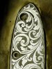
it is my pocketknife I wanted to use for all this learning process, and I must say it looks pretty good already when you see in life without to much magnification.

It is however not representative for my graver control, but I have no other choice than finish it.


Here is some progress


arnaud
 

Attachments

  • _DSC6833.jpg
    _DSC6833.jpg
    105.1 KB · Views: 43
Top