You are using an out of date browser. It may not display this or other websites correctly.
You should upgrade or use an alternative browser.
You should upgrade or use an alternative browser.
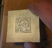
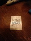
Critique Request Drawing for practice plate
- Thread starter BobGibson
- Start date
Matthew Evans
Elite Cafe Member
- Joined
- Jul 8, 2017
- Messages
- 410
.
Last edited:
Looks good and nice shading. Well done. Cut it.
Then do it again.
But next time move the central scroll a little to the left.
And revise the secondary scrolls and outside work to suit.
See which version you like best.
All great practice and design experience.
Then do it again.
But next time move the central scroll a little to the left.
And revise the secondary scrolls and outside work to suit.
See which version you like best.
All great practice and design experience.
Hope you post the results of your engraving.Will do!
Will enjoy seeing it in the metal.
Matthew Evans
Elite Cafe Member
- Joined
- Jul 8, 2017
- Messages
- 410
.
Last edited:
Daannyycc
Member
If you just look at it without studying it you can only see the non-good lines on the outside square section and the wavy deep/shallow straight lines.
Practice does make things mo-betta, and you are getting mo-betta.
Look at the parts that are most bad and practice them, then the rest not so bad ones will get better.
Practice does make things mo-betta, and you are getting mo-betta.
Look at the parts that are most bad and practice them, then the rest not so bad ones will get better.
AllenClapp
Elite Cafe Member
You might want to try doubling the number of background shading lines. That would increase contrast and make the design leap off the plate better.
A good start. Don't like the sanding marks though!
I would suggest a little lighter hand on the shading.
And closer spacing.
Not enough difference between your main and shading cuts.
Good effort, correct things and do it again please.
I believe you will like the results of your work.
I would suggest a little lighter hand on the shading.
And closer spacing.
Not enough difference between your main and shading cuts.
Good effort, correct things and do it again please.
I believe you will like the results of your work.
your cutting looks to be rather good to my eye.
BobGibson
Member
- Joined
- Oct 29, 2018
- Messages
- 38
Thank you. I appreciate it.your cutting looks to be rather good to my eye.
BobGibson
Member
- Joined
- Oct 29, 2018
- Messages
- 38
Much better.
BUT.......next time make the background lining in the exterior and interior panels line up.
Easy to criticize....... the inside top and side panels don't align.
And missing lines in the final two upper panels and one outside leaf curl on the right.
The devil is in the details. Otherwise, nicely done. Keep posting.
Last edited:
BobGibson
Member
- Joined
- Oct 29, 2018
- Messages
- 38
Thank you!Much better.
BUT.......next time make the background lining in the exterior and interior panels line up.
Easy to criticize....... the inside top and side panels don't align.
And missing lines in the final two upper panels and one outside leaf curl on the right.
The devil is in the details. Otherwise, nicely done. Keep posting.
Adder
Elite Cafe Member
Much better now. Else as John B says, and more lines as AllenClapp mention earlier. You getting there. Keep cutting!
Jørn-Ove
Jørn-Ove


