Example of lettering on the inside of a ring.

Arnaud Van Tilburgh

~ Elite 1000 Member ~
Joined
Oct 3, 2008
Messages
4,221
Location
Belgium
First let me tell that this is not my work.
There are already several treads about lettering on the inside of a ring, is one of mine I was talking about how I had seen these old letterings on the inside of wedding rings. And they always looked so simple to cut.
There is already given a lot of good tips how to cut these letters, but always different than for the type of lettering I would like to do on an inside ring.
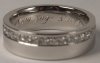
So yesterday came this piece that shows very well how the lettering is build up. And as you can see most lines on the lettering are cut the same angle, no problems making turns.
In my opinion these kind of lettering where done with a small flat graver, and it is the illusion that makes it look like smooth turns.

That is why I would like to show this example so big that we can find out how the different cuts are done.
I suppose that these kind of lettering was not only done in Belgium, at least I have seen a lot like these and I would like to learn this for lettering on inside rings.


arnaud
 
Last edited:

Kevin P.

~ Elite 1000 Member ~
Joined
Feb 28, 2008
Messages
1,256
Location
Nambe, NM
Arnaud, I guess what you see depends on what you expect.
Feanette is what I read which means nothing to me. It isn't a name familiar to me.

My point here is that a great deal is read into the engraving depending on your expectation. Overall it doesn't look attractive especially enlarged; but it's a good lesson none the less.
Thanks
Kevin P.
 

Arnaud Van Tilburgh

~ Elite 1000 Member ~
Joined
Oct 3, 2008
Messages
4,221
Location
Belgium
Kevin, it is a name "Jeannette" with double N and double T
Jean is a Frensh male name, Jeanne for the female.
Someone who is "gay" some also cal them "a Jeannette"
Jeannette means like little Jeanne.
And Jeanne is like Jeannine and so on.

arnaud
 

Brian Marshall

~ Elite 1000 Member ~
Joined
Nov 9, 2006
Messages
3,112
Location
Stockton, California & Taxco, Guerrero, Mexico
Kevin, Arnauds' point was that the angles of the cuts are suited to inside ring engraving.

And... unfortunately, since working inside a ring puts more than a little limitation on what is possible to do - it may never look really "attractive" to you.

Try it yourself and see...


Brian
 

Arnaud Van Tilburgh

~ Elite 1000 Member ~
Joined
Oct 3, 2008
Messages
4,221
Location
Belgium
Thank you Brian, indeed that is my point. ANd on the lettering there are no horizontal lines, not even on the t. They all can be cut in my opinion without a "special made" graver, just a smal flat.

And as it is very hard to make inside ring letters look like nice hand writing.
I think most of old engravers that were used to engrave inside rings did it this way.
I will have to try lots of rings to be able to space the letters like this example and having the angle equal.


I understand a lot of the why's this look so good. And remember this is small lettering.

arnaud
 
Last edited:

Kevin Scott

Elite Cafe Member
Joined
May 17, 2009
Messages
241
Location
Philadelphia, Pa, USA
inside ring engraving

Arnaud, I see your point. Can't tell for sure, but it does seem a flat graver was used, and the way the engraver did it makes it easier to see that is mostly straight cuts, some with a flair or roll cut to give the illusion of curved lines. This is basicly how the old jewelry engraving books teach how to do script, only with a square graver, not a flat. Beautiful traditional engraver's script is done this way. One reason is this way reduces tip breakage on turns, and also the problems of going from a deep cut to a light cut, which will likely result in a slip when using hand power.
The Lindsay or parallel heel geometry used with air power pretty much eliminates these problems, allowing the engraver to do script in a more flowing manner, and not by the ''build up system'' used here.
Somebody? posted that they have been engraving for 25 years and only used flats because they had trouble sharping squares. Maybe that is why this engraver used a flat, or Maybe this is the "look" he wanted to create.
Either way, your photo does show how most people do inside ring engraving, or at least how it is taught in the old books. Thanks for posting this. Kevin Scott
 

KCSteve

~ Elite 1000 Member ~
Joined
Jun 19, 2007
Messages
2,882
Location
Kansas City, MO
Thank you Arnaud!

In close up you can see the jags and breaks but I'm betting at a normal viewing distance, with naked eyes that your mind fills in / smooths over things to where that looks pretty darn good.

I wonder if they used a flat or a square and rolled to one side for the wide parts - from the photo it's hard to tell if the hairlines are even V's or if they're the more L shape you get from the corner of a flat. Doesn't really matter, of course. As Kevin noted, it's really just a matter of what you feel comfortable with - or happen to have in your hand at the time.
 

Mario Sarto

Elite Cafe Member
Joined
Jul 30, 2008
Messages
611
Location
Bad Salzuflen
Hello Arnaud,
i know this kind of engraving - here we call it cockish! I have seen a lot of these and they show the inability of the engraver or a great pressure of time. I don't want to offend someone with my words, but the purpose for a fine engraved wedding ring is a clean letter with correct spaces between and a nice flow - not the illusion of it. I have worked on such old fine engraved rings, but sadly i never took a photo of them.

One of the finest German engravers of the last 50 years, Professor Niedballa, wrote a small book about English script. The German engravers here should know it. In his book he devotes three pages to the engraving inside rings. The attachment shows, what he use, when he does a work like this. With every word he wrote, he reminds the reader to do his best work - every time!

Regards, Mario.
 

Attachments

  • inside-ring-engraving.jpg
    inside-ring-engraving.jpg
    10 KB · Views: 112

mbroder

Elite Cafe Member
Joined
Feb 1, 2007
Messages
203
Location
Brentwood,(Bay Area) CA
This is my current favorite font for inside rings. It's called Cataneo BT and I set it to italic. There are very few horizontal lines, it's easy to read and has an elegant style to it.
 

Attachments

  • P1012673.jpg
    P1012673.jpg
    30.4 KB · Views: 113

Kevin P.

~ Elite 1000 Member ~
Joined
Feb 28, 2008
Messages
1,256
Location
Nambe, NM
You're absolutely correct Mario and thanks for the attachment.
I understand Arnaud's position. And we should also be reminded to do the best we can.
Kevin P.
 

Kevin P.

~ Elite 1000 Member ~
Joined
Feb 28, 2008
Messages
1,256
Location
Nambe, NM
Brian, I understand Arnaud's point. I still don't think it's attractive whether or not I'm able to do better. I do know what better is.
Kevin P.
 

Arnaud Van Tilburgh

~ Elite 1000 Member ~
Joined
Oct 3, 2008
Messages
4,221
Location
Belgium
Mario, thanks for participating on this one. Glad you recognise this kind of lettering, also I have seen many of them. I understand that is probably cheap lettering work that was done before the pantogram came up.
And I agree that it does not look like fine calligraphy, but you have to admit, it has character.
And I have no problem with illusion done this way. Of course we all have different taste. But if you look at these kind of lettering at live size, it looks like a strong hand writing. I have blown up the picture, and almost every engraving when blown up at this size shows errors.

So I agree on your correct spaces between and nice flow, and as far as I understand you can do inside ring engraving much better tan this.
Perhaps that could also become my goal, however, being able to engrave on an inside ring these lettering is something I would like to learn. To me beauty not always has to be perfect, but it needs character.


Mark, your lettering looks great , well done, but I prefer my example more, even as it has more illusion than yours, but it is in my opinion the spacing and equal angles that are stronger in my “illusion example” than on yours. That does not mean yours is done better, but I would prefer my example on the inside of my wedding ring.
And in a way I think you are close to what I prefer.

Kevin, you’re welcome,

arnaud
 

Kevin P.

~ Elite 1000 Member ~
Joined
Feb 28, 2008
Messages
1,256
Location
Nambe, NM
Perhaps we'll be following you Arnaud.
You've come up with some very innovative things even if you're an old dude, like me.
It gives me encouragement.
Kevin P.
 
Top