Critique Request First time ever showing my work

Joined
Sep 17, 2021
Messages
49
Location
Los Angeles California
Hi everybody! Thanks for looking. I’m brand new to this forum, and to the wider engraving community In general.

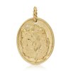
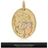
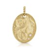
I have been messing around with hand engraving since I took classes at the GIA in Carlsbad California right out of high school. Since then I have decided to dedicate my life to mastering hand engraving. I feel like I got the fundamentals down to a point where I’m comfortable showing after years and years of practicing. This is a pendant i designed and engraved recently. It’s 14k yellow gold and has a stippled background with a flush set diamonds to keep it interesting. What do you guys think? I still have a lot of room for Improvements, but I’m quite proud of what I managed to accomplish so far.

Thanks for the feedback!
9DFABA1B-8474-48D5-9771-819CDC18E8FE.jpeg
 
Last edited:

AllenClapp

Elite Cafe Member
Joined
Aug 7, 2019
Messages
400
Location
Raleigh, NC
I like the design in general, but the shading seems a little flat. I think part of this is because all of the leaves are covered with shading and you have a lot of very long shading lines. You might want to consider folding some leaves over so that you break up the long shading lines. You also may want to consider having your shading lines increase in width as you approach the area where the leaf starts (or starts to go under another leaf part). If you haven't seen it, Sam Alfano has a great video on Advanced Shading Techniques that put life into engravings.
 

ByrnBucks

:::Pledge Member:::
::::Pledge Member::::
Joined
Dec 25, 2020
Messages
212
Location
Chattanooga, TN
Welcome JB, you definitely are ready to do some showing. I’m very green myself but there are many fine gentlemen here who can help refine and hone your designs for future projects. I like both your pieces the second feels unique and is intriguing to the eye, although I lack the knowledge to explain but it feels off at the bottom where your three turns all connect without something to distinguish them apart “taken with a grain of salt“. Anyways your in the right place I’d suggest you post your next design sketched out, let theses fellows make suggestions and hints, then redraw and resubmit before you know it you’ll have an amazing design with an unfathomable amount of combined knowledge nudging you in the right direction. Have a good one and keep up the good work.
 
Joined
Sep 17, 2021
Messages
49
Location
Los Angeles California
Thanks for the words of encouragement Byrn. I wanted the tree to look as if it was flowing out from the border. I think it looks off because I made the line that defines the transition between the stem and the border too thin, and in the picture it practically disappears. Is there something I could have done to make the transition more distinct?
 

ByrnBucks

:::Pledge Member:::
::::Pledge Member::::
Joined
Dec 25, 2020
Messages
212
Location
Chattanooga, TN
Good evening JB, allow me to apologize I lack the proper amount of design proficiency and understanding of leaf/scroll progression to critique in a knowledgeable manner… but here’s what I was trying to “understand” and forgive me for drawing on your piece. It wasn’t the border to stem that seemed off its the next junction between these three leaves, as all the outside fold overs : the dotted lines being the area folded and covering the face of each leave. I was looking at each leave as a stand alone, and with the uninterrupted “stem” as you described evolving into three leaf turns with no lines to explain how this transition takes place, one line puts one in front and the others can grow out of site. I very well may be wrong just wanted to explain. Maybe someone more seasoned will have a better take. Later JB
 

Attachments

  • 6F19D9A7-C746-4D41-945E-82AA4F68E13D.jpeg
    6F19D9A7-C746-4D41-945E-82AA4F68E13D.jpeg
    99.7 KB · Views: 44

Matthew Evans

Elite Cafe Member
Joined
Jul 8, 2017
Messages
410
Less critique and more food for thought. What are you trying to show your customer and is that able to be seen more than a foot away? The reason for shading is for contrast and to give dimensions. If it is bright cutting in gold, fewer clean and balanced lines communicate better than getting too many leaves. I was just educated on my previous posts about the drawing aspect and design, which I am learning is the harder and more productive part of the engraving process. I like where you are going with it nonetheless.

-good luck and happy chip making
 
Joined
Sep 17, 2021
Messages
49
Location
Los Angeles California
Less critique and more food for thought. What are you trying to show your customer and is that able to be seen more than a foot away? The reason for shading is for contrast and to give dimensions. If it is bright cutting in gold, fewer clean and balanced lines communicate better than getting too many leaves. I was just educated on my previous posts about the drawing aspect and design, which I am learning is the harder and more productive part of the engraving process. I like where you are going with it nonetheless.

-good luck and happy chip making
Thanks Matthew. designing is definitely the harder part of this craft. I tend to overthink everything when I’m designing. Knowing when it’s enough is something I need to work on.
 
Joined
Sep 17, 2021
Messages
49
Location
Los Angeles California
Good evening JB, allow me to apologize I lack the proper amount of design proficiency and understanding of leaf/scroll progression to critique in a knowledgeable manner… but here’s what I was trying to “understand” and forgive me for drawing on your piece. It wasn’t the border to stem that seemed off its the next junction between these three leaves, as all the outside fold overs : the dotted lines being the area folded and covering the face of each leave. I was looking at each leave as a stand alone, and with the uninterrupted “stem” as you described evolving into three leaf turns with no lines to explain how this transition takes place, one line puts one in front and the others can grow out of site. I very well may be wrong just wanted to explain. Maybe someone more seasoned will have a better take. Later JB
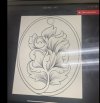
Don’t worry about it Byrn. I’m just as green when it comes to design proficiency. all of thoes leaves you marked are all part of the same stem. Here’s my drawing of it. Hopefully it will give you a Better idea of what I was going for. Thanks again and happy cutting!

DE242734-CADE-4105-B473-9CB8C4209FE5.jpeg
 
Last edited:
Joined
Sep 17, 2021
Messages
49
Location
Los Angeles California
Right there with you, post some drawings before cutting and you can find the balance with some feedback. I like what you did and have some great starting points. There’s never a cap on how well you can do of course so I’m coming from a how to improve. What’s your favorite design book or dvd at the moment ?

I got 3! Advanced drawing of scrolles by Ron smith is my go to for classic scrollwork. As well as art design fundamentals by lee griffiths. I also use sam alfanos book as a cheat sheet when I’m stumped on how to make something more interesting. I also dabble in mid evil manuscripts for inspiration. you got any recommendations?
 

Matthew Evans

Elite Cafe Member
Joined
Jul 8, 2017
Messages
410
I got 3! Advanced drawing of scrolles by Ron smith is my go to for classic scrollwork. As well as art design fundamentals by lee griffiths. I also use sam alfanos book as a cheat sheet when I’m stumped on how to make something more interesting. I also dabble in mid evil manuscripts for inspiration. you got any recommendations?
Those are the ones, Dover books will kill you with kindness with their prices and diversity too if you get bored. You are on the right track
 

Andrew Biggs

Moderator
Joined
Nov 10, 2006
Messages
5,035
Location
Christchurch, New Zealand
Hi JB

From what I can see you are well on your way. :)

Your main cuts are nice and sharp and show good graver control. The background work is well done by being nice and even which is actually quite hard on big areas like you have. Your leaves are well formed and show a great improvement from your first posting and the second. So there are a lot of good things happening with your work.

As for the shading cuts, that will improve over time with study, observation and practice. There’s no shortcuts.

So the last thing is your design. This is the area that needs attention. But again, that will come with time, practice and very careful observation.

One suggestion I would have is this…………….

The hardest part of engraving is the design and it is what most people struggle with the most. The cutting is the easiest part and in many ways just a learned process.

Your design is not seperate from your canvas. They must work in harmony …………..Engravers work within specified shapes. Oval, circle, rectangle, triangle, gun parts, jewellery, watches, etc etc. Try to have your work flow within that shape so one harmonises within it’s surroundings by following the contours of those shapes.

This also applies to foreground and background. One is no less important than the other. The two are should be intimately entwined to give an overall pleasing design. One should not dominate the other. With all design, balance is the key.

So to sum up…………..The shape of your canvas, the foreground and background and the individual parts like scroll and leaf must all work in conjunction with one another to give you the most pleasing design.


Cheers
Andrew
 
Joined
Sep 17, 2021
Messages
49
Location
Los Angeles California
Hi JB

From what I can see you are well on your way. :)

Your main cuts are nice and sharp and show good graver control. The background work is well done by being nice and even which is actually quite hard on big areas like you have. Your leaves are well formed and show a great improvement from your first posting and the second. So there are a lot of good things happening with your work.

As for the shading cuts, that will improve over time with study, observation and practice. There’s no shortcuts.

So the last thing is your design. This is the area that needs attention. But again, that will come with time, practice and very careful observation.

One suggestion I would have is this…………….

The hardest part of engraving is the design and it is what most people struggle with the most. The cutting is the easiest part and in many ways just a learned process.

Your design is not seperate from your canvas. They must work in harmony …………..Engravers work within specified shapes. Oval, circle, rectangle, triangle, gun parts, jewellery, watches, etc etc. Try to have your work flow within that shape so one harmonises within it’s surroundings by following the contours of those shapes.

This also applies to foreground and background. One is no less important than the other. The two are should be intimately entwined to give an overall pleasing design. One should not dominate the other. With all design, balance is the key.

So to sum up…………..The shape of your canvas, the foreground and background and the individual parts like scroll and leaf must all work in conjunction with one another to give you the most pleasing design.


Cheers
Andrew
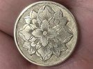
Thanks Andrew! It’s really inspiring to know that I’m on the right track. This last one is the latest piece I did just a few days ago. It’s not quite a finished piece of jewelry yet but its finished enough to show. I actually finnished this piece just before I joined this forum. Is this what you were talking about when you said that the canvas and the design would be in harmony?

thanks again for the advice! See you around! F84425D5-D707-4A9D-A007-959DE0A59599.jpeg
 

Latest posts

Sponsors

Top