Critique Request Gift for my wife

dcurrie911

Elite Cafe Member
Joined
Jul 13, 2012
Messages
265
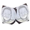
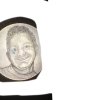
I am making a keepsake for my wife. It is an engraving of her late brother on the back of a silver quarter. As you might expect I want it to be the best that I can do and I would like some advice. what Am I missing? What needs work? odd that the right cheek is washed out on all the pics. I have dots there.

thanks, Dan
 

Attachments

  • 2520733B-AE73-4F46-801C-8A707A5148C0.jpeg
    2520733B-AE73-4F46-801C-8A707A5148C0.jpeg
    111 KB · Views: 156
  • 1F1E41E4-C418-413E-A034-EAD90DA282CB.jpeg
    1F1E41E4-C418-413E-A034-EAD90DA282CB.jpeg
    113.6 KB · Views: 157

monk

Moderator
Staff member
::::Pledge Member::::
Joined
Feb 11, 2007
Messages
10,962
Location
washington, pa
no need for worry. this is an excellent portrayal of the gentleman.
 

dcurrie911

Elite Cafe Member
Joined
Jul 13, 2012
Messages
265
Thanks John and Monk. But then I reversed the image. Looks like I have some work to do still.
 

Attachments

  • 22FDDD5B-582F-43AF-A637-4A41DD67DFE8.jpeg
    22FDDD5B-582F-43AF-A637-4A41DD67DFE8.jpeg
    78.2 KB · Views: 40

monk

Moderator
Staff member
::::Pledge Member::::
Joined
Feb 11, 2007
Messages
10,962
Location
washington, pa
my opinion-- you worry too much, or have too much self doubt. that would be a great gift, guaranteed !
 

speeedy6

Elite Cafe Member
Joined
Sep 16, 2013
Messages
272
Dan you've created the photo great ! The photo , because his right side is in the shadow makes his face look off a little. Maybe consider burnishing a little of the shadow on his right side to even out his face and maybe mirroring his ear from the left to the right. The pose is the problem not, your work. And I think the distant pic ( like most people would look at it) looks much better than the extreme closeup. If that's the photo your wife treasures then she'll recognize the pose and I wouldn't change anything except maybe a small, thin border around the edge. Nice work , Mark
 

JJ Roberts

:::Pledge Member:::
::::Pledge Member::::
Joined
Nov 10, 2006
Messages
3,520
Location
Manassas, VA
Dan,It's not easy engraving or painting the human anatomy you really nail it keep up the good work. J.J.
 

dcurrie911

Elite Cafe Member
Joined
Jul 13, 2012
Messages
265
Thanks everyone.
Monk, yep guilty of both charges. Probably always will be.... I already changed the eyes a bit. Will require some re-shading but I think the mirror images are better now?

Speedy, thanks for the observation and suggestion. Is this better? The shadowed ear in the attached picture is drawn in on procreate. It is not a direct mirror of the other side but does seem to even out the head. I think you are right that without the context of the background in the original photo the heavy shadowing was too strong.
 

Attachments

  • 15FB4168-55A7-4B88-A9DE-46B113438E55.jpeg
    15FB4168-55A7-4B88-A9DE-46B113438E55.jpeg
    111.7 KB · Views: 28

kraftrourke

Member
Joined
Sep 15, 2018
Messages
25
It looks great! I'm a lowly newb so I don't really have a right to critique... But just in case this is helpful, the one thing that jumps out to me is the teeth in the corners of the mouth. Since they are just as bright as the middle teeth, I don't perceive the curvature as much as the photo. It feels more like a flat row. On the far left, the last tooth is more in shadow. On the right the last three are more pink which could be darker grey. It's very picky and subtle, I know, but something I noticed right away.

I also wish there were brighter "catchlight" sparkles in the eyes like the photo. Maybe not right in the center though.
 

bamabubba

New Member
Joined
Apr 4, 2014
Messages
4
Looks great, Dan! She's going to love it, and the fact that you took the time and effort to do this for her will make it mean that much more. Kudos!
 

allan621

:::Pledge Member:::
::::Pledge Member::::
Joined
Jan 10, 2007
Messages
374
The curve from the cheek bones under the eye, merging with the emerging protrusion of the outer flank of the nose. If you can see it, its done wrong. Its a pretty darn good cut. I could never get that right, which is why I don't do faces. Well done.

Allan
 

dcurrie911

Elite Cafe Member
Joined
Jul 13, 2012
Messages
265
Thanks John-Ove.

Allan, are you referring to his right side As shown by the arrow? In the attached photo added some shading to that area in in Procreate as a test before I touch the coin. That much shading is probably only 25 dots but hard to remove if wrong.
 

Attachments

  • 05B6E81A-C54E-44A1-8D32-B40D811B3929.jpeg
    05B6E81A-C54E-44A1-8D32-B40D811B3929.jpeg
    94.5 KB · Views: 11

allan621

:::Pledge Member:::
::::Pledge Member::::
Joined
Jan 10, 2007
Messages
374
Not wrong at all. What I was trying to say is how well it was done because it is so subtle. The problem I have seen from portraits done by other jewelry engravers is the nose is made too prominent because of the over shading of the area from right side of the left eye down the curve of the nose. It makes the nose looked stuck on instead of naturally occurring. You've done the opposite. The area above the arrow is where I was talking about.

For instance, look at the current face of Grant from the 50 US dollar. The left side of Grants nose closest to the eye socket is almost non-existent. Almost non-existent but if you look carefully, the area does have a tiny bit of shading, basically where the light plays heaviest on the face.

Managing the reflection of light is an important part of jewelry engraving. The letters must show properly without it either being so bright the dazzle makes it hard to read, or so dull it tends to blend into the background.

The most amazing control of light was shown recently by Brian Hochstrat on his Lohengring sculpture. Its an incredible piece of engraving artistry. But look at it in terms of the movement of light. The shield has light flowing in minuscule variations, the feathers on the back of the swan are separated by the merest amount of shading. The clouds at the top, the inside back of the boat, the edge of the right coastline. His play in the control of light is incredible. A masterwork.

Allan GettyImages-622455120-ceb6e90ae70147829b15692c72e69505.jpg
 
Last edited:

dcurrie911

Elite Cafe Member
Joined
Jul 13, 2012
Messages
265
Due to many things including COVID my time table needed to pull in significantly and I had to give her the coin today. It was a complete surprise and she cried. . Thanks to everyone that provided suggestions and encouragement.
 

Attachments

  • E9073A88-0B0D-4074-B94D-A94705DC2249.jpeg
    E9073A88-0B0D-4074-B94D-A94705DC2249.jpeg
    139.2 KB · Views: 9

Latest posts

Sponsors

Top