
SharpGraver
Elite Cafe Member
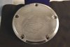
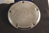
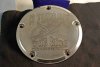
Here are some Harley Derby Covers I just finished. My Photography leaves alot to be desired but you guys can feel free to critique the engraving.
Attachments
-
 DSC_0110 copy.jpg57.3 KB · Views: 105
 -
 DSC_0099.JPG56.1 KB · Views: 95
 -
 DSC_0103_edited copy.jpg69.3 KB · Views: 122


