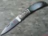
Hello Cafe members,
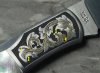
I used the same design for both sides,
however the engraving experiences were as different as night and day.
I am NOT satisfied with the finished product or the process by which I got there.
I hope the photos allow you to see enough detail to give me some valuable input as to how to improve on the next knife.
I appreciate your time and help.
Stephen
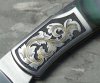
Joe, I now understand what you meant about the width of the gold and the thinness of the leaves.
Actaully I think it looks pretty dang good overall
A few points to improve on. Where your gold forks, I would shade the gold so that it lays under the backbone of the scroll just like you have done with the leaves. Don’t be afraid and go back and crosshatch some more, just run at a different angle than your other shade lines have run and you will be fine
1, this is a real judgement call, but I think at your skill level , the shading would be more effective it was pointing back toward the intersection of the gold split, (which is really the center of the leave you are shading, than running straight back into the curl over section of the leaf
2, the line running between 1 and 2 which creates the end curl-over, needs some serious shading. Across the gold, and also at the base of 2, that clean area needs more shading to make it pop up.
3, I’m not crazy about the round endings on the gold, for this application in the leaves, I think a tapered point would look better, but I realize this is beginning effort, so its ok,. But maybe I would use the shade lines to “point up” the gold end
4, the leaf running under four is obviously starting from the origination point just in front of 4. However because it starts with that 90 degree edge from the gold at the end of leaf on the left, it looks like it is coming out from under that left leaf, which of course it can’t. I would cut the edge of the leaf under four so that it comes back is just starting it out right in front of the left point of the numeral 4.
Also, where the orgination ball above 4 lays over the leaf to the left of it, I would shade that leaf pretty hard up against the ball and the backbone of gold, so that it clearly stood out from the leaf.
Hope this helps, don’t be afraid to go back and add to it now.
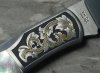
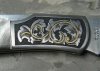
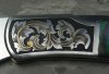
Mike, It was Not that the medal of the knife was like night and day, it was the engraver. The inlay went well on one side, it was a battle on the second side. Same experience with the relief and shading. A lack of experience, tweaking of my gravers or not enough scotch.... operator malfunction.... LOL
Scott, Thanks for the encouragement to recut and the pointers on what to recut.
I appreciate the time and effort you made to help me improve and the opportunity to learn from my mistakes. Thank you....As a result, I've posted photos of the New and Improved knife engraving.
Any suggestions for future reference, are welcome.
However, I do not care to recut this knife, again.
Back to the drawing board I go....
Thanks,
Stephen
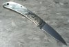
stephen, you did good my friend. The intensity in the shading improved the appearance. I see a few violations in spacing, but they are trivial to the whole design as is and nit picky stuff. I like it. Refinement will come with a little more experience in this area.....Bravo! Good job!....Once you have gained a certain amount of experience and quality in one arena, it is easy to make transitions from one genre to another, and that shows to be true here in your knife.
Right on, ride on Stephen.........Ron S