sdcoxx
Elite Cafe Member
Hello Cafe members,
I struggle with scroll design and layout.
I want to incorporate 24k inlay and a stimpled relief background into my engraving.
I've been fiddling this idea long enough.
Something is just not right with this effort, but I don't know what it is.
Your input would be deeply, appreciated.
Thanks,
Stephen
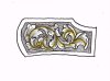
I struggle with scroll design and layout.
I want to incorporate 24k inlay and a stimpled relief background into my engraving.
I've been fiddling this idea long enough.
Something is just not right with this effort, but I don't know what it is.
Your input would be deeply, appreciated.
Thanks,
Stephen
Attachments
-
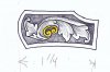 almarr2_edited-1.jpg63.7 KB · Views: 256