Its been awhile

Goosebuster

Member
Joined
Jan 2, 2018
Messages
15
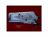
A few years back I sent in a photo that was not clear enuff for a critique. I am self taught, with help from books and the internet, but been at it for some time. I'm on the West coast in Canada and do not travel much, so there is not much, to no contact with other firearms engravers. If my photos are acceptable, I would appreciate
some input. Trying to send attachments Thanks.........Larry Bison - Practice Plate.jpg
 

Attachments

  • Winchester 92 L. Side.jpg
    Winchester 92 L. Side.jpg
    70.9 KB · Views: 86

AllenClapp

Elite Cafe Member
Joined
Aug 7, 2019
Messages
376
Location
Raleigh, NC
Larry, I am a painter and an engraver. One of the things that fools a lot of painters is thinking that different colors produce different values. I teach my painting students to take a photo of a color painting with their cell phones and turn it to grayscale to check the real values. If it doesn't look good in grayscale, it won't look its best in color.
Where painters tend to fail is NOT having enough contrast. Think about a probability distribution: it always has tails. It may be skewed one way or the other to darker or lighter and, if in color, to cooler or warmer colors (and in nature will be), but it always has those small amounts of dead dark and dead light that really make it sparkle.
In your work, you poked the bison head out of the frame. That is NOT a problem, but if you do it, you should make sure that it looks intentional, just the same as you would if you had the edge of one leaf go over the edge of another. The edge of the head is so close to following the frame outline that I would recommend that you think about extending part of it a little further out.
Secondly, it could use some small areas of greater contrast. Adding some blacker areas at the nose/mouth and eyes, and maybe some heavier shadow on the neck under the jaw would make this really pop. You may also find that just darkening the outer edge of the head where it goes outside of the frame to make the head seem more rounded, rather than extending the head, would help.
I like it as it is, but it could really pop with a little more contrast. Try printing your photo in grayscale and then using a B or darker pencil lead to see how darkening some areas might work. (I use 9B woodless pencil when I sketch so I can get some really dark places.) If it looks like that would help, then have fun and go for it.
 

JJ Roberts

:::Pledge Member:::
::::Pledge Member::::
Joined
Nov 10, 2006
Messages
3,456
Location
Manassas, VA
Larry,I like the Bison but I would fill in the Bison's body hair more to the edge's of the frame,down and to the right. J.J.
 

Goosebuster

Member
Joined
Jan 2, 2018
Messages
15
Thanks for the input guys, I still have a lot to learn, it looks as tho I have finally solved the photo problem with better lighting. Keep the critiques coming, I will attach more photos A.S.A.P. ............Larry
 

JJ Roberts

:::Pledge Member:::
::::Pledge Member::::
Joined
Nov 10, 2006
Messages
3,456
Location
Manassas, VA
The one thing that I could never see is an engraved oval frame on a rifle floor plate with an animal's head floating in midair, that looks terrible. J.J.
 

Goosebuster

Member
Joined
Jan 2, 2018
Messages
15
Larry,I like the Bison but I would fill in the Bison's body hair more to the edge's of the frame,down and to the right. J.J.

Thanks J.J.
Never noticed until your reply, but I think you are right on. I will take that advice as I to think it would look better .
 

Latest posts

Sponsors

Top