You are using an out of date browser. It may not display this or other websites correctly.
You should upgrade or use an alternative browser.
You should upgrade or use an alternative browser.
Last nights drawing
- Thread starter Leland Davis
- Start date
AllenClapp
Elite Cafe Member
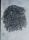
For my taste, that is a lot of gray tone. More highlights and darker areas would make it pop. I notice that many of the leaves had crosshatching all the way out. If you start crosshatching where you want the darkest spot and make them lighter and further apart as you move away--and don't cover the whole leaf with crosshatching--it will more effectively distinguish between light and shadow. I suggest drawing the same design, leaving some highlights and adding some darker spots, and see if you agree.
As Allen said above, your tones are not varied enough to be visually clear. Your composition is pleasing to the eye overall though. There is a general rule to design regarding balance and that is the 1/3 to 2/3rds rule. Your shading should be either 1/3 of the total design, or 2/3rds. There is some leeway in that rule, but it always leans towards a 50/50 ratio. Basically 1/3 black to 2/3 white, or the reverse. I hope this makes sense.
Leland Davis
Elite Cafe Member
Yep my tone is off if you put that much graphite in there some will get away from you. I usually don't shade my drawings. It's much easier to shade with a graver. My drawing is never for show as a drawing it's just an exercise for fun. If I find a place to cut this the tone will be better.
Thanks all
Thanks all


