Critique Request New member..."first practice plate"

oniemarc

Elite Cafe Member
Joined
Mar 29, 2021
Messages
356
Location
The Netherlands
Hi there,

Let me start by introducing myself. My name is Marc from the Netherlands. Tattooist by trade with a passion for machinebuilding and metalwork. I have been working on getting into engraving for a couole of years now. Slowly getting some parts and equipment over the past 2 years.
The last 2 months or so, I have been working up to actually engraving. Trying to get a grasp on scrollwork and shading(I still need lots of practice there too). Did a couple of very small brass pendants for my wife, but nothing fancy.
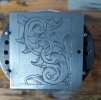
Decided I would try some mild steel and tried my "first practice plate".
I do realise there are some design issues with this plate, like the leaf structures around the border, but this was the only design I had a transfer of, hahaha.
Shading looks quite subpar, I'm hoping that will get better when my microscoop gets in...
Also added a design I have been working on...any suggestions on that would be greatly appreciated.

Rip it apart ladies and gents...
 

Attachments

  • 20210405_153751.jpg
    20210405_153751.jpg
    189.2 KB · Views: 172
  • 20210331_095335.jpg
    20210331_095335.jpg
    141.7 KB · Views: 170

monk

Moderator
Staff member
::::Pledge Member::::
Joined
Feb 11, 2007
Messages
10,857
Location
washington, pa
nothing major as this is your first. certainly not perfect. in time you will see improvement. practice makes it all come together. don't be afraid to practice drawing the scroll spine. all that follows will be a bit out of whack with less than a perfectly drawn spine.
 

oniemarc

Elite Cafe Member
Joined
Mar 29, 2021
Messages
356
Location
The Netherlands
Thank you for the reply and tips...I will try and re-draw this design and post it here to see if I can see where and how I messed up to begin with. Already noticing more and more, hahaha. My guess is that it will be changing a fair bit.
 

oniemarc

Elite Cafe Member
Joined
Mar 29, 2021
Messages
356
Location
The Netherlands
Ok...second draft...hahaha. I noticed I had some of the leaves growing the wrong direction, so I "corrected" that(remains to be seen obviously if I indeed correct them). Tried to make the backbones better. Detachted the leaves from the backbones on the outside. And made the background border smaller to have a lot less lost space.

Feel free to let me know where else to look or if it indeed improve a bit(not aiming for miracles at the moment).

Thanks in advance


20210406_201513.jpg
 

John B.

Lifetime Pledge Member
::::Pledge Member::::
Joined
Nov 9, 2006
Messages
3,950
Location
Los Angeles area, California.
Some nice elements within your design.
But the overall design it is not working well within the border you have created.
Some of the exterior elements seem like they are forced to just ignore the existing border.
The large negative spaces at the lower right and upper left need some thinking.
 

Goldjockey

Elite Cafe Member
Joined
May 17, 2018
Messages
274
Really beautiful. I don't have a problem with the design exceeding the borders, but the design could benefit from a second square outward proportional border to frame it in.

You've got some blank areas in the upper left and lower right hand corners that need to be proportionately filled in. You've got a great natural sense of design, composition, and proportion. The design flows very nicely, and is easily shadeable and engrave-able.

I also really liked the trapezoid ellipse design (right hand) in your first post. It isn't nearly as well defined, or sophisticated as your latest design (which shows you've really been working at it), and has a couple of flatter spots on the scroll spine that need to be finessed. This design really needs the refinement and attention you've devoted to your most recent drawing.

However, as a professional jewelry designer with many decades of experience, I can confidently say, that the trapezoidal design - as designed- has the magic. In silver, or gold, or in any metal people will bring out their wallets for. It will sell, as an earring, or a pendant, necklace stations, an embellishment on a knife bolster, etc. etc

Engraved as drawn, it will sell, but it will bring much less than if you take the time to refine it. which you clearly have the talent to do.
 
Last edited:

oniemarc

Elite Cafe Member
Joined
Mar 29, 2021
Messages
356
Location
The Netherlands
Thank you guys for the critiques. Back to te drawingboard it is.

I will try and split this design in two seperate drafts. One where I try and keep everything within the border...and one with an added border on the outside. See what works best.
Will also try to fill up the corners...was struggling with those spaces, hahaha.

@Goldjockey Thank you for the kind words. I try my best and eat humble pie on a daily basis. I will take another crack at the trapezoid design also. Fix some of the flat spots and see if I can get it to work a little better.
It is wayyyy beyond my skill level to engrave that design for now, but will try and perfect it for when I will be able to cut it.
 

John B.

Lifetime Pledge Member
::::Pledge Member::::
Joined
Nov 9, 2006
Messages
3,950
Location
Los Angeles area, California.
Looking good well drawn.
But the last segments of the two upper scrolls lack any leaves or buds.
This makes for unbalanced, large segments of background. If you black in the background areas you will see it.
And to my eye, the three even leaves breaking through the top border seem a little forced and out of proportion with the other border break-throughs.
Just a suggestion, try eliminating the center one and substitute a leaf that stays within the border.
See if that works for you.
 

oniemarc

Elite Cafe Member
Joined
Mar 29, 2021
Messages
356
Location
The Netherlands
Looking good well drawn.
But the last segments of the two upper scrolls lack any leaves or buds.
This makes for unbalanced, large segments of background. If you black in the background areas you will see it.
And to my eye, the three even leaves breaking through the top border seem a little forced and out of proportion with the other border break-throughs.
Just a suggestion, try eliminating the center one and substitute a leaf that stays within the border.
See if that works for you.
Totally get what you're saying about the upper scrolls, so I will revisit those. Will also see what I can do with the centered leaves.
 

oniemarc

Elite Cafe Member
Joined
Mar 29, 2021
Messages
356
Location
The Netherlands
Started on the the other design aswell last night. For now this is where I ended up. Can't seem to find a good solution to fill up some of the corners that were too empty. Any suggestions would be very helpful. Maybe I should look at the bottom scroll and tilt it a little more, so it leaves less space and open up some new angles to work from?
20210408_074823.jpg
 

John B.

Lifetime Pledge Member
::::Pledge Member::::
Joined
Nov 9, 2006
Messages
3,950
Location
Los Angeles area, California.
Great Job. Looks much better to me.
You have some nice elements going for you.
But more importantly, what do you think?
This is going to be a real winner if it is well shaded.
Looking forward to seeing it.
 
Last edited:

John B.

Lifetime Pledge Member
::::Pledge Member::::
Joined
Nov 9, 2006
Messages
3,950
Location
Los Angeles area, California.
Started on the the other design aswell last night. For now this is where I ended up. Can't seem to find a good solution to fill up some of the corners that were too empty. Any suggestions would be very helpful. Maybe I should look at the bottom scroll and tilt it a little more, so it leaves less space and open up some new angles to work from?
View attachment 47764
On your other drawing..........
Doing a repeat of what you did in the upper left corner into the lower right corner will work .
And going back to the outside leaves in the first drawing will maintain a better border and design IMO.
 
Last edited:

oniemarc

Elite Cafe Member
Joined
Mar 29, 2021
Messages
356
Location
The Netherlands
I was really happy with the first draft I did on this, but I really value the opinion of those that are more knowledgeable in anything I am trying to learn. As soon both you and @Goldjockey pointed some of the points of improvement out, I started seeing what went wrong. Once you see the mishaps....you can't unsee them. This last draft looks way more pleasing to me and more balanced. At this point I am just glad I got a chance to improve on something and learn along the way.
Now all I have to do....is get my cutting to a point where this design wouldn't get butchered by me.
I'll cut the other designs first when I get those up to par...hahaha.

Very greatful for all the advice and help given...
 

oniemarc

Elite Cafe Member
Joined
Mar 29, 2021
Messages
356
Location
The Netherlands
On your other drawing..........
Doing a repeat of what you did in the upper left corner into the lower right corner will work .
And going back to the outside leaves in the first draying will maintain a better border and design IMO.
I will not be able to do anything on these till this weekend as I have a ton of drawing to do for work. But...I will try to have a crack at it and see if I got what you're saying. Trying and failing is the better part of learning eh...hahaha
 

oniemarc

Elite Cafe Member
Joined
Mar 29, 2021
Messages
356
Location
The Netherlands
Ipad ran on fumes....so I only did the version that stays within the border. To me...this is starting to look a lot better....although I do struggle with those corners. Quite hard to put my finger on it. 20210411_220726.jpg
 

oniemarc

Elite Cafe Member
Joined
Mar 29, 2021
Messages
356
Location
The Netherlands
Ha...I see it...
Not trying to act smart or anything, trust me. But forgot to line it. I had it folding over in the sketch, hahahah.
I correct that first thing in the morning...

Thanks....
 
Top