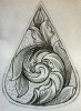
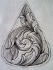
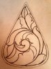
The shapes all look good, it has nice movement, balance and a good ratio of pos./neg. space.All very pleasing to the eye The only thing I see that I would have done different would be, on the 3 main leaves inside the scroll, at the spot where the line re-joinns the inside of the backbone line, I would have brought that line further back to where it almost touched the beginning of that line. I might be completely wrong about this concept but I know I'm not the only one. PLEASE TELL US IF WE'RE WRONG.
Dave, from what I remember the position of the line t think your referring conveys the relationship between steam and leaf , on top , behind, etc . Its a preference thing from what I can tell. Thanks for the comment.
Yes roger I been looking at that leaf trying to figure out if it worked or not. It has the large to small ratio effect I was looking to achieve. And thats why i left it. I do see where it looks to fat. I knew there was going to be some things I didn't get quite right . I think I am on the right path finally though.
Your leaves that are "symmetrical" on each side of the backbone
I would put a fold in them where they come together instead of having the backbone split them. Then add some detail and interest by putting overlapping/fold overs on the large leaves.
I might also change some of the "outside" leaves to a tendril style of leaf or something else to add visual diversity to the design.
It definitely has a lot of potential, but with some tweaking it could be really good.
Thank you Dave , Roger , and Bert . For your directions. I did my best to follow your suggestions and I think it paid off. And I think your doing well beladran. Keep cutting my friend.

 IMG_20140212_213140_094-1.jpg164 KB · Views: 291