
Cloudy
~ Elite 1000 Member ~
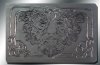
Tried out a few more techniques on this belt buckle-
Attachments
-
 oakman.jpg136.1 KB · Views: 288
I realized I need help with the shading- that's why I posted- could I impose on any of you to mark up the photo to point me in the right direction? I'd really appreciate this help!
And thanks for the kind remarks on the so-far work!


