
Dave Friedman
Member
- Joined
- Oct 30, 2018
- Messages
- 40
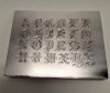
Practice plate for review......
Sorry, difficult to photo.
Thank you for your comments,
Dave
Sorry, difficult to photo.
Thank you for your comments,
Dave
Attachments
-
 Old English Font2.jpg142.1 KB · Views: 176


