Overlapping Letters

Haraga.com

~ Elite 1000 Member ~
Joined
Jul 27, 2007
Messages
1,264
Location
Skiff
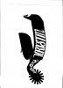
This pic is for jmcutting. I did not take the time to figure out how to download your picture on the bit and spur forum. Sorry for the intrusion. Jmcutting- I hope this helps. On the last letter I drew an inside cut with a script and then you may want to bright cut outside of that line. You may also want to fill in with more script cut going horizontal. There are many options and they will all look better than not.
 

Attachments

  • kristinspursscanreduction.jpg
    kristinspursscanreduction.jpg
    75.9 KB · Views: 224
Last edited:

Tom Curran

Elite Cafe Member
Joined
Feb 18, 2007
Messages
451
Location
upstate New York
To me, the 'K' looks slightly too condensed, and the 'I' looks too close to the 'N'.
You have to watch the spacing on special typefaces. Adjust until it looks right to your eye.
 

KCSteve

~ Elite 1000 Member ~
Joined
Jun 19, 2007
Messages
2,882
Location
Kansas City, MO
Thanks for posting this!

Question: do you try to avoid the bits where the next letter is going to overlap or just cut this letter as usual and then cut the next letter 'as usual' but letting it overlap the previous one?
 
Top