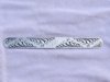
Bracelet for a friends daughters birthday. Any critique welcome. My lettering was a little iffy, I had trouble with that T and the more I tried to fix it, the worse it got.
Yeah, kinda boring, right? I was actually just going to do the two batches of scrolls on either end, and do something different in the middle. But plans got changed in mid stream, so I salvaged it by taking the same thing on across, and doing the initials. I know it ain't very exciting or original, but I'm still working on execution of simple stuff.
i'm with Mark- it will look nice without trying to follow a more complex design around the curve. there's something to be said for a layout that allows the eye to take in a complete chunk of the whole without rolling it around to take it all in (if that makes sense...)