You are using an out of date browser. It may not display this or other websites correctly.
You should upgrade or use an alternative browser.
You should upgrade or use an alternative browser.
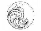
Critique Request Scroll idea
- Thread starter JBtheApprentice
- Start date
wowilson
Elite Cafe Member
Everything is doing what it’s supposed to do. Everything flows back into the scroll properly. I assume the design being heavy on the left side is what you intended. Looks ok to me.
i think it is well designed. i'd like it better if there was something added to that glaring blank area on the right.
AllenClapp
Elite Cafe Member
There are so many things that you can do with that design. It looks reasonably balanced now, even with the blank area to the right. It can stand alone. The beauty of this design is that the weight of the design seems stable enough to allow you to leave the area to the right alone or, if you wanted to put something there, the overall design would still balance. There are all kinds of things that could be done with that area if desired, such as initials, a logo, rain, an inlaid gold moon, or even a dog howling at the moon. This is the kind of thing that you could sell by itself at a bazaar or charge extra for adding someone's initials. If you are good at quick numbers, you could also charge extra for adding the telephone number on the back.
Goldjockey
Elite Cafe Member
- Joined
- May 17, 2018
- Messages
- 295
Looks good overall, with the exception of numerous point errors where elements partially bifurcate. Simply put, these bifurcations, absolutely following the flow of the scroll backkbone, should point directly to the center of the element origin within the scroll. In the case of the scroll you have drawn, if one follows the bifurcations to their implied end point, almost universally, the implied endpoints you have drawn hook around to intersect partway down with the outside line of the individual elements. If you have Sam's video on drawing scrolls, please review the section on point errors again. These are not huge errors, and are easily correctable.


