You are using an out of date browser. It may not display this or other websites correctly.
You should upgrade or use an alternative browser.
You should upgrade or use an alternative browser.
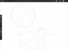
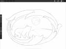
Critique Request Some doodles to show
- Thread starter JBtheApprentice
- Start date
FANCYGUN
~ Elite 1000 Member ~
Well two things as I see it.
First off move the leaf at the bottom more towards the right. Its crowding the bear where it is and leaving a gap.
Secondly, Is the bear looking away at the moon or did you just not sketch it in yet Looking at the moon will leave a boring back of the neck on the bear.
My opinion
First off move the leaf at the bottom more towards the right. Its crowding the bear where it is and leaving a gap.
Secondly, Is the bear looking away at the moon or did you just not sketch it in yet Looking at the moon will leave a boring back of the neck on the bear.
My opinion
FANCYGUN
~ Elite 1000 Member ~
Here's another thought... try turning you oval upside down so the heaver elements ar on the bottom and not visually squishing the scene. Heavier is always most of the time with some exceptions that cannot be determined by mere mortals usually towards the bottom
i'd spend some time with a pencil to create hilite and gradual transitioning to darker shade values. the lines you show on the bear are never going to appear natural. perhaps that was your goal but simply never pushed the drawing that far. it's a very good thing to create with a pencil first. trashing a sheet of paper is far less disturbing than doing the same in metal. your attitude is spot on. mastery requires total dedication.
JBtheApprentice
Member
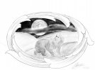
Thanks for the tips guys! Yes, dedication is the true path to success in any profession. Hopefully I can make Fega emerging artist next year when I’m eligible. Anyway, I spent some more time playing with the drawing. I’ve changed up the frame to make it less constricting and made it lighter at the top and made changes to the overall layout Including the bear itself. I’ve also tried my hand at adding shading and adding highlights to the scene overall.

JBtheapprentice,
Much better design and bear, well done.
But a lot of black night sky. It imparts too harsh of a contrast.
Try some moonlight clouds in this area.
Clouds will add some light relief and interest, value and depth to the scene.
You are doing some good drawing and your bear is outstanding now.
A very good pose, looking back over it's shoulder.
This post edited by John B. Original was too quickly written and sounded critical, not helpful.
Last edited:
bear looks way more natural. jb was right. the sky has a too-harsh contrast. even tho it's a background, it is just as revelant to the overall design you're doing. don't be discouraghed. learning this artform in all its facets is not an overnite, done deal.
JBtheApprentice
Member
thanks Monk! this was a great learning experience. do You think adding stars into the sky would break things up enough? I was thinking about trying to add the Milky Way behind the moon or something along those linesbear looks way more natural. jb was right. the sky has a too-harsh contrast. even tho it's a background, it is just as revelant to the overall design you're doing. don't be discouraghed. learning this artform in all its facets is not an overnite, done deal.
JBtheApprentice
Member
thanks John it’s been fun so far! real quick tho. how should I shade the clouds to make it look like it’s night. I’ve never done clouds in a night sky beforeJBtheapprentice,
Much better design and bear, well done.
But a lot of black night sky. It imparts too harsh of a contrast.
Try some moonlight clouds in this area.
Clouds will add some light relief and interest, value and depth to the scene.
You are doing some good drawing and your bear is outstanding now.
A very good pose, looking back over it's shoulder.
This post edited by John B. Original was too quickly written and sounded critical, not helpful.
The best thing for you to look at for the clouds is a masterful engraving by Lee Griffiths.
His was done on a gold background, if I remember, but the cutting would be basically the same.
You might find a picture of Lee's work with a search of the Cafe and the FEGA forums.
If you don't find that engraving you might try a personal message to Lee through the forums.
Lee could probably direct you to or email you a copy of that great work.
I think that moonlit clouds would really add to your scene.
JBtheApprentice
Member
Goldjockey
Elite Cafe Member
- Joined
- May 17, 2018
- Messages
- 295
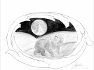
Pretty sweet although very subtle! If you can pull the clouds off in an actual engraving It'll be something to behold. One suggestion, with the smooth surfaces on the hills, moon, and outline engraving, some additional irregular detail (natural outlines) in the hills would add visual interest. The surrounding 'salad work', which flows very nicely could use some spicing up.Just wanted to give an update to the harvest moon bear drawing. I’ve tried my hand at adding some clouds to the scene to break up the sky View attachment 48723
Additionally, there are numerous point errors within the original scrollwork which need to be cleaned up. The bifurcations within the individual elements should always follow the backbone, as should the shading lines.
With regard to this particular design, the backbone from which the scroll originates is the oval which surrounds the design. In this particular circumstance, I see shading lines which follow the inner oval, and then others which tend to diverge and follow outside curves.
Overall, I like the design very much!
Last edited:
JBtheApprentice
Member
Thank you sir! i would love to put this to metal. it’s beyond my current ability to engrave any of this save for the frame. Having a blast drawing tho. cant wait to learn how to make this a realityPretty sweet although very subtle! If you can pull the clouds off in an actual engraving It'll be something to behold. One suggestion, with the smooth surfaces on the hills, moon, and outline engraving, some additional irregular detail (natural outlines) in the hills would add visual interest. The surrounding 'salad work', which flows very nicely could use some spicing up. Overall, I like the design very much!
AllenClapp
Elite Cafe Member
You may find that reducing some of the very long shade lines by adding a few leaf folds will add depth, particularly on the left side and bottom.
I like your attempt at moonlit clouds, JB. Well done
And Goldjockey's suggestion about some details on the hills is another winner.
And Goldjockey's suggestion about some details on the hills is another winner.
