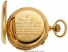
That is up to you! Just pointing it out! As long as you are happy and the customer is happy! As an artist this is up to you! But it helps to have a reason designwise or for space considerations, etc. You will ultimately have to determine if it looks good to you or your customer! Lettering does have certain conventions. Some people have strict ideas about how things should look. Script especially has more artistic license and variability. Vertical letters such as block letters, Old English, ect, that are more geometric have definite rules of proportion and easily show up any design and cutting flaws! Calligraphers and those that design alphabets have a skill that requires extensive study and training. Not always a good idea to drift too far off course! Just my opinion! People who are sticklers will often harshly point out things that are off. Look at the beautiful precise watch inscription that Roger Bleille posted the other day! Close to flawless, well cut, layout and design. The calligraphers provide us excellent premade alphabets to use them wisely, engrave them, and cut them true to form. Here is the title of Roger Bleile's post scroll down. " Inscription on Patek Philippe"
I appreciate and respect your input on this and please know that I value all opinions concerning this art form, being a beginner/rank amateur at this process means that I am gonna make mistakes with it, I did look at the post Roger put up with the watch and am in awe at the skill it took to cut so cleanly at that small size, I have a long way to go.
I also understand the need for uniformity and strict adherence to the established guidelines when cutting phrases or more than one word on an object, that being said, this was a single word (last name on a muzzle loader patch box). Having looked at many examples of signage (Bergling books etc.) I assumed that I was allowed a certain amount of artistic freedom to deviate from the norm in such circumstances.
Again I wish to thank everybody that offered their support and constructive critique (I asked for it) as it is the only way I am going to further my understanding of what is and what is not accepted practices.
Actually there are a lot of occasions for elevating the lower case letters above the baseline, especially if you're just engraving a single name. The height of the piece you are working on may be cramped; especially if you have descender and asscender letters. If the first letter of the name is centered on the piece and you use the bottom of the letter to use as the bottom of the lower case letters, then the descender of the f would be trying to fill the below cramped space while the ascender h would have too much room at the top, throwing the name off balance.
The way TG ll has done this is pretty perfect. It looks balanced. The line below the name, while not usually done, actually reinforces the balance.