Heraldry

Andrew Biggs

Moderator
Joined
Nov 10, 2006
Messages
5,035
Location
Christchurch, New Zealand
This is something a little different for me to engrave. Heraldry is a great area to dabble in and a very traditional format for engravers.

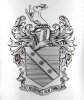
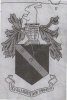
A cigarette case made of Sterling silver with the family coat of arms. The engraving is 50mm high. The horizontal lines on the shield represent blue.

The actual case isn’t completed yet and is now off to the jeweller to finish. Hence the close up photo.

To engrave Sterling silver is a real pleasure and a nice break from 316L stainless watch metal :)

Cheers
Andrew
 

Attachments

  • Crest-Finished-Small.jpg
    Crest-Finished-Small.jpg
    52 KB · Views: 433

monk

Moderator
Staff member
::::Pledge Member::::
Joined
Feb 11, 2007
Messages
10,998
Location
washington, pa
certainly a beautiful job, andrew. tyvm for showing. i once had an excellent book on the subject. i found there was way more to learn than i wanted. how did you do the design ? direct drawing or a transfer ? whatever, it's rather snazzy looking !
 

Andrew Biggs

Moderator
Joined
Nov 10, 2006
Messages
5,035
Location
Christchurch, New Zealand
Thanks for that :)

Monk......The design was reworked considerably as the original was pretty bad. The leaves were dead and lifeless plus the helmet and hare salient were very cartoon like. I also moved the ribbon up on the finished engraving as it was to detached from the shield. I've attached the original that I had to work with and the reworked pencil drawing.

The design was reworked in pencil, outlined in photoshop and transferred. I personally find this way quicker and more reliable than drawing straight to the metal.........having said that. I also draw directly onto the metal over complex shapes.

Cheers
Andrew
 

Attachments

  • Original-Crest.jpg
    Original-Crest.jpg
    70.7 KB · Views: 385
  • Reworked-Drawing.jpg
    Reworked-Drawing.jpg
    65.5 KB · Views: 385
Last edited:

speeedy6

Elite Cafe Member
Joined
Sep 16, 2013
Messages
275
Andrew , I never thought a bunny rabbit could look regal but yours does . Thank you for showing the progression from original to finished work and explaining it all along the way. That's what I like to see, I think it helps me to see your thought process so I can improve mine.
 

DakotaDocMartin

:::Pledge Member:::
::::Pledge Member::::
Joined
Oct 15, 2007
Messages
1,839
Location
Grand Forks, ND
Deo adjuvante non timendum

Deo adjuvante non timendum

Literally, "With God helping, it should not be feared". (With the help of God there is nothing to be afraid of)

But, the correct spelling is: timendum, with an "e". :eek:
 

monk

Moderator
Staff member
::::Pledge Member::::
Joined
Feb 11, 2007
Messages
10,998
Location
washington, pa
Thanks for that :)

Monk......The design was reworked considerably as the original was pretty bad. The leaves were dead and lifeless plus the helmet and hare salient were very cartoon like. I also moved the ribbon up on the finished engraving as it was to detached from the shield. I've attached the original that I had to work with and the reworked pencil drawing.

The design was reworked in pencil, outlined in photoshop and transferred. I personally find this way quicker and more reliable than drawing straight to the metal.........having said that. I also draw directly onto the metal over complex shapes.

Cheers
Andrew
tyvm, andrew. interesting how one can make a ho-humm design just come to life. you've certainly done that here !
 

Doc Mark

~ Elite 1000 Member ~
Joined
Nov 16, 2006
Messages
1,284
Location
Hampton, Virginia
Lovely shading, as always, Andrew. I too like the way you turned the magicians puny little bunny into the " Killer Hare Rampant" of the famed Monty Python "Quest for the Holy Grail".
 

Latest posts

Sponsors

FEGA
Top