Critique Request Knife guard scroll design

vanLanen

Member
Joined
Jan 2, 2021
Messages
36
Location
Siebengewald, The Netherlands
Hello folks!

after my previous drawing I posted it was back to the drawing board, literally.
I think I was too happy with the fact that I was able to complete some kind of design and therefore didn’t see how mediocre it actually was.
also I think that something was holding me back when drawing or trying new things, but after more hours of studying and practice, I feel like that became less of an issue.
here is a new design I’m working on, it’s only sketch, but wanted to hear what I can improve on before continuing.
Thanks,
-Thomas
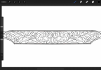
12E03817-21BB-4C26-9528-060CAA9903DD.png
 

monk

Moderator
Staff member
::::Pledge Member::::
Joined
Feb 11, 2007
Messages
10,962
Location
washington, pa
your scroll spines need improvement. such would be a good starting point. i also think the design puts too much emphasis on the leaves.
 

vanLanen

Member
Joined
Jan 2, 2021
Messages
36
Location
Siebengewald, The Netherlands
your scroll spines need improvement. such would be a good starting point. i also think the design puts too much emphasis on the leaves.
Thank you for your input Monk, could you also tell what I can improve on the spines? maybe a bit thinner? As for the leaves, I was aiming to put the emphasis on them, so I guess I succeeded there.
 

monk

Moderator
Staff member
::::Pledge Member::::
Joined
Feb 11, 2007
Messages
10,962
Location
washington, pa
perhaps it's just my eye, but the scroll seems to be a bit flat. the leaves do show good flow, it is just my own personal opinion on the emphasis on the leaf structures. attempting to satisfy everyone is a daunting task for sure. the real deal is to cut with good execution.
 

vanLanen

Member
Joined
Jan 2, 2021
Messages
36
Location
Siebengewald, The Netherlands
perhaps it's just my eye, but the scroll seems to be a bit flat. the leaves do show good flow, it is just my own personal opinion on the emphasis on the leaf structures. attempting to satisfy everyone is a daunting task for sure. the real deal is to cut with good execution.
I will keep an eye out for your pointers.
Yes I do have the habit of wanting to satisfy everyone, unfortunately this is seldom possible.
Cutting with good execution is also on the list, but I'm thinking I first need to learn how to properly apply shading in the right areas.
 

dcurrie911

Elite Cafe Member
Joined
Jul 13, 2012
Messages
265
I actually agree with both. A little too leafy for me but still a nice design. My concern though is the ‘cut-ability’ of it. Your leaf folds are so narrow, so close to the outer edge of the leaf that I fear they will merge when you cut them. Won’t know until you transfer to metal and put a graver tip down. I am curious to see the results.

Dan
 

vanLanen

Member
Joined
Jan 2, 2021
Messages
36
Location
Siebengewald, The Netherlands
I actually agree with both. A little too leafy for me but still a nice design. My concern though is the ‘cut-ability’ of it. Your leaf folds are so narrow, so close to the outer edge of the leaf that I fear they will merge when you cut them. Won’t know until you transfer to metal and put a graver tip down. I am curious to see the results.

Dan
Thank you for your input Dan, Im afraid you might be right, I think that I got carried away drawing and forgot the size I was designing it for. This will be a huge challenge, if not impossible for me to cut now , I have almost zero cutting experience, besides a few practice scrolls and lines. I need to improve my workbench/turntable/body position before I can spend some serious time cutting. I’ve had more surgerie and broken bones then I can remember, so comfort comes first for me.
I’ll save this design for when I get some more experience and will start a new one which will be a bit easier to cut.
thanks
 

Goldjockey

Elite Cafe Member
Joined
May 17, 2018
Messages
276
It's a lovely design. The unbroken areas of the scrolls - from the knobs and thumbs back to the more well defined leaves (which again are quite lovely) - present an interesting challenge to shade. I think if I were shading it, I would simply add some simple leaf fold overs to break up those long sections a bit to provide a bit more depth and open the door to additional shading opportunities.
 

vanLanen

Member
Joined
Jan 2, 2021
Messages
36
Location
Siebengewald, The Netherlands
It's a lovely design. The unbroken areas of the scrolls - from the knobs and thumbs back to the more well defined leaves (which again are quite lovely) - present an interesting challenge to shade. I think if I were shading it, I would simply add some simple leaf fold overs to break up those long sections a bit to provide a bit more depth and open the door to additional shading opportunities.
Thank you Sir, yes shading... that’s another thing. Never been really good at it, that’s a bit of problem of course with these kind of drawings where it’s critical. I tried shading a few pieces but it start to look messy and clumsy real quick. But I’m learning and still studying, doing things in baby steps. I’m on the verge of purchasing Sam’s video on shading though.
could you maybe explain a bit more about the leaf fold overs to break up the large sections you are referring to?
thanks again.

I appreciate all the really valuable feedback you guys are giving.
 

monk

Moderator
Staff member
::::Pledge Member::::
Joined
Feb 11, 2007
Messages
10,962
Location
washington, pa
Thank you for your input Dan, Im afraid you might be right, I think that I got carried away drawing and forgot the size I was designing it for. This will be a huge challenge, if not impossible for me to cut now , I have almost zero cutting experience, besides a few practice scrolls and lines. I need to improve my workbench/turntable/body position before I can spend some serious time cutting. I’ve had more surgerie and broken bones then I can remember, so comfort comes first for me.
I’ll save this design for when I get some more experience and will start a new one which will be a bit easier to cut.
thanks
do the same design, same size, etc on a chunk of brass, or whatever the guard will be. don't jump in on the real piece just yet. that will show your areas that need adjusting without xperimmenting on a real job. others may not agree with this, but it seems you could use a little on-hands experience. good luck
 

Leland Davis

Elite Cafe Member
Joined
Nov 22, 2014
Messages
548
Location
Wells KS
Do what monk suggested cut it on a practice plate over and over trying different shading till you get it right. It will improve your cutting skills and won't ruin your guard and will show you where to refine your design. When you get to the point you can cut and shade that design you will be well on your way.
 

AllenClapp

Elite Cafe Member
Joined
Aug 7, 2019
Messages
399
Location
Raleigh, NC
It's a lovely design. The unbroken areas of the scrolls - from the knobs and thumbs back to the more well defined leaves (which again are quite lovely) - present an interesting challenge to shade. I think if I were shading it, I would simply add some simple leaf fold overs to break up those long sections a bit to provide a bit more depth and open the door to additional shading opportunities.
Great point about breaking up the long lines. Sam Alfano's Advanced Shading Video illustrates that very well.
 

Goldjockey

Elite Cafe Member
Joined
May 17, 2018
Messages
276
Thank you Sir, yes shading... that’s another thing. Never been really good at it, that’s a bit of problem of course with these kind of drawings where it’s critical. I tried shading a few pieces but it start to look messy and clumsy real quick. But I’m learning and still studying, doing things in baby steps. I’m on the verge of purchasing Sam’s video on shading though.
could you maybe explain a bit more about the leaf fold overs to break up the large sections you are referring to?
thanks again.

I appreciate all the really valuable feedback you guys are giving.
I’ve attached a piece of your drawing with overlays to give you an idea of what I’m seeing for potential foldovers (red) and shading (blue). The original image was pretty low resolution, so a little difficult to shade, but it should convey the idea.
 

Attachments

  • CB32B412-29AE-464D-86BC-911A575DBA2B.jpeg
    CB32B412-29AE-464D-86BC-911A575DBA2B.jpeg
    43.9 KB · Views: 39
Last edited:

vanLanen

Member
Joined
Jan 2, 2021
Messages
36
Location
Siebengewald, The Netherlands
Thank you Michael! I appreciate that you took the time to make a example, and with so much detail. very nice touch indeed to break up the long backbone. Also your shading example will help me a lot, its like a tailored reference.
again, many thanks.
 

Goldjockey

Elite Cafe Member
Joined
May 17, 2018
Messages
276
Thank you Michael! I appreciate that you took the time to make a example, and with so much detail. very nice touch indeed to break up the long backbone. Also your shading example will help me a lot, its like a tailored reference.
again, many thanks.
You're quite welcome! I second the suggestion to get Sam's video on shading. It will be well worth the investment.
 

Latest posts

Sponsors

FEGA
Top