You are using an out of date browser. It may not display this or other websites correctly.
You should upgrade or use an alternative browser.
You should upgrade or use an alternative browser.
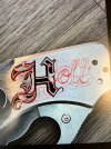
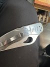
Critique Request Holt script
- Thread starter KyleMontoya
- Start date
Matthew Evans
Elite Cafe Member
- Joined
- Jul 8, 2017
- Messages
- 410
.
Last edited:
KyleMontoya
Member
I take a picture and then draw over the image using an iPad with the program procreate.what brand RED marker do you use please?
KyleMontoya
Member
I appreciate the input, I think I’ll start over.I’d say the sizing of the h is a little big to my eye compared to the other letters height. -Ymmv
AllenClapp
Elite Cafe Member
IF I understand your red lines correctly, it looks like you may be wanting to make the small letters in the name look three dimensional. If so, that maylook odd next to a capital H that is clearly a flat two-dimensional letter, unless you also add a little to the H to make it look more three dimensional.
i simply don't like the combination you show here. i'd say start over


