Colt45 project

shonn

Member
Joined
Apr 26, 2007
Messages
38
Location
Layton utah
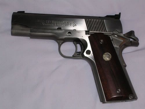
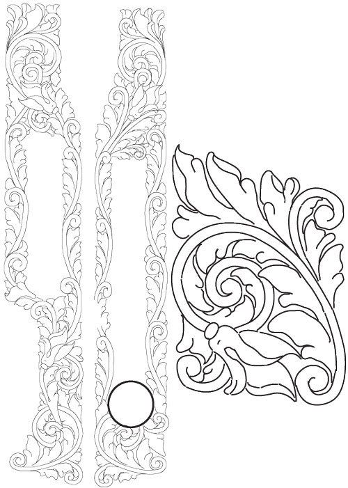
This is the new gun I am going to engrave. Colt 45 Slider
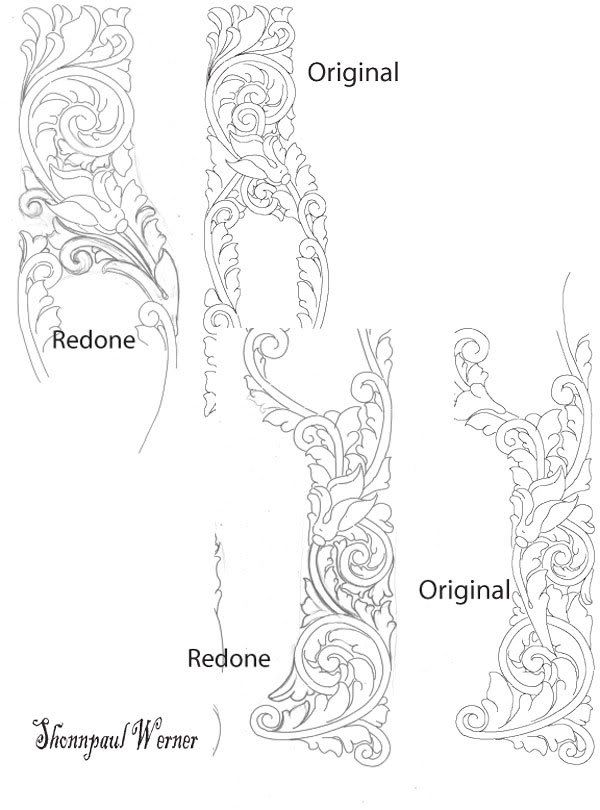
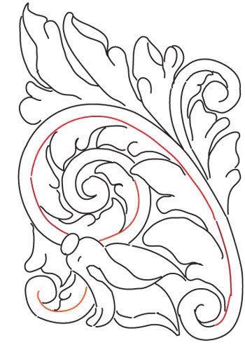
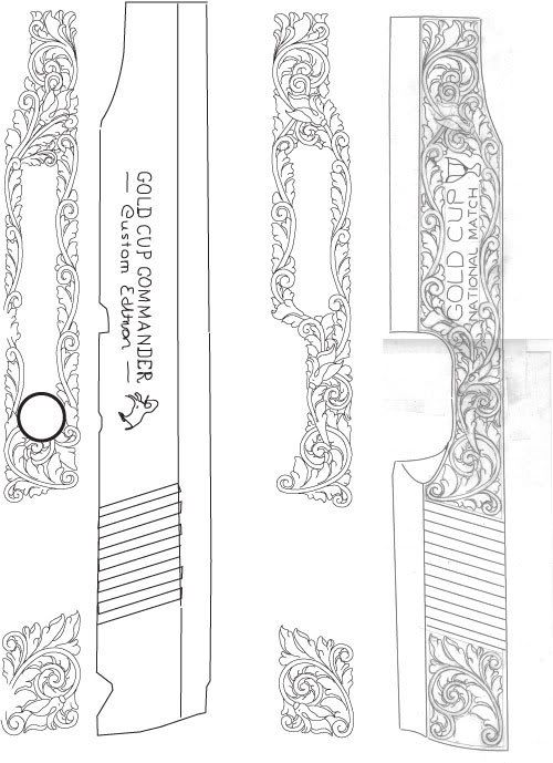
Here is the scroll I just made up for it(took about 8hr to work up the design)(is this a long time?)(includes smoke pull and puting it into my computer and re drawing it in adobe illustrator and Vectoring the image)
if you have any advice on it please share I would like to get or have others see mistakes or things you don’t like before I put it on the gun. (Easier to change the drawing) since I did my 12 gauge shotgun I have been focusing on the scroll work and trying to take advice and make the adjustments hope it shows in this design.
I will still be working on the handle in the next few days (design the scroll for it).
yes i will be shading it in later when i cut it in the gun.
and yes this is one of my fathers gun's he is allowing me to work on (2d practice piece) he is a very giving person.( of corse he gets to keep the gun when i am finished)


Last edited:

dclevinger

Elite Cafe Member
Joined
Nov 9, 2006
Messages
267
Location
Arvada, CO
Really big step. The whole slide is pretty hard. If you don't have carbide gravers yet, you will want to get some. HSS gravers will go about .050" before they get dull or break the tip. Try a test cut on the under side of the slide and you'll see what I mean. Good luck.

David
 

Andrew Biggs

Moderator
Joined
Nov 10, 2006
Messages
5,034
Location
Christchurch, New Zealand
Hi Shonn

Good on you for giving it a go. Well done…….â€who dares wins†You will learn a lot by doing this project. At this stage I wouldn’t worry about how long the design takes. I’m presuming that it’s a labour of love so take your time with it and make any adjustments that are necessary………..even if it means re-drawing several times.

Just remember that your Dad is going to proudly show this to all his friends…..so make sure it’s the very best you can do on the day. Take your time with the cutting as well.

There are a couple of things that I would draw your attention to in the design. . Please bear in mind that these things are only my opinions and others may see things differently. If you don’t like what I have to say then let me know and I’ll remove them.

1. On the large version of the scroll it seems to be over extended and gives the appearance of the backbone being flat. It would look nicer if a lot more curved. Perhaps there is room for one or two more scrolls instead of the big leaves.

In general a lot of your lines seemed to be very over extended and if you aren’t very careful they will start looking flat. They also have a tendency to dominate the design. I would look at the long scrolls you have at the top and bottom of the lettering. Perhaps break them down to smaller and more curved scrolls. These types of lines give the impression that you are trying to fill an area as fast as possible.

Have a good hard look at your scroll proportions.

The lesson here is…… instead of big over extended scrolls and leaves try to keep breaking your work down into smaller units.

A very handy thing to have is a scroll template from GRS or N-Graver. You can use them directly or use them to check the proportions of your scroll. I would highly recommend that you buy and use them. They are not cheating………..they are just another useful tool to have in your arsenal of engraver tricks!!!!

2. With your scrolls………are you going to cut both sides of the backbone? If you are be very careful as this can sometimes separate the leaves from the backbone and not look all that good. It suits some styles better than others. Have a look at Ron Smiths book and you’ll see what I mean.

3. Will you be doing any background treatment like relieving and stippling etc? Again this will have a big impact on the design as it will show up the background a lot more aggressively. If you want to see how the background will affect the foreground then pencil it in and you will immediately see the change. It will also affect what side of the line you should cut.

4. I like the buds in the design and I think they add a very pleasing element.

5. Your leaves. Some are good and others not so good. There is nothing wrong with a round leaf but you seem to have rounded some off to the point that they no longer resemble a leaf.

6. There are some small scrolls growing out of nowhere. They just seem to be there for the sake of it and to fill a space. At the end of the lettering where the small picture of the cup is you have two small scrolls going in opposite directions that look to be there for no purpose.

Now in saying all that……………..you are doing very well, but I think that right now you are capable of a lot better. I very much like your enthusiasm and willingness to take on hard projects.

Cheers
Andrew
 

shonn

Member
Joined
Apr 26, 2007
Messages
38
Location
Layton utah
ok let me see if i got it better.
i did some addjustments on the scroll.
but i do like around the letter box the long scroll i think it looks good but i can allways make more adjustmenst on that later.
 

Mike Bissell

Elite Cafe Member
Joined
Nov 11, 2006
Messages
492
Location
Ludington, MI
I like your redone scrolls better. I think you should look at more scroll drawings before you cut the inside of the scroll. Most will show the leaves flowing into the inside line and the inside line will be broken up instead of a continuous line. Also try a drawing with either fewer leaves or smaller ones and more negative space, just for comparison. You’re doing the right thing by studying your drawings before you cut the metal.

Mike
 

shonn

Member
Joined
Apr 26, 2007
Messages
38
Location
Layton utah
By the way the Orange line is just there for reference in the scroll spine its there for a reference point when I shade in my lines I stop shading at the orange line it helps me ( still new ) but shading is one of the things I am working on right now. any ways thats the idea. maybe i need to change things... oh as i look at it the black spine on the other side where the leafs come down should be Orange also

 
Last edited:

Markofx

Member
Joined
Jan 6, 2007
Messages
56
scroll design

Hi Shonn,

Your design is comming along great! just try this in designing your scroll back bones. Take some round templetes and fit the one over the scroll you've just drawn. Mark the vertical and horizontal lines and draw the ninety degree lines thru the circle. This will give you some idea as to the spacing of the lines rotating out from the center. I found that scrolls drawn freehand are difficult to keep symmetrical at first, and templetes will give you an area to draw to.

Good luck,
Mark
 

Latest posts

Sponsors

Top