Please comment this piece

vilts

Elite Cafe Member
Joined
Apr 8, 2007
Messages
512
Location
Estonia
Hey all,

Lately I've been rather busy trying to get a hang of engraving and I must say that the more I engrave the more I like it and the more my respect grows for you guys, because designing a beautiful flowing design and then executing it flawlessly takes just tremendous amount of work.

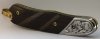
Here is one side of a knife that my father made and I engraved. Please tell me your honest opinion about it - how is the engraving, shading, relief work, design and everything else that I can't even think about (if you happen to see any good things then maybe tell these too, then I'd know that I got at least something right ;) ). Sorry about the photo quality, I don't have my macro lens at hand, so this is as good as it gets right now.

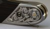
First thing I noticed (after completing the engraving, of course) was the leaf that the arrow points to - it seems very out of place that way, right? Maybe it should grow the other way or... or something like that?

Viljo
 

Attachments

  • full length.jpg
    full length.jpg
    87.8 KB · Views: 376
  • bolster.jpg
    bolster.jpg
    105.2 KB · Views: 310

TallGary

Elite Cafe Member
Joined
Mar 16, 2007
Messages
208
Location
Plainfield, Illinois
Viljo,

I'll ask a question which may help you find the answer to your leaf direction question -- where is the vine growing from?

I see three ends but have trouble locating the beginning. There is a leaf to the left of the one you indicated and a leaf just above that one also that look like they are flowing against the direction of growth.

The relief looks good and I like the way the design flows. All in all, much better than any of my early attempts.

Keep at it! I think you have the spark and desire to do well!

Gary
 

KCSteve

~ Elite 1000 Member ~
Joined
Jun 19, 2007
Messages
2,882
Location
Kansas City, MO
Viljo,

Well, you hit right on the 'power points' of the rule of thirds from photography (divide the image into thirds in both directions and the intersections are the power points).

I agree with TallGary - I think there's a question of 'flow'. The scroll around the pivot pin is consistent, except at the far left end where the leaf goes the other way. The offshoot vine down around the bolster screw also has its leaves pointing backwards. And, of course, the leaf you asked about goes against the grain of the others.

Thanks for posting this! As I start to advance from the simple geometrics I can (pretty well) do now I know I'm going to do the same things. Hopefully I'll remember this thread when I'm doing my layouts and make sure I've got consistent flow.

Good looking knife, btw - care to add some more shots of the knife as whole (including the blade)?
 

vilts

Elite Cafe Member
Joined
Apr 8, 2007
Messages
512
Location
Estonia
Gary and Steve, thanks for your comments on design. Now that you pointed out these points I can look with new eyes and to tell the truth, it looks rather messy. Half of the leaves are in one direction, other are to the other...

About the rule of thirds. I think it came unconsciously, as my second (or third, or fourth, not sure about it) profession is being (wedding) photographer and there I use this rule quite a lot.

Gary, could you please explain little bit more what you mean about vines not having a beginning, I'm not sure I quite understand it. Some example photos would be great.

Steve, knife is not yet finished, but when I finish it and it's fully assembled I'll definitely post some photos here too.

Thanks for comments!
Viljo
 

JBrandvik

Elite Cafe Member
Joined
Jan 6, 2007
Messages
268
Location
Bandera County, Texas
Viljo,
I see several things you have done right. Your deep background relief shows evidence of a very steady hand. You managed to keep your bright cuts fresh (no noticable knicks in the borders of you design). That's very difficult and you managed it well. Your leaves have good form and dimension. Your cuts appear very clean and bold.
I do agree with Gary also. Nature tends to be very logical in determining the beginning and end of plants. Sometimes it is very tempting to bend the laws of nature in order to fill in a big blank space. I'm sure we are all guilty of this.

Thanks for posting your work. Keep cutting!
Looking forward to seeing your progress.
 

sam

Chief Administrator & Benevolent Dictator
Staff member
Joined
Nov 6, 2006
Messages
10,542
Location
Covington, Louisiana
Viljo, you're doing great! Deep and bold with crisp and bright walls that would delight McKenzie (he emphasized this many times). Congratulations!!
 

monk

Moderator
Staff member
::::Pledge Member::::
Joined
Feb 11, 2007
Messages
11,007
Location
washington, pa
very clean for the level of depth that you have gone to . nice cutting. i don't find fault with the design, but i also like things that are unusual, which this is. i like this very much. it's bold !
 
Joined
Jul 20, 2007
Messages
46
Aloha Viljo,
My very first thought when I opened the large version of the close-up photo was how beautifully bright your cuts were, and how carefully you had backgrounded the relieved areas so as to not ding thr brightcutting. I also like the way the small leaf in the tight lower corner breaks through the border slightly.

I think if the leaf you mentioned grew from the stem above it, the design would seem "logical," that is, your eye wouldn't backpedal when it is following the design.

A solution to the "Start/stop" problem Gary (insightfully) mentions might be to start the design from the screw. That is, let the stem of the scroll develop out of the circle around the screw.

Thank you for sharing the picture.

Aloha,
Robert Booth
The Koa Bench Goldsmith
 

vilts

Elite Cafe Member
Joined
Apr 8, 2007
Messages
512
Location
Estonia
Thank you guys for kind comments and suggestions about design. I updated the design according to what you said and you can see the final result (second side of that knife) soon, I'm about 60% done with cutting and I got my macro lens, so you can see what there really is.

Actually one of many things that I remembered well from Sam's class was that the sides on relief engraving must smooth and shiny and when he cut one example leaf on my practice plate (just 2 perfect cuts) I had good example to learn from.

Hey, at least I got something right :)
 

Andrew Biggs

Moderator
Joined
Nov 10, 2006
Messages
5,035
Location
Christchurch, New Zealand
Looks really good Vilts. Well done.............just keep at it as much as you can. Who needs sleep anyway!!!!!

One suggestion I do have purley from a photo point of view is that a bit of blackening agent rubbed into the engraving would help the contrast of the photo.

Cheers
Andrew
 

vilts

Elite Cafe Member
Joined
Apr 8, 2007
Messages
512
Location
Estonia
Looks really good Vilts. Well done.............just keep at it as much as you can. Who needs sleep anyway!!!!!

One suggestion I do have purley from a photo point of view is that a bit of blackening agent rubbed into the engraving would help the contrast of the photo.

Cheers
Andrew

Actually these bolsters will be blued and French grayed, if I get a hang of how to do it properly. Right now it's still a work in progress.

But another question came up as you suggested using blackening agent. If, then how do you guys blacken relief engravings? I mean if I just cover it with black paint and the rub some of it off, then all those beautiful bright cuts will be lost, everything will be just deep black... Or is it meant to be like that? It would be great if I could just blacken the shading lines and nothing else, but that's probably asked too much?

Viljo
 

Marcus Hunt

~ Elite 1000 Member ~
Joined
Nov 9, 2006
Messages
1,799
Location
The Oxfordshire Cotswolds, England
Vilts, very nice cutting and relief work.

It's been pointed out that the flow is wrong and the leaves are growing from all directions which gives a messy look. Try to think of scrollwork as a stylized plant. Take a tree and think of how it forms; there is a trunk from which grow branches, then twigs and finally leaves. In scrollwork we follow the form anf rules of nature i.e. a twig grows from a branch never a branch from a twig. If a scroll is forming (growing) in one direction whatever comes from it grows in the other direction. However, this rule can be bent slightly when you fully understand the basics of scrollwork and it's construction.

If you haven't got a copy already try and get hold of and study fully Ron Smith's "Advanced Drawing of Scrolls". This book is a wealth of information and will get any novice on the way to understanding the construction of scrollwork and what you should be aiming for.

You seem to have excellent graver control, now you just need to polish up on scroll formation. Well done and keep cutting.
 

Andrew Biggs

Moderator
Joined
Nov 10, 2006
Messages
5,035
Location
Christchurch, New Zealand
Hi Vilts

The reason I suggested blackening agent is for the photo only. What it does is fill the cuts which can help make them more visible in a photograph. You could try filling the shade lines only by smearing a bit of black with your finger tip. Just enough to get into the cuts only. I sometimes do that when I'm working on something just to see what's going on with the cutting.

It can always be removed later with a bit of acetone or something similar.

The blackening agent can be anything if it's temporary, or if you wanted something more permanent for a job then a flat/satin oil based paint or Speedball oil base block printing ink. Or whatever you can get in Estonia.

As far as "having to blacken the cuts and background".......the answer to that is, it's personal preference. Some do and some don't. There’s no rule that says you have to.

Some engravings are enhanced because of the blackened background because it adds contrast. Other work is enhanced by not having any black and just letting the various shades and shadows of the steel give the appearance that the engraver wants. As you say…….why go through all that trouble to get bright sparkly cuts only to blacken them.

My best advise is to play around and experiment and see what you like doing the best.

Hope this helps

Cheers
Andrew
 

coincutter

Elite Cafe Member
Joined
Jan 30, 2007
Messages
235
Location
Pleasantville Iowa 50225
One of the intersting things you learn when doing any type of design work is that the human mind leaves a lot to be desired as a tool. In short it over looks obvious irregularities if you stare at a piece for too long. After you have you idea down on paper - regardless of what its going on - hold it up in front of a mirror and look at it right side up upside down etc. Then the areas which need work become more apparent as it becomes a totally new image to the senses. This process works well in any art form. Sometimes just walking away from the design for a day or two makes all the difference.
 
Top