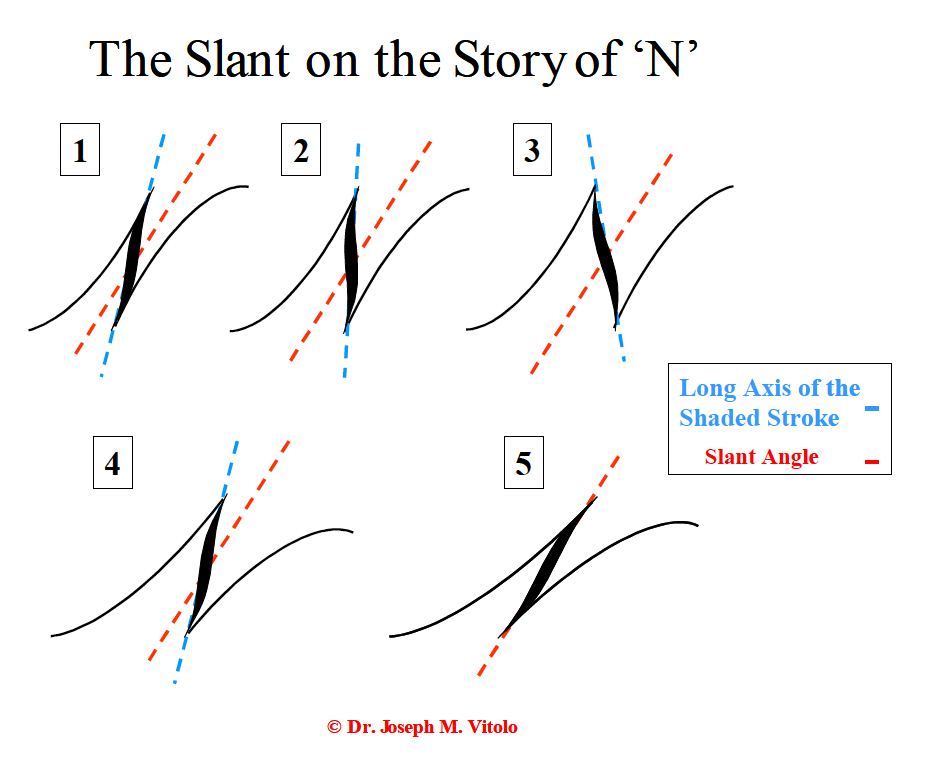
The following was taken from my tips on script and can be found in my Workshop Handout. Depending on the letter exemplar forms you are using there are a few capital letters that can be particularly problematic, one is the 'N' and the other is 'D'. Here I will examine the letter 'N'.
Joe Vitolo
I will discuss The Slant on the Story of N. My personal preference is to start with the left hairline stroke working from the baseline and proceeding upwards to the top line. I usually use a slant angle of approximately 52 degrees. Find a slant angle you find comfortable and stick with it. Now back to N. I will next move the paper so it is vertical in front of me. The shaded stroke is next. I like to make this stroke almost vertical with the lower point just to the left of completely vertical. I then finish with the final hairline starting from the baseline and proceeding up keeping it on the slant angle. My computer generated model pictured in the image posted in the next message illustrates the effects of varying the vertical angle of the shaded stroke and/or the angle of the hairlines. My personal preference is for Form #2 and to a lesser extent Form #1. Notice how even small changes can have a big effect on the appearance of the letter. When keeping the hairlines on the main slant angle, varying the vertical angle of the shaded stroke will either flatten or fatten the letter depending upon the position. Form #3 is a little too obese for my tastes. Form #4 with both hairlines and shade off the slant angle just looks off to my eyes. Lastly, Form #5 is your classic tilting till it falls over cap N. This form imparts lots of tension in the appearance to my eyes. Best to experiment and learn.
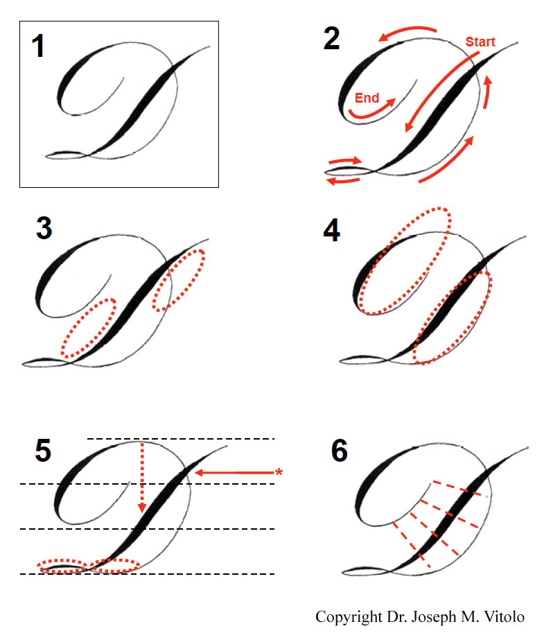
I mentioned in my last post that two capital letters often prove to be problematic in script writing, D and N. I addressed the 'N' in my previous post. In this post I will address the 'D'. This information is available on my workshop handout.
The Key of D
Forming any letter consistently well requires precise knowledge of not only the pen strokes involved but also the structural components that help form the letter. Of course, some letters are harder to pen than others. In this installment I would like to discuss the challenge that is the Engraver's script capital 'D'.
A properly formed 'D' is shown in Figure 1 (penned by the author). The direction of the pen strokes forming the letter are shown in Figure 2. Begin as indicated by the ‘start’ with the main shaded compound curve. Think of this as the backbone of the letter. It should be noted that The Zanerian Manual* suggests forming the letter in one continuous stroke as indicated. My own approach to forming this letter involves using separate strokes; however, that is beyond the scope of this article. To understand how to properly form the letter we will break the letter into the structural components that help form it.
The initial stroke is a graceful compound that extends three full line spaces. As I have explained in past articles, the compound curve is formed on imaginary ovals that have their overall slant dead on the main slant angle as shown in Figure 3. As the stroke hits the baseline it extends back in a gently curving oval that continues around and forward to 1 form a delicate oval before sweeping first downward then upward to form the forward portion of the 'D'. Keep in mind the final form. By this I mean that both the forward and rearward portions of the letter are form by two imaginary ovals indicated by red dotted lines in Figure 4. Achieving this result is dependent on how the lower portion of the letter is formed. Note how the lower portion of both the rear and forward curvatures are formed on nearly identical imaginary ovals that are horizontal to the baseline (red ovals in Figure 5). Or to say it another way, 'the way you curve in is the way you curve out.' This will help impart the proper upward trajectory to the forward hairline portion of the 'D' without it getting too wide or too narrow.
The forward hairline of the 'D' continues 'curving' gracefully upward and should intersect the compound curve at or slightly above the top of the first ascender space as indicated by the red arrow in Figure 5. Continue the graceful curvature back. If done correctly, the maximal height of this curvature will be no higher than the top of the second ascender space as indicated by the upper most line in Figure 5. In addition, this height of curvature should be located approximately over the center point of the main compound curve as indicated by the downward pointing red dotted arrow in Figure 5.
Place a rear shade as the curve descends in the rearward portion of the 'D'. Be careful to make this rear shade less wide than the main compound curve of the letter. Continue the stroke around and up to end in a hairline that should be should be parallel and harmonize with the forward hairline portion of the 'D' as shown by the red dotted lines in Figure 6. The completed 'D' should have an overall form consistent with Figure 1.
Go ahead and try your hand at the letter. Be sure to compare it to the exemplar. Then pencil in the imaginary component ovals of your letter as I have done. Make adjustments as necessary. I tried to show with this article that the Key of 'D' is rests in the ovals!
Regards,
Joe Vitolo
*IAMPETH has long considered The Zanerian Manual as the bible (small ‘b’) for script writers and Engrosser’s. It is not an expensive book and I think it would be a worthy book on the shelf of an Engraver.
Muchas gracias por la aportacion, exelentes letras, estoy haciendo un nuevo proyecto con unas incrustaciones en oro, cuando las tengas listas pongo unas fotos, saludos....
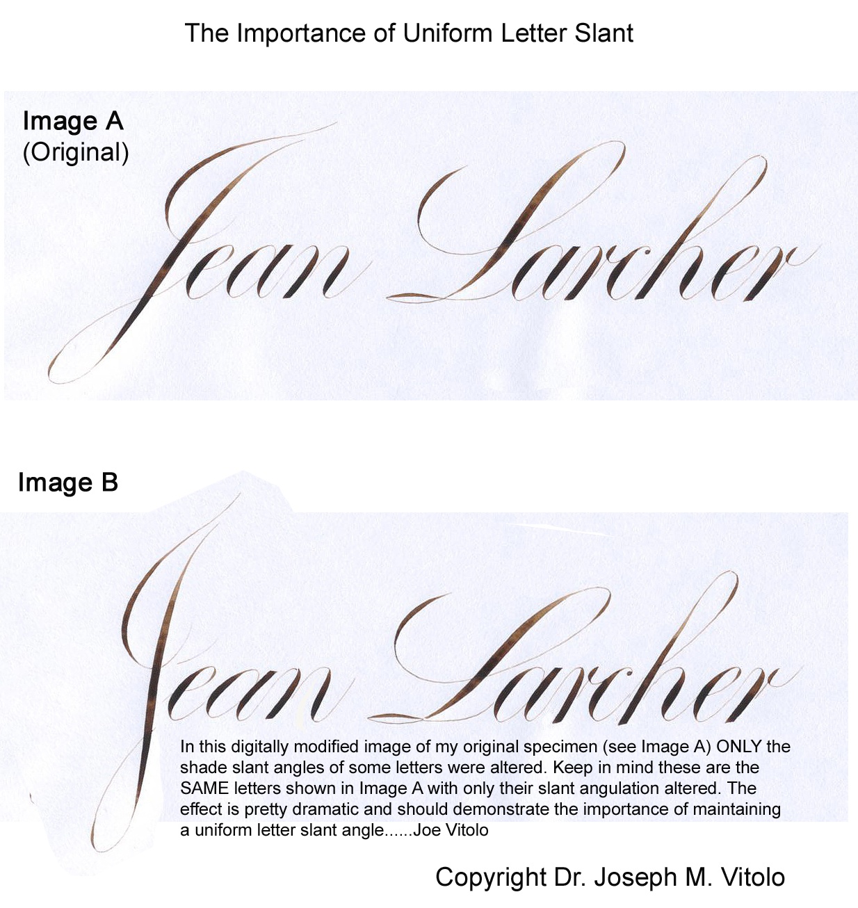
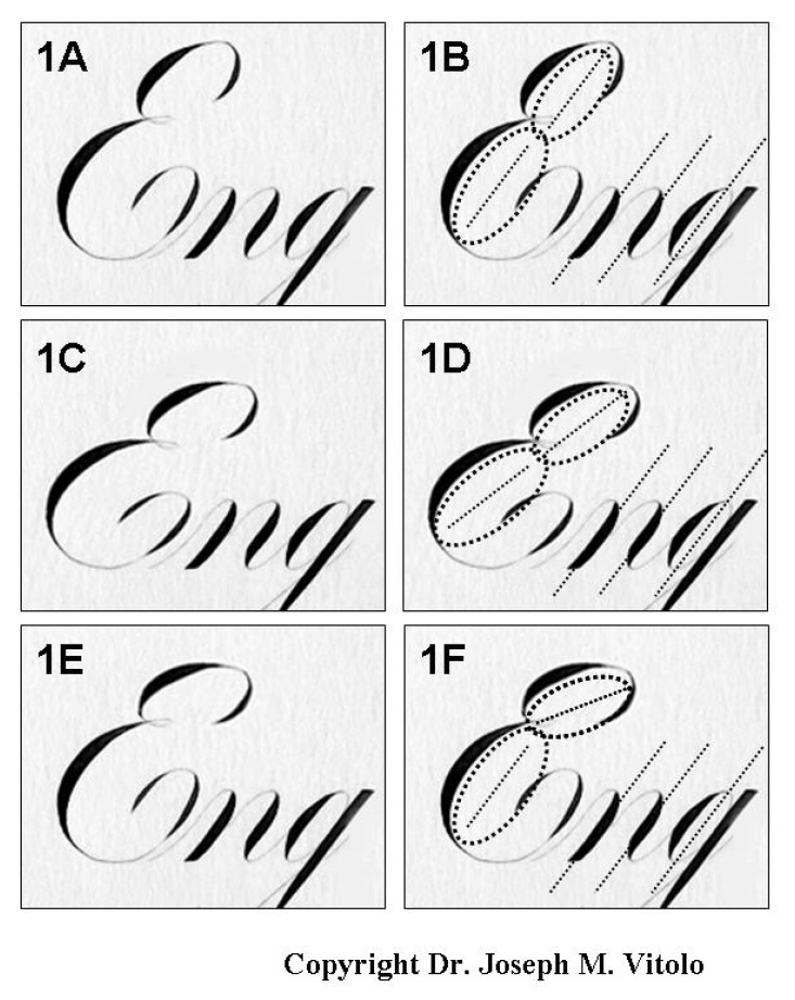
One of the most important aspects of good script writing is maintaining consistent slant angle. Please note that I said slant 'angle', singular, not slant angles. Even the best letter forms will be held hostage to the glaring inadequacies of inconsistent slant angles. While such consistency requires much practice, there are some letters that can be more problematic in this regard. One such letter is the capital 'E'. I have seen examples of the letter either too erect or too slanted. In either case the harmony of the letter slant angle is disrupted.
Let us examine all the letters shown in Figure 1A. Their respective slant angles are in fact all parallel. This means that there is one overall slant angle. In order for us to understand how to consistently achieve a properly slanted 'E', we must break the letter into its component parts.
The Capital 'E' is essentially two ovals stacked one atop the other (Figure 1B). In fact, when I approach making the 'E', I basically attempt to form two individual ovals that happen to be connected by a loop. Of course, the top oval is slightly smaller than the bottom oval. Please refer to my previous LFA article dealing with the importance of the oval. I cannot overstate the importance of learning how to make correct ovals.
The 'secret' is that each of these imaginary ovals have their long axis on the slant angle as shown in by the dotted straight line bisecting the dotted oval in Figure 1B. Thus the main axis of the 'E' overall is on the same slant angle as the other letters and contributes to the perceived consistency of the slant angle.
Now let us examine some common mistakes when making this letter. Figure 1C, shows a digitally modified 'E' with the letter leaning/tilting drastically to the right. To the untrained eye the letter might appear ok. However, it is my hope that after all my ranting on ovals and slant angles that the problem will be glaringly obvious to your eye. Notice how the visual harmony is compromised when compared to figure 1A. Remember that this is exactly the same letter pictured in Figures 1A and 1B. I just tilted it using some electronic wizardry. No, I am not Harry Potter. Notice that while both imaginary ovals are on the same slant with respect to one another. Yet they are way off the main slant angle. Therefore, they are out of synch with the rest of the other letters (Figure 1D).
Another common error is demonstrated in Figure 1E, namely an 'E' made with the top and bottom imaginary ovals formed on different slant angles (Figures 1F). This actually compounds the issue since it not only skews the overall letter slant but also results in a poor letter form. Note how the letter appears compressed at the top.
The concepts discussed above should be addressed in practice sessions. This is because practice allows us to evaluate our work and make corrections to form when necessary. Writing high quality script requires a focus and rhythmic flow that would be impeded by worrying about imaginary ovals.
The best approach for practice is to use guidelines. I believe that one should practice script with ALL the guidelines possible. The exception would be very experienced script writers. I personally use a complete set of guidelines for practice sessions. These guide sheets include properly drawn slant angles spaced at regular intervals depending upon the size of the script. The particular angle depends on your preference. Angles of 52 or 55 degrees are often mentioned in instructional texts. Pick one and stick to it.
Once you have your practice sheet start making capital 'E's. Just write them as you naturally would. Do not worry about imaginary ovals and their slant angles until after finishing about 10 letters. Once done, simply draw the imaginary ovals over your letters as I have done and compare their slant angle to the actual slant angles of your guide sheet. Make changes in your technique as necessary and follow it up with lots of practice.
Needle Stitch Script is an historical variant of the lower case letters. The lower case letters are interrupted at or just below the mid-point of the x-height.
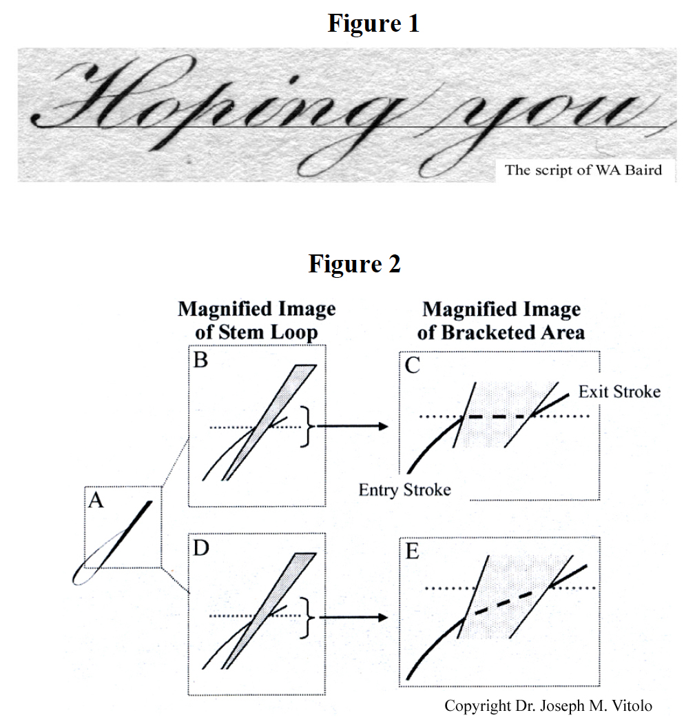
I would like to examine the baseline crossing on descender stem loops. For the remainder of this chapter, anytime I use the term ‘stem loop’, I will be referring specifically to the descender stem loop found in letters such as ‘g’, ‘j’, ‘y’ and ‘z’. Figure 1 (script from Willis A. Baird), illustrates a typical descender stem loop in Engrosser's script. However, before I continue I would like to take this opportunity to thank everyone for indulging my ‘rants’ on letter form analysis. It is my hope that this series has been helpful to the reader/student of this beautiful art form.
To set up this discussion we need to consider letters immediately following descender stem loops in a given word. These letters should have their hairline connector stroke emerging from the baseline on the right side of the stem loop. Consider the letter combination ‘yo’ written in the word ‘you’ in Figure 1. Notice that the lead in hairline stroke of the ‘o’ emerges from the baseline extending upwards from the ‘y’. The importance of this will be made clear later in this chapter. I will refer to this stroke as the 'Exit Stroke' with respect to the stem loop. The question I want to address in this chapter is ‘what should occur on the left side of the stem loop to facilitate proper transition through the baseline?’ Specifically, where should the hairline of the loop meet the stem shade? I will refer to this stroke as the 'Entry Stroke'. Both Entry and Exit hairline strokes are shown in Figure 2C.
The typical descender stem loop is shown in Figure 2A. We will now ‘zoom in’ on the baseline transition (Figure 2B). Note that this entry stroke intersects the shade exactly at the baseline (indicated by the gray dotted line). This means the for the exit stroke to emerge from its proper position on the baseline, the imaginary line connecting both strokes would have to bend quite a bit (Figure 2C). In fact, it would be nearly horizontal to the baseline. Keep in mind that the crossing is meant to look like a continuous smoothly curving line to the mind’s eye. I will readily admit that the example in Figures 2B and 2C does not look way off and might be acceptable to some. However, masters such as Lupfer and Baird had a more refined and graceful look to their best script.
At this point I should state that I recently re-evaluated my own approach. I will now share with you the result of this study. After reviewing MANY specimens from past mater penmen, I discovered that their entry strokes insert into the shade slightly below the baseline (Figure 2D). The end result is a baseline crossing that is smoothly continuous as illustrated in the magnified image in Figure 2E. This is devoid of any acute imaginary bends, as per Figures 2B and 2C. The proof and effectiveness of this approach can be seen in the remarkable specimen of the words ‘Hoping you’ from the pen of WA Baird (Figure 1). Notice how the entry strokes of both the 'g' and the 'y' are slightly below the baseline and the exit strokes emerge from the baseline. This brings us back to a point I mentioned above about letters following these stem loops. Notice how the exit stroke of the 'y' in the word ‘you’ emerges from the baseline to form the lead in hairline for the 'o'. Both entry and exit strokes are harmoniously continuous without any acute angles. I hope you found this chapter helpful.
This is a great chapter, Joe. I've never given much thought to how the hairline crosses the descender in my script engraving of the g, y, and j, but I will definitely practice this. These subtle details are part of what makes great work great, and the more we know the more consistent our work becomes. I doubt many (any?) of us engravers have had real instruction in the art of script cutting. Most of us have learned on-the-fly over years at the bench or perhaps a day course in an engraving class. What you're presenting here is extremely helpful and valuable, and I hope you'll complete your book soon!
The script of WA Baird is absolutely perfect. I don't think it can get much better than that
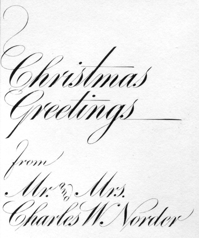
Thanks for the comments. Willis A. Baird (1882-1954) was my personal favorite along with penman such as Charlton V. Howe (1870-1952) and Charles W. Norder (1881-1979). Norder was particularly known for his incredibly precise script (see sample below). Note the wonderful oval variant that Norder uses on his 'a' and 'g' letters in the words 'Christmas Greetings'. Also note the absolute consistency of form, curvature, slant angle, etc....
It should be noted that all of these penmen 'retouched' their letters to optimize the final form.
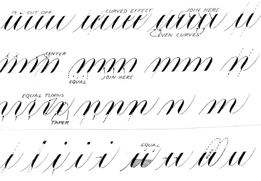
Here are a few more 'key' script insights penned by past master Earl A. Lupfer (1890-1974). These are also well worth close study. To learn more about Lupfer go to:
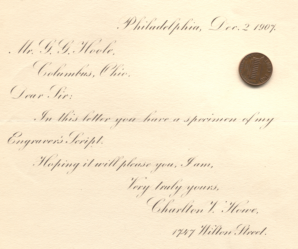
The ability to write extremely small precise script was a mark of a true master. Below you will see a specimen penned by past master Charlton V. Howe (1870-1952). I scanned a penny with the letter for scale. For more on Howe please visit:
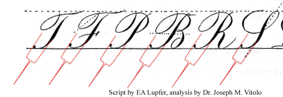
Here is another insight into script consistency that focuses on the baseline 'ladle' of the compound curve. These are types of examples demonstrate techniques that you can apply to your own script to analyze your letter forms.
Getting back to Norder's work, I do like his variation of the lower G and A. That's a nice touch that I might try myself. One thing I'm unsure about is his treatment of the lower H where his hairline enters the letter but doesn't continue through to the loop at the top. What are your thoughts on that? While it's a very subtle thing, my eye isn't agreeing with it.
These are fantastic examples you have. I assume they're your personal collection?
I really appreciate your posting this Joe, and all for the small price of..."FREE" My teacher taught me cursive writing in the 5th grade (way back in 1958!), only not in the depth you have presented here and those exercises have never left me. I love this style of writing and practice it every day. Needless to say, it has helped me with my script lettering in the craft.
I understand traditional cursive writing is not being taught in school these days, only printing, so to those wishing to provide a service that is fast becoming dead, learn calligraphy and learn it well, it will benefit you more than you may realize.
By the way, my wife tells everyone that my handwriting today is the same as when I first started writing her 46 years ago. Apparently, it was my good looking writing, not my good looks !!?!! that captured her heart!
Thanks for your comments. The pen masters of the past such as Norder used many forms of the same letter but usually stayed consistent within the same specimen.
With regards to modifying the entry point of the stem loop, this particular topic has been the subject of more than a few conversations among ornamental penmanship historians such as myself at IAMPETH meetings. The following is based largely on our conjecture as well as anecdotal evidence. I have long believed that Norder was more influenced by John Jenkin’s 1813 publication ‘The Art of Writing’ which was essentially Jenkin’s approach to English Roundhand. In my collection, I have exemplars penned by Norder that were close to exact reproductions of Jenkins’ forms. The following page would illustrate this approach:
This ascender stem loop form was used by 'some' penmen including Baird, Howe, Norder, etc. when slightly shorter capital letter forms were used, i.e. the ratio of CAPITAL:lower case letter was not the typical 3:1. This is the ration taught at The Zanerian College of Penmanship. Letters such as 'A', 'B', were typically ~3 times the x-height size of the lower case letters such as ‘a’, ‘c’, ‘e’, etc. Norder's form in the specimen in question used a ratio closer to 2:1. It was not uncommon to see an ascender stem loop that was shortened, slightly wider and more curved. Such loops would typically end above the lower case x-height line. This stem loop form was also used when writing extremely small even when using the 3:1 ratio. However, this was not an absolute rule. The important thing was to keep it consistent throughout the piece.
Sam, like you I am not a fan of this form/approach since I rarely deviate from the 3:1 ratio. However, even this ratio is only one approach. It was taught in The Zanerian College of Penmanship during the teaching tenure of Earl Lupfer. In addition, I am not sure why Norder used that looooong stem lower case ‘t’ form in Christmas.


")