Engraver's Script Instruction

arcangel6

Elite Cafe Member
Joined
May 11, 2011
Messages
141
Location
Brookfield, WI
The Double 'll'

Hi,

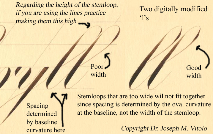
Below you will find my comments on forming words containing a double 'll' such as fall, sell, Holly, etc. A common issue that arises is the overlapping double 'll' where the first stem loop runs into the second. The image below should makes this clear. I also included a link to one of my videos that illustrates this and how to avoid it. You can view the clip at:

http://www.iampeth.com/videos/pages/vitolo_lowercase_group2_supplement_double_L.htm

The video shows pointed pen script but the basic principles apply to engraving as well.

Regards,

Joe Vitolo
 

arcangel6

Elite Cafe Member
Joined
May 11, 2011
Messages
141
Location
Brookfield, WI
Handwriting versus Engraver's script

Hi,

The following video may be helpful in separating cursive handwriting from Engraver's script. In this video I use a pencil to demonstrate basic form concepts.

Regards,

Joe Vitolo

[video]http://youtu.be/l-PWvLlplb4[/video]
 

arcangel6

Elite Cafe Member
Joined
May 11, 2011
Messages
141
Location
Brookfield, WI
Joe, Thank you for sharing you knowledge of penmanship and do you think it will ever be taught in schools again? :thumbsup: J.J.

Hi J.J.,

My apologies for missing your post. Sadly, the answer to your question is most likely 'no'. At least in regards to high grade cursive handwriting. I will post an image of such a specimen.

Joe Vitolo
 

arcangel6

Elite Cafe Member
Joined
May 11, 2011
Messages
141
Location
Brookfield, WI
The Beauty of Mono-line (Plain) Penmanship

Hi,

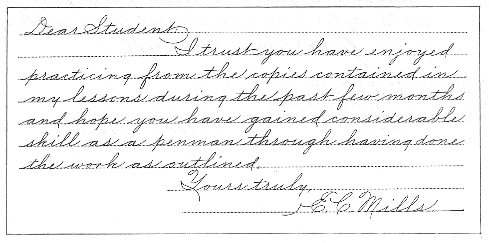
This post is offered as a followup to my reply to J.J.'s post. Plain, unshaded cursive handwriting can be as esthetic as shaded script if it is executed at a high level of proficiency. The specimens below we penned by Edward C. Mills (1872-1962). Mills was considered to be one of the finest plain penmanship writers ever. The style is very similar to the Zaner-Bloser and Palmer Methods of handwriting. You can view Mills' complete instructional book at:

http://www.iampeth.com/books/mills_modern_business_penmanship/Mills_Modern_Business_Penmanship_index.php

Since the style is relatively unadorned with swirling/curling embellishments AND it is a mono-line style (no shading) the quality of (or lack of quality) the script is readily apparent. Properly executed I believe it could be of value to the engraver.

Regards,

Joe Vitolo


JJ Roberts

:::Pledge Member:::
::::Pledge Member::::
Joined
Nov 10, 2006
Messages
3,530
Location
Manassas, VA
Last edited:

acorn

Member
Joined
Jun 3, 2011
Messages
9
Location
Shelby Co. IL USA
Please critique this example of my gold inlayed script. Sorry for the poor pic. Constructive criticism is always welcome. Gary CCF08042009_1.jpg
 

arcangel6

Elite Cafe Member
Joined
May 11, 2011
Messages
141
Location
Brookfield, WI
Dr. Joe..Here is a certificate I was awarded in the 6th grade for penmanship which I always received "A's" for. My teacher Mrs. Bergfeld was my favorite teacher.
She also had me doing murals for the school. They were done on 4'x8' plywood panels...I guess she was my 1st mentor.

http://imageevent.com/loveoldstuff/jjpastartatwork?p=12&n=1&m=12&c=2&l=0&w=4&s=0&z=2

Hi,

Thank you for posting that certificate. I have seen many in my research. It should be noted that handwriting is alive and well with many homeschooling families.

Regards,

Joe Vitolo
 

sam

Chief Administrator & Benevolent Dictator
Staff member
Joined
Nov 6, 2006
Messages
10,533
Location
Covington, Louisiana
I've been traveling and haven't been able to stay up to date with this thread. I will continue next week.
Thanks Joe!
 

arcangel6

Elite Cafe Member
Joined
May 11, 2011
Messages
141
Location
Brookfield, WI
Small Script & Fine Hairlines

Hi,

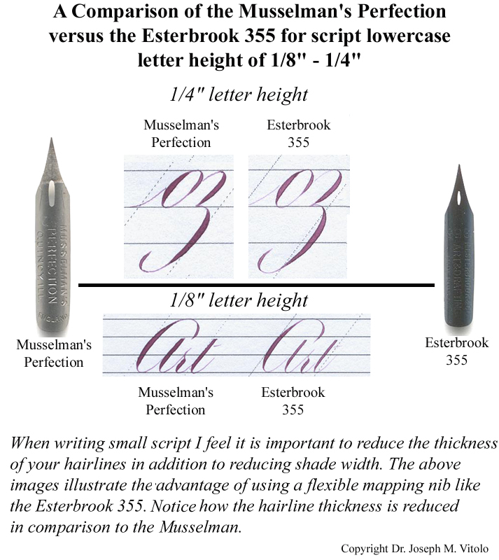
In the world of high-grade script executed with a flexible steel nib/pen, as the script gets smaller in size maintaining the dramatic contrast between shaded strokes versus hairline strokes becomes increasingly more difficult to maintain. Once that contrast is lost the script will appear more monoline in character. In fact script experts spend an incredible amount of time and effort trying to achieve finer and finer hairlines at an size script to maintain this contrast. Masters would delight in producing almost invisible hairlines. However, there is a limit and too extreme can effect the legibility of the script.

In the image below I penned the word 'Art' using (on the left) my usual favorite vintage pen the "Musselman Perfection" and (on the right) a small extremely fine/sharp mapping pen. While they both look 'ok' at either scale the ones penned using the mapping pen (right) have the finer hairlines.

I have no experience with engraving on metal so please forgive my ignorance but this should translate into using either a finer burin (not sure if there is such a thing) and/or a lighter touch to maintain the delicate hairlines. I realize that for most eyes looking at the specimen below either penning of the word 'Art' may look fine. In reality, they are all acceptable; however, to the trained eye the words penned using the mapping pen (right top and bottom) are the finer specimens. They have the best shade to hairline contrast.

Regards,

Joe Vitolo


arcangel6

Elite Cafe Member
Joined
May 11, 2011
Messages
141
Location
Brookfield, WI
The Madarasz Lowercase 's'

The great ornamental penman Louis Madarasz (1860-1910) occasionally used a beautiful lowercase 's' form (see image below. Notice that he does not connect the dot to the shaded stroke using a hairline as would normally be done? This simulates the effect of an invisible hairline when in reality it is not present. The delicate dot on the ascender hairline looks almost like a dew drop about to slide off the letter.

Joe Vitolo


arcangel6

Elite Cafe Member
Joined
May 11, 2011
Messages
141
Location
Brookfield, WI
Harry S. Blanchard (1855-1940)

Remarkable pen flourishing from the pen of HS Blanchard (1855-1940). Please note the 'right angle intersection of the strokes. I've often wondered if such 'stylized' bird forms would work well for engravers. For more on Mr. Blanchard please visit:

http://www.zanerian.com/Blanchard.html

Regards,

Joe Vitolo


arcangel6

Elite Cafe Member
Joined
May 11, 2011
Messages
141
Location
Brookfield, WI
Jake Weidmann

The following remarkable specimen of flourishing was penned by a relative newcomer to penmanship, Jake Weidmann. You can browse his remarkable art at:

http://www.jakeweidmann.com/

I would be interesting to see an intaglio copperplate made of such a specimen.

Joe Vitolo


arcangel6

Elite Cafe Member
Joined
May 11, 2011
Messages
141
Location
Brookfield, WI
Copperplate Engraving

Hi,

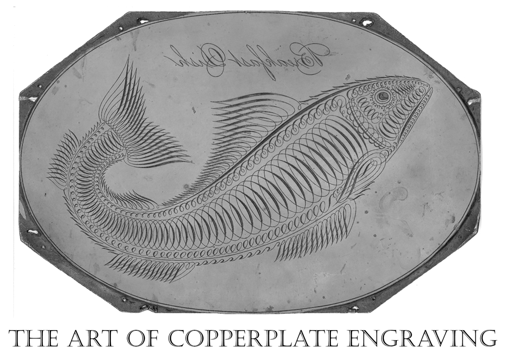
The following is an image of an actual early to mid-nineteenth century copperplate engraving used for intaglio printing of a penmanship book. The plate is owned by one of my colleagues. Thought you'd like to see it. I also uploaded the 2003 IAMPETH Penman's Journal that contains the article on the plate. The article starts on page 9. You may view it here:

http://www.zanerian.com/Penmans Journal Spring 2003.pdf

Joe Vitolo

 
Last edited:

Les Riddell

Member
Joined
Oct 21, 2008
Messages
83
Location
Cromwell New Zealand
thank you joe. i have down loaded your hand out and i am sure it will help me through a few hurdles. i am a serial collector of reference material and encourage you to produce your mentioned instructional video. put me on your advanced order list. just tell me when and how much.
 

JJ Roberts

:::Pledge Member:::
::::Pledge Member::::
Joined
Nov 10, 2006
Messages
3,530
Location
Manassas, VA
Dr.Joe,Thank's for sharing all this wonderful information on the art of penmanship,it's amazing what can be accomplished with pen & ink.:thumbsup:J.J.
 

arcangel6

Elite Cafe Member
Joined
May 11, 2011
Messages
141
Location
Brookfield, WI
The lead in connector and the lowercase 's'

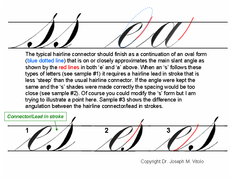
It should be noted that the lowercase 's' when properly formed is essentially an invert 'c'. Also the top of the 's' should be just above the x-height line.

Regards,

Joe Vitolo


arcangel6

Elite Cafe Member
Joined
May 11, 2011
Messages
141
Location
Brookfield, WI
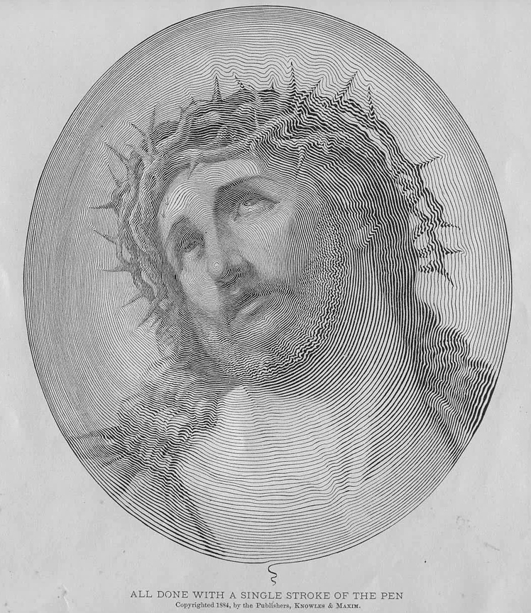
The Face of Christ in a Single Stroke of the Pen

The top image below was penned by Jake Weidmann using a single stroke of the pen lifting the pen only to re-ink. I also included a closeup of the face. Jake was inspired by image at the bottom from the 1884 publication Real Pen Work by Knowles and Maxim. While originally created with a pen the Knowles and Maxim image is actually an engraved form. Jake's specimen is penned.

Regards,

Joe Vitolo


Engraved form circa 1884 from Penmanship book by Knowles and Maxim:
 
Last edited:

arcangel6

Elite Cafe Member
Joined
May 11, 2011
Messages
141
Location
Brookfield, WI
Workshop Handout Reminder

Hi,

Just a reminder that if any Engravers on this site are interested I’ve decided to make my complete Script Workshop Handout available to members of this site. There is no cost and no catch. You may download and print the complete 87 page Workshop Handout at:

http://www.zanerian.com/VitoloBookHandoutComplete3.pdf

I just ask that you do not distribute this file since it will serve as the basis of my future instructional book should I ever get around to publishing it. The instruction manual is composed of several of the articles I’ve published over the years. Please keep in mind that these are individual articles pasted together; therefore, the narrative does not read as a cohesive book. Even though it is intended for pointed pen instruction it is my hope that Engravers will find the concepts contained with in helpful. I will be posting additional concepts in script under this post.

Regards,

Joe Vitolo
 

Latest posts

Sponsors

Top