Critique Request keytag design to silver pendant

Matthew Evans

Elite Cafe Member
Joined
Jul 8, 2017
Messages
410
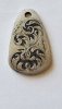
Keytag with an original design. Break it down and give me your worst. Only things I might change are some elements on the outside or relieving all the way to the border. Really these are practice for shading and will give em away, but in the meantime, thanks for looking.
 

Attachments

  • 20200410_110903.jpg
    20200410_110903.jpg
    113 KB · Views: 268
Last edited:

Goldjockey

Elite Cafe Member
Joined
May 17, 2018
Messages
274
Scroll structure is sound, pleasing, and postitive/negative space is very good.

Scroll elements read well but need to extend to touch the backbone, and could use a bit more definition and flair.

Single point shading is clearly defined and nicely spaced, but needs taper (light to dark, fine to heavy) and weight to convey a proper sense of light to shadow.

Overall, the design and use of space is very good and well balanced, and could benefit from a clear border encompassing and defining the outer edges of the design elements.

The total area of the design could be brought in about ~10% to accomplish this without the need to change the structure or flow of the scroll design.

The background removal and treament looks great, and the overall effect of the existing design would be enhanced with an encompassing ~ 1/16" to 3/32" border from the ouside edge of the key fob with additional background removed between the scroll elements and inside border element.
 
Last edited:

Matthew Evans

Elite Cafe Member
Joined
Jul 8, 2017
Messages
410
Scroll structure is sound, pleasing, and postitive/negative space is very good.

Scroll elements read well but need to extend to touch the backbone, and could use a bit more definition and flair.

Single point shading is clearly defined and nicely spaced, but needs taper (light to dark, fine to heavy) and weight to convey a proper sense of light to shadow.

Overall, the design and use of space is very good and well balanced, and could benefit from a clear border encompassing and defining the outer edges of the design elements.

The total area of the design could be brought in about ~10% to accomplish this without the need to change the structure or flow of the scroll design.

The background removal and treament looks great, and the overall effect of the existing design would be enhanced with an encompassing ~ 1/16" to 3/32" border from the ouside edge of the key fob with additional background removed between the scroll elements and inside border element.

Thank you for the critique and for the expert advise. Appreciate this forum and for the more experienced to weigh in.
 

Leland Davis

Elite Cafe Member
Joined
Nov 22, 2014
Messages
523
Location
Wells KS
Matty, if you go back and recut the outside of the scrolls you can clean up some small areas like the lower right scroll has a small bump on the outside. When you recut you will do what monk was saying and emphasize your design.
 

Sam

Chief Administrator & Benevolent Dictator
Staff member
Joined
Nov 6, 2006
Messages
10,489
Location
Covington, Louisiana
I think your design has potential with a few tweaks. It's screaming for some outer work which will really fill in and balance the outside areas.

Be careful with over polishing or sanding your work after it's shaded. If it needs deburring do that before shading. Once shading is done I don't touch mine except in rare instances. The first thing to go is the delicate tapered startup of your shade cuts and you don't want to lose those. Plus sanding and polishing can ruin the crispness of my cuts so I avoid it.

I will add that it's not uncommon for those still in the learning curve to have cuts that aren't perfectly smooth and free of burs, and thus some deburring is necessary.
 

Matthew Evans

Elite Cafe Member
Joined
Jul 8, 2017
Messages
410
Thanks for the input from all. This is step number I dont want to count anymore, but im liking it more and more. Sorry for the two photos, the add photo feature hates me on the mobile version.
 

Attachments

  • 20200419_214904.jpg
    20200419_214904.jpg
    90.6 KB · Views: 101
  • 20200419_214904.jpg
    20200419_214904.jpg
    90.6 KB · Views: 99
Last edited:

Brant

Elite Cafe Member
Joined
Feb 6, 2014
Messages
198
Location
Weeki Wachee
You are definitely getting better.

2 suggestions, slow down and refine your shading.

Only perfect practice makes perfect, if you are in a rush you will just reinforce bad habits, speed will come in time.
 

Archie Woodworth

Elite Cafe Member
Joined
Dec 10, 2010
Messages
293
Location
Northeastern North Carolina
Might not be "world class" but sure looks good and sure as heck will sell ... consider it GONE. Engrave some more.Maybe even on the next one offer it with an initial on the other side. Sell it for whatever you you can get; then start on the next one. You can ratchet up the price the more you sell. Just look at it this way, for now you are learning and you are getting paid to learn.
 

Matthew Evans

Elite Cafe Member
Joined
Jul 8, 2017
Messages
410
Thank you. I wont blow up the cafe with every finished piece, but when i get to the last one ill post to see progress. Much appreciated for the critique and confidence.
 

Latest posts

Sponsors

Top