Shading challenge

Sam

Chief Administrator & Benevolent Dictator
Staff member
Joined
Nov 6, 2006
Messages
10,491
Location
Covington, Louisiana
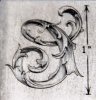
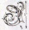
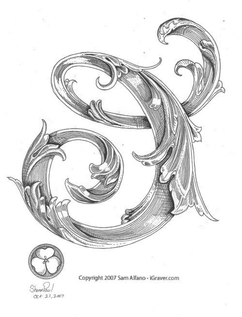
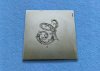
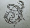
Anyone up for a challenge? I've vectorized a leaf script drawing which you can download, engrave, and shade. Here's the file if you're interested. It's an EPS file so you'll need an application that can open and scale the file to the size you prefer. I think most decent graphics applications can handle it, and maybe even a word processor, but I'm not sure.

Let's see what you can do! / Sam
 

jimzim75

Elite Cafe Member
Joined
Nov 10, 2006
Messages
808
Location
Canada
The challenge maybe opening the file.
Jim

ps. I got it open.
 
Last edited:

vilts

Elite Cafe Member
Joined
Apr 8, 2007
Messages
512
Location
Estonia
That is just excellent. I'm in!

This kind of shading is just what I need to practice, long and smooth curves. I'll try to get my dad to engrave this too, then it'll be even more exciting - father or son :)

Thanks Sam!
 

Sam

Chief Administrator & Benevolent Dictator
Staff member
Joined
Nov 6, 2006
Messages
10,491
Location
Covington, Louisiana
Zernike: All I did was a quick outline in Illustrator. I don't expect those who engrave it to follow every error in the tracing, but to cut clean, smooth curves and to improve on it, just like you would as you engrave a pencil outline on metal.

Regards / Sam
 

Doc Mark

~ Elite 1000 Member ~
Joined
Nov 16, 2006
Messages
1,284
Location
Hampton, Virginia
OK Sam,

Here are my amateur attempts. The first one is using parallel lines only to do the shading. The second pic is after adding crosshatching to darken certain areas. Frankly, I like the "cleaner" aspect of the parallel lines the best, but that may be because my crosshatching technique is still a bit sloppy. All critiques are welcome.

All engraved with Monarch, Airtact, and 120 degree graver. Engraved lines were filled with etching ink. Height less than 1 inch.


Mark
 

Attachments

  • shading-exercise-1.jpg
    shading-exercise-1.jpg
    73.7 KB · Views: 332
  • shading-exercise-2.jpg
    shading-exercise-2.jpg
    74.6 KB · Views: 355
Last edited:

shonn

Member
Joined
Apr 26, 2007
Messages
38
Location
Layton utah
well here is my attempt to shade it in. filled it in with a .005 black pen
just wish i could use my engraver the same as my pen( need more practice)


Last edited:

russ

Member
Joined
Nov 12, 2006
Messages
85
Location
Denver
Thanks Sam. I was looking for something to do on the first snowstorm of the season. Tell me what I’m doing wrong – I thought it looked good tell I put it under the camera.

Thanks
Russ
 

Attachments

  • shading challenge reduced.jpg
    shading challenge reduced.jpg
    118.4 KB · Views: 244
Last edited:

coincutter

Elite Cafe Member
Joined
Jan 30, 2007
Messages
234
Location
Pleasantville Iowa 50225
Zernike

I will make you a bet that many of the excess and dogleg points were generated aside of the original drawing during the export to eps process. I have seen the program do this many times - it will take something relatively simple and convert it into a monstor vector.

I am not an expert in Illustrator but it's one of my favorite toys. Vectors are the only way to go but the programs have issues. Illustrator generates many additional points on export. More on import.

I put a link to a good tutorial on Lindsay's forum some months back, can't remember where it linked to but it defined exactly what you are talking about and the tricks to make beautiful curves using 3 points and the main control point was invariably off the drawing in the weirdest of places you would never expect to find it.

This response was based on issues people were having doing relatively simple drawings over the net and ending up with 100 plus meg images on export and conversion or making a simple vector drawing and ending up with millions of unneeded points.

Perhaps I am wrong but i think Sam may be leading you all to discover the fact that when drawing representations of floral and leaf structures (scrolls) you must make your shading lines conform to the realities of the forms shape and in doing so accurately represent the natural lighting effects of a 3D object in 2D space.

Artist's come by this naturally, illustrators generally pick up on it and mechanical cutters - ie wood block intaligo banknote and other styles process their shading shading effects in different manners but usually ending up with something that will fool the eye into thinking that the object looks real if done small enough.

I am not picking on illustrators per say, but most who use computers for design and production use flat color, gradient or pattern fills in various combinations of layers to accomplish a given dimensional appearence.

Unfortunately by using such mechanical methods to excess they never learn to draw. Most fail to learn to see which is the basis for drawing.

I see the same problems popping up all the time when people draw most of them are glaringly obvious but only to an artist. Engravers may know something is "wrong" but may have a hard time putting their finger on it or explaining it.

But in this example it should be very obvious to you what people are doing wrong. It's not so much a matter of engraving as it is a lighting issue.

In general we view all things with a "standard" of lighting. The norm is sunlight which can be at any angle but it is generally high and shadows proceed from it in only one direction, shadows are filled by ambient lighting, reflection or color. This holds true in all forms of renderings paint pastel pencil photography etc etc.
But shadows or the lines that represent them must follow the shape of the plane(s) they fall on or are intersected by.

The time worn standard is Rembrandt or high 45 degree lighting followed by Butterfly or high frontal lighting. Those configurations and anything in between drive 99.9 percent of the minds on the planet.

If you are doing deep sculptural engraving - ie carving the lighting issues are resolved by the planes of the sculpture and if something is off it becomes apparent as the naturalal lighting throws shadows which indicate problems with the plane relationships.

When engraving (drawing) a 3D subject on a 2D surface you do not have the luxury of actual planes in various heights to throw shadows so you must fake them by shading in some fashion.

Your shading must conform to natural lighting or it will look strange. Regardless of the type of shading if the lighling is conflicting or the lines of force are conflicting the eye of the viewer will see error.

After you read this go back through the examples posted by others and for that matter the examples of many of the master engravers to see if this is now obvious to you. Perhaps you will catch them making mistakes!

On areas of the floral which can only be curved and stressed (as dictated by the main lines of the drawing) one should not place lines of force which are indicators of a flat surface. Nor should they be placed in such a fashion as to indicate a reverse force on a plane. Lines should be placed to indicate if the plane leans left right forward backward in addition to it's curvature. That's where cross hatching comes in and works well but the lines may not all be straight and at 90 degrees to one another, on a curved surface long straight lines can be questionable if not an idicator of length or center. But rarely is a naturaly form straight and rigid.

If the light is coming from the upper left then all shadows must fall and lie lower right - if main is upper right then all shadows fall and lie lower left at the same angle or in a spread which indicates a point of diminishing perspective and they must track the intended curvature - convex or concave.

If one surface overlaps another then shadows must conform to the over/under lap. Not all overlaps have shadows depending on the direction of the lighting!

Shader lines indicate the fall off of a shadow to a lighter area or conversly light to dark so it follows the cross hatching, stipple or line work must vary in size (line width) and delicacy (dot size or cross hatch pattern scale). Front to back and side to side and line widths balenced if need be to the left or right
- right to left - center out and conversely. Shader lines are the indicator of high's and lows. But they must conform individually and completely across the entire drawing / engraving. Look close at the great ones, you will see more than just a few lines thrown down here and there to indicate shadow, Shading/texture is an art to itself. It may take 10 minutes to do the scroll work and another 10 months to do the shading......

It's that simple, yet that hard.

It is the one thing that most instructors will not wish to tell in the beginning but as time passes it must become obvious to all.

Your engraving skill is dictated by your drawing ability and suplimented by your abilitiy to discern which tool is right for the particular effect you wish to impart on your canvas regardless of the genra or medium and how to apply it.

Painters rarely use one brush to do a painting unless a master at achieving a variety of strokes and effects by creative handling of the one tool.

All these rules apply and how one chooses to use or bend them to achieve a final out come is a matter of individual preference. This is what we call art.

Have fun.....!
 

John B.

Lifetime Pledge Member
::::Pledge Member::::
Joined
Nov 9, 2006
Messages
3,966
Location
Los Angeles area, California.
Hi Steve and Zernike.

Thank you both for the very interesting and insightful discussion on the shading and modeling of leaves and tendrils that form scrollwork.

I am sure your discussion will be of great help to many, especially some newer engravers.
It will help many to analyze what they like or dislike in the scroll they are studying and what theory of shading was used to develop it.

Both of you have excellent points.
Steve seems to favor natural, directional lighting and that is understandable as he come from a background of oil painting.
From a pure art theory no doubt that is correct and I note that Zernike agrees.
And many fine engravers support and follow the theory of a single light source for shade and shadow.

But Zernike also makes an excellent observation in pointing out the other traditional method of modeling engraving by simply applying shade and shadow to each leaf or element to give it a dimensional shape without consideration of a single overall light source.
Many fine engraving artists adopt this method of shading their scroll out of tradition even though they a well aware of the fine art single or reflected light source theory.

Both methods of modeling are fine when applied with skill and care.
Engravers differ; each method of modeling is employed by some of the world’s best engravers to shade their work.
Scroll engraving has a long history and tradition that supports both theories.
In that, it sometimes deviates in shade and shadow from pure fine art rules.
As the old saying goes, sometimes rules may be broken.
Especially if well broken by an experienced hand, eye and heart.

Thank you both, just my thoughts. John B.
 
Last edited:

Sam

Chief Administrator & Benevolent Dictator
Staff member
Joined
Nov 6, 2006
Messages
10,491
Location
Covington, Louisiana
Mark: excellent work. You've employed a variety of shading techniques and handled them all well. Absolutely excellent.
Shonn: You did well, but I'd like to see you engrave one! You can do it!
Russ: I see nothing wrong with the way you handled this, but a closer photo would be better. Nice job, Russ.

Zernike: Your comments are true and what I did was a rush-job on the tracing. I'm an old CorelDRAW guy for many years, and Illustrator for only a few weeks, but I'm learning. Even with Coreldraw I rarely did this kind of illustration, so I'm new to vector drawing. Thank you for your comments and suggestions. Maybe when I'm in HK next year you can teach me some things in Illustrator. Now it's time to engrave the design, so let's see what you can do!

Cheers / ~Sam

p.s. The design is a leaf script letter "C", and I'm surprised everyone engraved it backward!


rod

~ Elite 1000 Member ~
Joined
Nov 19, 2006
Messages
1,609
Location
Mendocino. ca., and Scotland
Thank you all contributers to Sam's initial posting!

You got some good stuff going, Sam, for the likes of people like me, who are hungry to read the various views of what more experienced drawers and cutters have to offer here.

I am getting a lot of value from these discussions, particularly the 'fine art' overview presented by Steve E, augmented by the replies of Zernike and John B. Thank you for taking the time, you three, to 'throw more light' on the subject... (sorry about that).

I hope this keeps going, please way in some more?

best

Rod
 

coincutter

Elite Cafe Member
Joined
Jan 30, 2007
Messages
234
Location
Pleasantville Iowa 50225
All points are valid and the varieties of lighting and shadow expression are endless.

This is not an easy project that Sam threw at you as he is requiring you not only to use your drawing skills but more so your imagination and forcing you to visualize this object lit in 3d space.

So now there are several examples of how people imagined they would see shadows appearing on this object and the ways in which they would place them. Now comes the task of using a few words to describe whats happening in space.

What I have been alluding to is the visual confusion caused by multiple Primary light sources and how they change the relative positioning of the implied planes.

If you take note of Sam's work it is apparent that the light direction is consistant across the entire image and because of this there is no "visual" question about the spatial position of each portion of the scroll. In short Sam has achieved a perfect balence of main light and shadow fill and reflected light that one would expect to see occuring in an example of fine product photography of an actual item.

Each plane transitions smoothly from front to back. There are no places in the rendering where the eye hangs up, no question as to which edge is leading or trailing and the curvature of the surfaces are clearly defined by the shaders which define the reflected light.

The lines of force and subtle indicators of lighting keep your eye moving thru out the design.

To be sure most people do not pick up on the fact that aside from the obvious indicators of a main and fill light the scroll is acting as it's own fill light source. In short Sam is drawing and engraving photographically or rather photorealistically. There are only a very few people in the engraving scene who pull this off well (contrast gradient) it takes time to master 3d art on a 2d plane.

The other renditions follow the same configuration "to a point" but in various areas the lighting changes from a single point to a multiple main point senerio. I am not picking on Shawn but his image is larger and easier to see and therefore makes it much easier to compare to Sam's image side to side. Take a close look at the what is happening on the lower left quadrant of the C. The main lighting has moved from upper right to lower right and this effectively changes the position of this segment and flattens it visually. Photographically or painterly speaking we would say it has lost it's snap. In a dimensional carving it could be termed as a misplaced plane. In other areas the edges which we "think we know" should be leading seem to fall back of the mid body of the element. Reversed planes. Tricky stuff.

The alternate lighting style which i believe Zernike is referring to works very well if consistant and is in effect what would happen if you placed the main light source at infinity directly behind your head pointing at the object. With one source the shadows eminate from the center outwards in a circular fashion throughout the design. Take a look at a dollar bill.

Two points or cross lighting with equal shadows left and right of center works well too. All are beautiful when well thought out and applied correctly and all are difficult to accomplish as it requires great attention to the relative length of each line side to side to achieve balence and maintain spatial relationships.

All I am trying to say here is that randomly mixing multiple lighting styles in one design generally doesn't work well. Not that one style is better than another. Whatever works, works as long as it supports the range of depth you are trying to portray and doesnt confuse the issue.

The choice of lighting style is probably best determind by the subject matter, the size of the design and it's relationship to the object it's placed upon. Nothing is written in stone but when a switch is made midstream it may or may not become glaringly apparent to the viewer. As artist's we are more critical of these things than the average person and by some fashion we should be able to put all this malarky into just a few words instead of having to write volumes to convey the concepts to those wishing to learn.

Art is what it is. The eye needs to be trained to see. The mind may gloss over what the eye percieves. Sometimes there is no correlation between the two. Picasso made a fortune when he figured that out.

Do the design, engrave the piece, destroy the design. With no evidence left behind no one will be the wiser about the changes you made. Just don't screw up. Never make a mistake. Don't admit to anything. That's the secret.

Don't ask what's wrong with my work. Ask what's right about it. That will make people take the time to really look at your work and give you an honest evaluation. If they can't come up with anything nice to say you'll know something is not working and chances are if you put the drawing on hold and come back to it a few days later you will see where it's lacking. When in doubt, hold up your design and look at it in a mirrror. You will be aforded a fresh look that just may shock you! Last but not least don't ever take anything I say seriously.

SLE
 

russ

Member
Joined
Nov 12, 2006
Messages
85
Location
Denver
Sam,
Here is a closer picture. I’m embarrassed to show this (it looks like a bunch of chicken scratches) but if it will help me get better, then here it is. I guess my eyes are going bad – most of the lines didn’t look that bad under the 10X optivisor. I also have a hard time with the glare after each cut – trying to stay parallel.

OK - enough excuses…

Thanks
Russ
 

Attachments

  • close up.jpg
    close up.jpg
    112.8 KB · Views: 209
Top